
Custom UI/UX Design for Web & Mobile AppsMuhammad Nur Setiawan
I create intuitive and visually stunning UI/UX designs tailored to your brand's needs, ensuring exceptional user experiences for web and mobile platforms.Specializing in creating interactive prototypes and wireframes that align with your business goals and enhance user satisfaction.
What's included
Wireframe Design for Digital Interfaces
This deliverable includes a structured and professional wireframe design for web or mobile applications, ensuring clear layout and user flow before moving into detailed design or development. The package includes:
Low-Fidelity Wireframes: Simple sketches focusing on content structure and hierarchy.
High-Fidelity Wireframes: Detailed layouts for realistic presentation and team discussions.
Interactive Wireframes (Optional): Clickable wireframes showcasing user flow interactively.
All files will be delivered in compatible formats such as PDF, PNG, or source files (Figma/Adobe XD) to facilitate seamless collaboration with your team.
Mockup Design for Web and Mobile Applications
This deliverable provides high-quality, visually polished mockups for your web or mobile application, showcasing the final look and feel of the product. The package includes:
Realistic Visual Mockups: Detailed representations of the final design, including typography, colors, and branding elements.
Multiple Screen Designs: Mockups for key pages or screens to ensure consistency and clarity.
Responsive Variations (Optional): Mockups optimized for different devices (desktop, tablet, and mobile).
All files will be delivered in standard formats such as PNG, JPEG, or source files (Figma/Adobe XD) for easy integration into your workflow.
Interactive Prototype for Web and Mobile Applications
This deliverable includes a fully interactive prototype, allowing you to experience the flow and functionality of your web or mobile application before development begins. The package includes:
Clickable Prototypes: Simulations of user journeys with linked screens for a realistic experience.
Core Interaction Demonstrations: Showcasing essential features like navigation, buttons, and transitions.
Device Optimization (Optional): Interactive prototypes designed for various devices (desktop, tablet, mobile).
The prototype will be delivered via a shareable link (Figma, Adobe XD, or similar platforms), enabling easy collaboration, review, and presentation.
UX Writing for Digital Products
his deliverable offers clear, concise, and user-centered copy to enhance your digital product's user experience. The writing is tailored to guide users effectively through your application or website. The package includes:
Microcopy: Engaging and functional text for buttons, tooltips, and navigation labels.
Error Messages: Thoughtfully crafted error and success messages to guide users.
Onboarding Content: Welcoming and instructional text to help users get started seamlessly.
Content Consistency: Ensured alignment with your brand voice and tone throughout the product.
Deliverables will be provided in a structured document or integrated directly into your design file (Figma, Adobe XD, or Google Docs) for seamless collaboration.
Design System for Digital Products
This deliverable provides a comprehensive design system to ensure consistency, scalability, and efficiency across your digital product. The design system will serve as a single source of truth for your team, streamlining collaboration and future updates. The package includes:
Style Guide: Detailed documentation of typography, color palette, spacing, and iconography.
Reusable Components: Pre-designed UI components (e.g., buttons, cards, modals) for efficient development.
Design Tokens: Defined values for colors, fonts, and spacings for seamless integration into code.
Interaction Guidelines: Specifications for hover states, animations, and responsive behaviors.
File Organization: A well-structured library in tools like Figma, Adobe XD, or Sketch for easy access and updates.
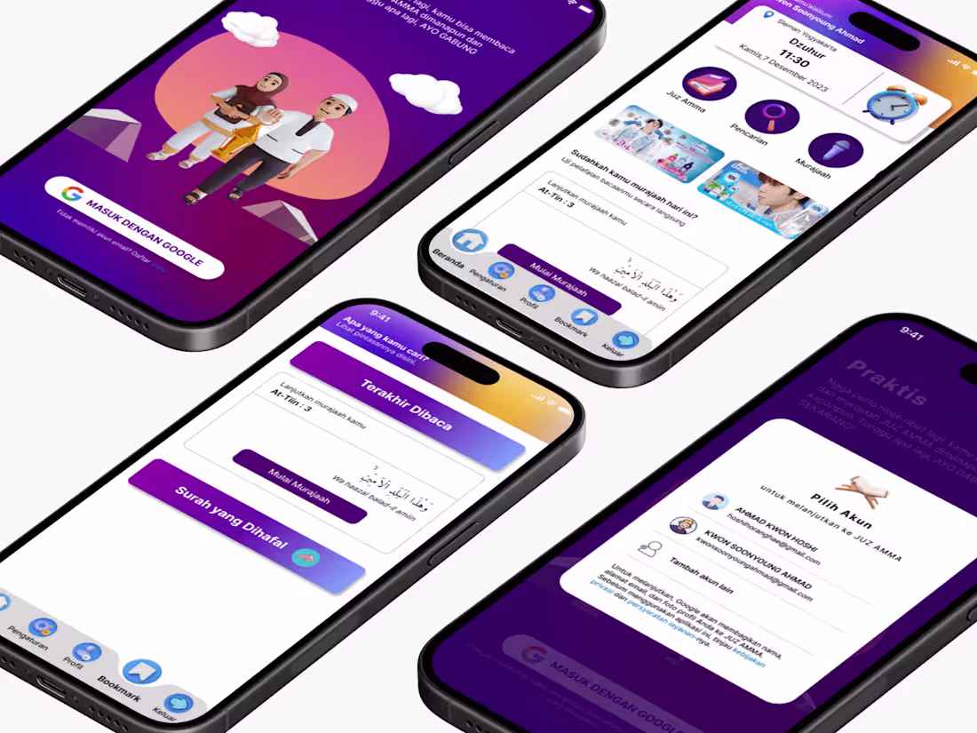
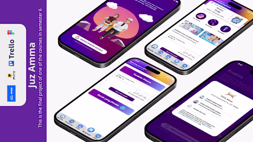
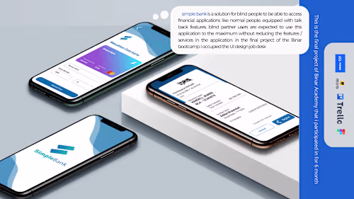
Example work
Muhammad Nur's other services

Contact for pricing
Tags
Adobe XD
Figma
UI Designer
UX Designer
Web Designer
Service provided by
Muhammad Nur Setiawan Yogyakarta, Indonesia
Custom UI/UX Design for Web & Mobile AppsMuhammad Nur Setiawan
I create intuitive and visually stunning UI/UX designs tailored to your brand's needs, ensuring exceptional user experiences for web and mobile platforms.Specializing in creating interactive prototypes and wireframes that align with your business goals and enhance user satisfaction.
What's included
Wireframe Design for Digital Interfaces
This deliverable includes a structured and professional wireframe design for web or mobile applications, ensuring clear layout and user flow before moving into detailed design or development. The package includes:
Low-Fidelity Wireframes: Simple sketches focusing on content structure and hierarchy.
High-Fidelity Wireframes: Detailed layouts for realistic presentation and team discussions.
Interactive Wireframes (Optional): Clickable wireframes showcasing user flow interactively.
All files will be delivered in compatible formats such as PDF, PNG, or source files (Figma/Adobe XD) to facilitate seamless collaboration with your team.
Mockup Design for Web and Mobile Applications
This deliverable provides high-quality, visually polished mockups for your web or mobile application, showcasing the final look and feel of the product. The package includes:
Realistic Visual Mockups: Detailed representations of the final design, including typography, colors, and branding elements.
Multiple Screen Designs: Mockups for key pages or screens to ensure consistency and clarity.
Responsive Variations (Optional): Mockups optimized for different devices (desktop, tablet, and mobile).
All files will be delivered in standard formats such as PNG, JPEG, or source files (Figma/Adobe XD) for easy integration into your workflow.
Interactive Prototype for Web and Mobile Applications
This deliverable includes a fully interactive prototype, allowing you to experience the flow and functionality of your web or mobile application before development begins. The package includes:
Clickable Prototypes: Simulations of user journeys with linked screens for a realistic experience.
Core Interaction Demonstrations: Showcasing essential features like navigation, buttons, and transitions.
Device Optimization (Optional): Interactive prototypes designed for various devices (desktop, tablet, mobile).
The prototype will be delivered via a shareable link (Figma, Adobe XD, or similar platforms), enabling easy collaboration, review, and presentation.
UX Writing for Digital Products
his deliverable offers clear, concise, and user-centered copy to enhance your digital product's user experience. The writing is tailored to guide users effectively through your application or website. The package includes:
Microcopy: Engaging and functional text for buttons, tooltips, and navigation labels.
Error Messages: Thoughtfully crafted error and success messages to guide users.
Onboarding Content: Welcoming and instructional text to help users get started seamlessly.
Content Consistency: Ensured alignment with your brand voice and tone throughout the product.
Deliverables will be provided in a structured document or integrated directly into your design file (Figma, Adobe XD, or Google Docs) for seamless collaboration.
Design System for Digital Products
This deliverable provides a comprehensive design system to ensure consistency, scalability, and efficiency across your digital product. The design system will serve as a single source of truth for your team, streamlining collaboration and future updates. The package includes:
Style Guide: Detailed documentation of typography, color palette, spacing, and iconography.
Reusable Components: Pre-designed UI components (e.g., buttons, cards, modals) for efficient development.
Design Tokens: Defined values for colors, fonts, and spacings for seamless integration into code.
Interaction Guidelines: Specifications for hover states, animations, and responsive behaviors.
File Organization: A well-structured library in tools like Figma, Adobe XD, or Sketch for easy access and updates.
Example work
Muhammad Nur's other services
Contact for pricing