
Data Visualization & DashboardsPulseLoop LLC
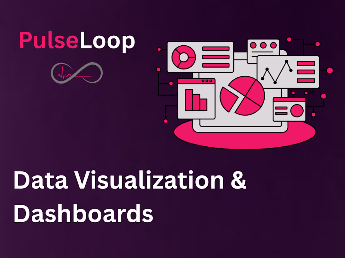
We create dashboards and visuals that transform complex data into clear, interactive insights. Using Tableau, Power BI, and Python, we design visuals that help teams track performance, make data-driven decisions, and tell compelling stories through data. PulseLoop delivers clean, actionable, and presentation-ready dashboards across industries.
What's included
Dashboard Design & Setup
Custom, interactive dashboards created in Tableau, Power BI, or Python, tailored to your data, KPIs, and audience.
Data Connection & Integration
Connecting dashboards to live or static data sources (Excel, CSV, SQL, or APIs) for dynamic updates and accurate reporting.
Visualization & Layout Optimization
Designing charts, graphs, and visuals that communicate insights clearly with color-coded themes, filters, and responsive layouts.
Reporting & Export Setup
Enabling PDF or online sharing options for team collaboration and presentation-ready reports.
Documentation & Handoff
Clear guide explaining dashboard structure, data refresh methods, and how to update or maintain visuals.

Contact for pricing
Tags
Microsoft Excel
Microsoft Power BI
Python
R
Tableau
Data Analyst
Data Scientist
Data Visualizer
Service provided by
PulseLoop LLC Beverly Hills, USA
Data Visualization & DashboardsPulseLoop LLC
Contact for pricing
Tags
Microsoft Excel
Microsoft Power BI
Python
R
Tableau
Data Analyst
Data Scientist
Data Visualizer
We create dashboards and visuals that transform complex data into clear, interactive insights. Using Tableau, Power BI, and Python, we design visuals that help teams track performance, make data-driven decisions, and tell compelling stories through data. PulseLoop delivers clean, actionable, and presentation-ready dashboards across industries.
What's included
Dashboard Design & Setup
Custom, interactive dashboards created in Tableau, Power BI, or Python, tailored to your data, KPIs, and audience.
Data Connection & Integration
Connecting dashboards to live or static data sources (Excel, CSV, SQL, or APIs) for dynamic updates and accurate reporting.
Visualization & Layout Optimization
Designing charts, graphs, and visuals that communicate insights clearly with color-coded themes, filters, and responsive layouts.
Reporting & Export Setup
Enabling PDF or online sharing options for team collaboration and presentation-ready reports.
Documentation & Handoff
Clear guide explaining dashboard structure, data refresh methods, and how to update or maintain visuals.
Contact for pricing