
Design System Starter KitAmrita Singh
I offer a clean, ready-to-use Design System Starter Kit that helps product teams design and build faster with consistent, on-brand components. It includes essentials like buttons, forms, typography, and color styles all delivered in a fully editable Figma file. What makes this unique is my focus on simplicity, brand alignment, and making handoff easy for both designers and developers.
What's included
Design System Starter Kit
A clean, ready-to-use mini design system that gives your product team everything they need to design and build faster with consistency.
Core UI Components
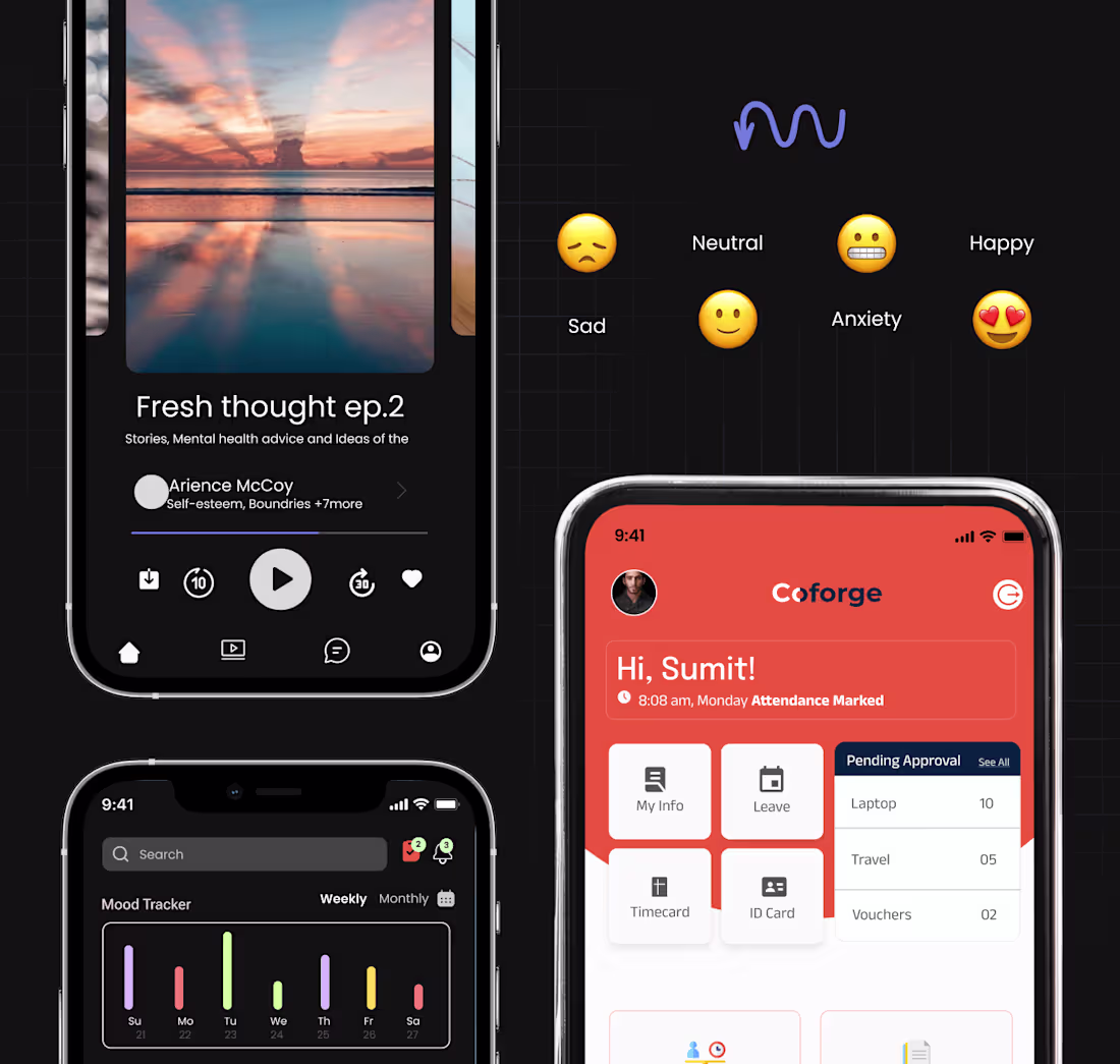
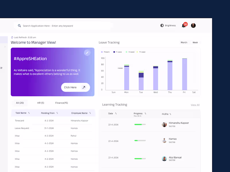
Buttons, input fields, forms, cards, navigation items (up to 10 core components)
Typography System
Headings, body text, spacing, and line-height scales
Color Palette
Brand colors + functional colors (e.g. success, warning, error)
Grid & Spacing Rules
Layout guides for mobile and desktop
FAQs
Amrita's other services
Contact for pricing
Tags
Adobe Creative Suite
Figma
Framer
Brand Designer
Design Systems Specialist
UI Designer
Service provided by
Amrita Singh Gurugram, India
- 7
- Followers
Design System Starter KitAmrita Singh
Contact for pricing
Tags
Adobe Creative Suite
Figma
Framer
Brand Designer
Design Systems Specialist
UI Designer
I offer a clean, ready-to-use Design System Starter Kit that helps product teams design and build faster with consistent, on-brand components. It includes essentials like buttons, forms, typography, and color styles all delivered in a fully editable Figma file. What makes this unique is my focus on simplicity, brand alignment, and making handoff easy for both designers and developers.
What's included
Design System Starter Kit
A clean, ready-to-use mini design system that gives your product team everything they need to design and build faster with consistency.
Core UI Components
Buttons, input fields, forms, cards, navigation items (up to 10 core components)
Typography System
Headings, body text, spacing, and line-height scales
Color Palette
Brand colors + functional colors (e.g. success, warning, error)
Grid & Spacing Rules
Layout guides for mobile and desktop
FAQs
Amrita's other services
Contact for pricing