
Dashboard UI/UX DesignZayed Hossain
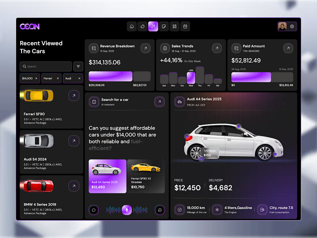
Turn complex data into clear, actionable decisions.
Most dashboards fail at one critical thing,
They show data, but don’t help users understand what to do next.
I design dashboards that simplify complexity, guide attention, and make decision-making faster and easier.
Whether you’re building a SaaS product, analytics platform, or internal tool, the goal is the same:
clarity → confidence → action.
What you’ll get
User-Centered Dashboard Design
Every layout is built around how your users think, not just how data looks.
Data Visualization that Makes Sense
Charts, graphs, and metrics designed for quick understanding, not confusion.
Clear Information Hierarchy
Important insights stand out instantly, reducing cognitive load.
Modern, Scalable UI System
Consistent design system that grows with your product.
Responsive & Developer-Ready Files
Clean, organized Figma files ready for smooth handoff.
Who this is for
SaaS products with data-heavy interfaces
Admin panels & internal tools
Analytics platforms
Startups building MVP dashboards
Businesses are struggling with confusing UI
How I approach it
Understand the users & use cases
What decisions are they trying to make?
Structure before visuals
Wireframes and flows that prioritize clarity.
Design for usability
Clean UI, strong hierarchy, intuitive interactions.
Refine for performance
Iterate based on feedback and real usage scenarios.
If your dashboard looks good but feels hard to use,
You don’t have a UI problem; you have a clarity problem.
Let’s design something your users actually understand.
Zayed's other services
Contact for pricing
Duration1 week
Tags
Figma
Framer
UI Designer
UX Designer
Dashboard Design
Landing Page Design
Service provided by
Zayed Hossain Noakhali, Bangladesh
- 2
- Followers
Dashboard UI/UX DesignZayed Hossain
Contact for pricing
Duration1 week
Tags
Figma
Framer
UI Designer
UX Designer
Dashboard Design
Landing Page Design
Turn complex data into clear, actionable decisions.
Most dashboards fail at one critical thing,
They show data, but don’t help users understand what to do next.
I design dashboards that simplify complexity, guide attention, and make decision-making faster and easier.
Whether you’re building a SaaS product, analytics platform, or internal tool, the goal is the same:
clarity → confidence → action.
What you’ll get
User-Centered Dashboard Design
Every layout is built around how your users think, not just how data looks.
Data Visualization that Makes Sense
Charts, graphs, and metrics designed for quick understanding, not confusion.
Clear Information Hierarchy
Important insights stand out instantly, reducing cognitive load.
Modern, Scalable UI System
Consistent design system that grows with your product.
Responsive & Developer-Ready Files
Clean, organized Figma files ready for smooth handoff.
Who this is for
SaaS products with data-heavy interfaces
Admin panels & internal tools
Analytics platforms
Startups building MVP dashboards
Businesses are struggling with confusing UI
How I approach it
Understand the users & use cases
What decisions are they trying to make?
Structure before visuals
Wireframes and flows that prioritize clarity.
Design for usability
Clean UI, strong hierarchy, intuitive interactions.
Refine for performance
Iterate based on feedback and real usage scenarios.
If your dashboard looks good but feels hard to use,
You don’t have a UI problem; you have a clarity problem.
Let’s design something your users actually understand.
Zayed's other services
Contact for pricing