
Website DesignDinesh Raj
I offer personalized UI/UX design solutions with a focus on creating intuitive, user-centric digital experiences that drive engagement and conversions. With expertise in advanced UX/UI design, I specialize in designing responsive, visually appealing interfaces tailored to the unique needs of each business. What sets me apart is my deep understanding of user behavior, enabling me to craft designs that are both functional and emotionally engaging, delivering real results for clients.
What's included
Completed product
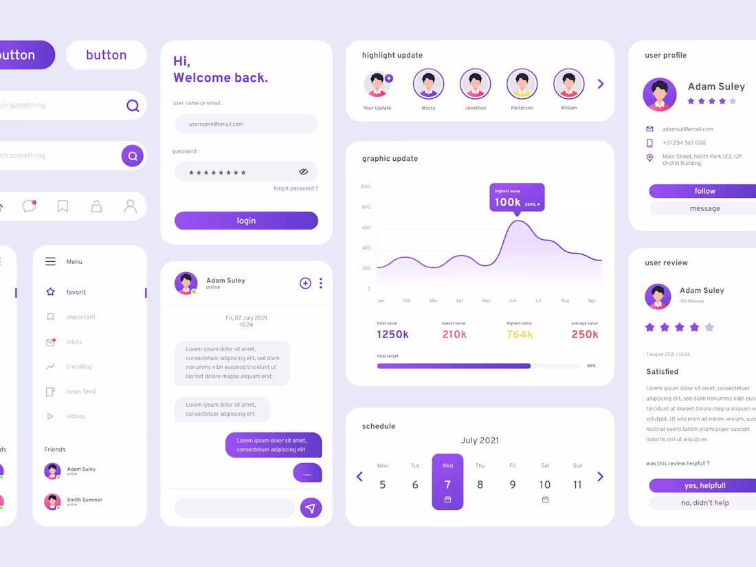
•High-Fidelity Wireframes: Detailed, clickable wireframes showcasing the user flow and structure of the site or app.
•Interactive Prototypes: Fully interactive prototypes allow clients to experience the design's functionality and user interactions before development.
•UI Design Mockups: Polished, high-resolution UI design files (Figma, Adobe XD, etc.) that reflect the final look and feel of the product.
Responsive Design: Design files optimized for various screen sizes (mobile, tablet, desktop).
•Design System & Style Guide: A comprehensive design system including typography, colour palettes, iconography, and UI components for consistency across the platform.
•User Testing Insights (if applicable): A summary report of user testing, including feedback, insights, and recommendations for improvements.
•Handoff for Development: Well-organized design files and assets ready for smooth collaboration with development teams, including any necessary annotations or guidelines.
Dinesh's other services
Starting at$15 /hr
Tags
Adobe Illustrator
Figma
Webflow
UI Designer
UX Designer
Web Designer
Service provided by
Dinesh Raj Chennai, India
Website DesignDinesh Raj
Starting at$15 /hr
Tags
Adobe Illustrator
Figma
Webflow
UI Designer
UX Designer
Web Designer
I offer personalized UI/UX design solutions with a focus on creating intuitive, user-centric digital experiences that drive engagement and conversions. With expertise in advanced UX/UI design, I specialize in designing responsive, visually appealing interfaces tailored to the unique needs of each business. What sets me apart is my deep understanding of user behavior, enabling me to craft designs that are both functional and emotionally engaging, delivering real results for clients.
What's included
Completed product
•High-Fidelity Wireframes: Detailed, clickable wireframes showcasing the user flow and structure of the site or app.
•Interactive Prototypes: Fully interactive prototypes allow clients to experience the design's functionality and user interactions before development.
•UI Design Mockups: Polished, high-resolution UI design files (Figma, Adobe XD, etc.) that reflect the final look and feel of the product.
Responsive Design: Design files optimized for various screen sizes (mobile, tablet, desktop).
•Design System & Style Guide: A comprehensive design system including typography, colour palettes, iconography, and UI components for consistency across the platform.
•User Testing Insights (if applicable): A summary report of user testing, including feedback, insights, and recommendations for improvements.
•Handoff for Development: Well-organized design files and assets ready for smooth collaboration with development teams, including any necessary annotations or guidelines.
Dinesh's other services
$15 /hr