
your brand, redefined.Taller Tintor MX
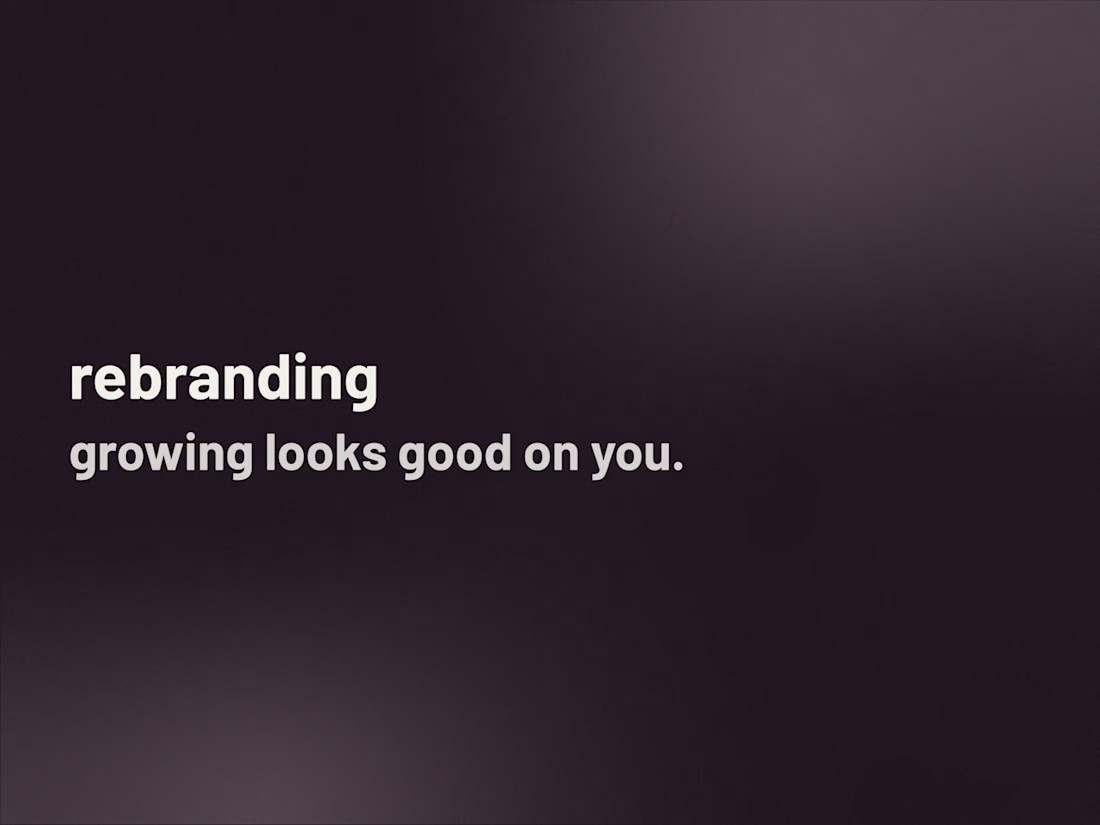
rebranding is about growing into what’s next. we take what your audience already knows and loves, and evolve it so it feels right for where your brand is today.
What's included
research and alignment
before we design, we study how your brand has evolved, what has changed in your audience, and where your goals are heading next. this helps us align your identity with your current stage, keeping what still works and adjusting what no longer fits.
brand files
everything lives in a drive folder, ready for you and your team. each file is labeled, grouped by format, and easy to find. this becomes your updated brand’s home: where the new and the familiar meet consistently.
design justification
every change has a reason. this section explains the thinking, emotion, and strategy behind your evolution: what stayed, what shifted, and why. it helps you communicate your rebranding story clearly, internally and externally.
brand kit guide
a practical manual that walks you through your evolved brand. it shows how to apply your refreshed logo, combine your colors, and use your updated typography. think of it as your everyday guide to staying consistent while moving forward.
logo, icon, and imagotype
we refine proportions, adjust composition, or simplify where needed, making sure each version feels familiar yet aligned with your next chapter. we’ll define how and when to use each one, keeping flexibility intact.
ai, svg, and pdf files
editable originals for every updated element of your brand. these are the source files for designers, printers, and future collaborators, built to maintain precision and consistency wherever your refreshed identity appears.
png and jpg files
ready-to-share formats for everyday use. these are your quick, accessible versions for digital platforms, presentations, and social media. all optimized to reflect your updated brand clearly and cohesively.
color palette
your brand’s visual language, refined. we keep the tones that still represent you and introduce new ones where your story has grown. every color comes with clear codes and context, ensuring your new palette feels intentional and relevant.
typography selection
we revisit your type system to strengthen your brand’s tone of voice. whether we refine your current fonts or introduce new ones, the goal is simple: to make your written voice as aligned and confident as your visuals.
right and wrong uses
a visual guide showing how your rebranded elements should (and shouldn’t) appear. we include examples of logo, color, and layout use to help your team apply the evolved identity consistently across every touchpoint.
three collateral pieces
we redesign three of your core brand pieces to reflect the new direction, whether that’s social posts, simple packaging, or printed materials. each one shows your refreshed identity in action, delivered in editable ai/svg and ready-to-use formats.
FAQs
Taller Tintor's other services
Starting at$1,500
Duration2 weeks
Tags
Adobe Illustrator
Adobe Photoshop
Figma
Brand Designer
Brand Strategist
Digital Marketer
Service provided by
Taller Tintor MX Puebla, Mexico
- 22
- Followers
your brand, redefined.Taller Tintor MX
Starting at$1,500
Duration2 weeks
Tags
Adobe Illustrator
Adobe Photoshop
Figma
Brand Designer
Brand Strategist
Digital Marketer
rebranding is about growing into what’s next. we take what your audience already knows and loves, and evolve it so it feels right for where your brand is today.
What's included
research and alignment
before we design, we study how your brand has evolved, what has changed in your audience, and where your goals are heading next. this helps us align your identity with your current stage, keeping what still works and adjusting what no longer fits.
brand files
everything lives in a drive folder, ready for you and your team. each file is labeled, grouped by format, and easy to find. this becomes your updated brand’s home: where the new and the familiar meet consistently.
design justification
every change has a reason. this section explains the thinking, emotion, and strategy behind your evolution: what stayed, what shifted, and why. it helps you communicate your rebranding story clearly, internally and externally.
brand kit guide
a practical manual that walks you through your evolved brand. it shows how to apply your refreshed logo, combine your colors, and use your updated typography. think of it as your everyday guide to staying consistent while moving forward.
logo, icon, and imagotype
we refine proportions, adjust composition, or simplify where needed, making sure each version feels familiar yet aligned with your next chapter. we’ll define how and when to use each one, keeping flexibility intact.
ai, svg, and pdf files
editable originals for every updated element of your brand. these are the source files for designers, printers, and future collaborators, built to maintain precision and consistency wherever your refreshed identity appears.
png and jpg files
ready-to-share formats for everyday use. these are your quick, accessible versions for digital platforms, presentations, and social media. all optimized to reflect your updated brand clearly and cohesively.
color palette
your brand’s visual language, refined. we keep the tones that still represent you and introduce new ones where your story has grown. every color comes with clear codes and context, ensuring your new palette feels intentional and relevant.
typography selection
we revisit your type system to strengthen your brand’s tone of voice. whether we refine your current fonts or introduce new ones, the goal is simple: to make your written voice as aligned and confident as your visuals.
right and wrong uses
a visual guide showing how your rebranded elements should (and shouldn’t) appear. we include examples of logo, color, and layout use to help your team apply the evolved identity consistently across every touchpoint.
three collateral pieces
we redesign three of your core brand pieces to reflect the new direction, whether that’s social posts, simple packaging, or printed materials. each one shows your refreshed identity in action, delivered in editable ai/svg and ready-to-use formats.
FAQs
Taller Tintor's other services
$1,500