
Design Systems & UI LibrariesMatea Raić
I design scalable design systems that help teams move faster, stay consistent, and ship with confidence.
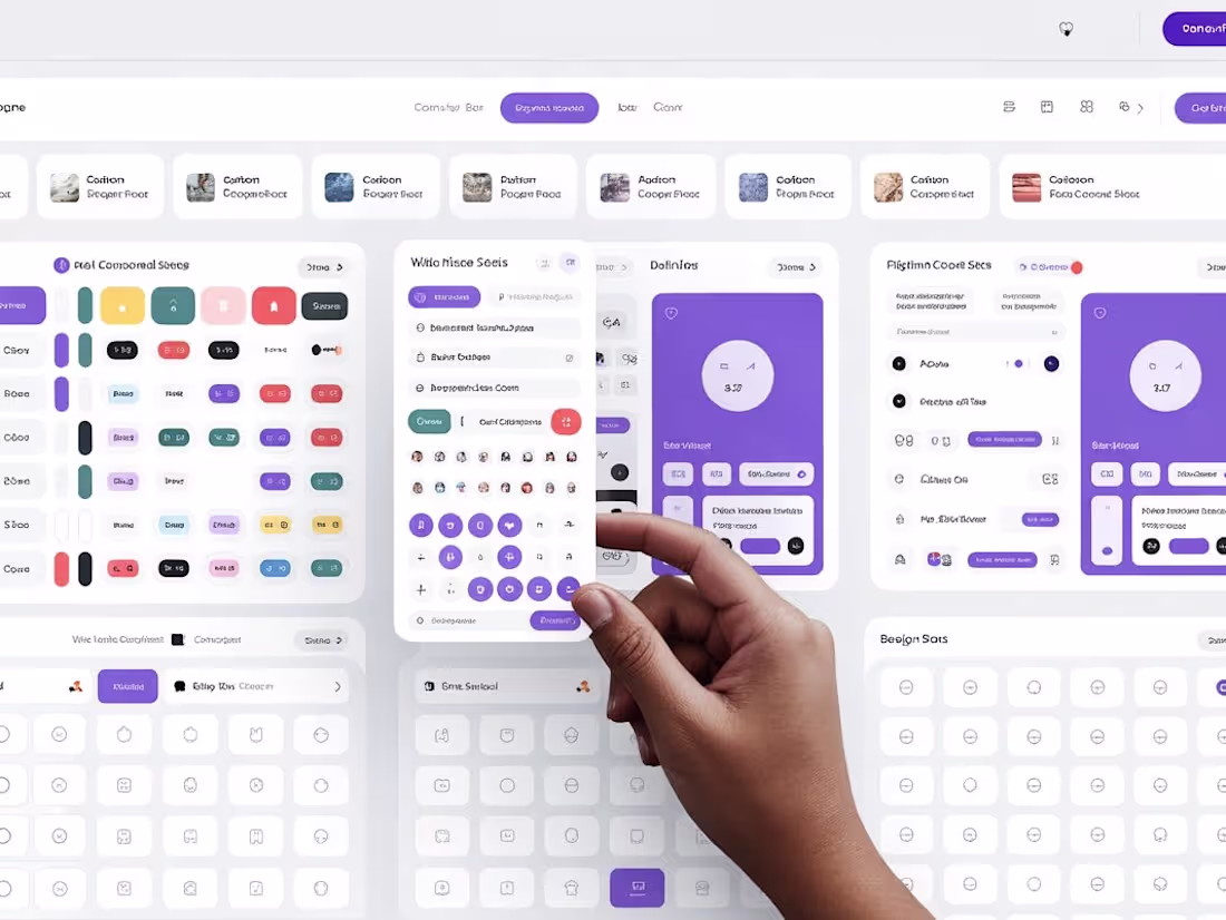
This service is ideal for startups and growing teams who want a solid UI foundation without design chaos. I create clean, well-documented design systems in Figma that align with your product, brand, and development workflow.
How this helps you
Ship features faster
Maintain visual consistency across your product
Reduce design & dev rework
Scale your product without rebuilding UI from scratch
Best for
Early-stage startups building their first design system
Teams scaling fast and feeling design inconsistency
Products preparing for growth, fundraising, or rebranding
What's included
Design Foundation
• Color system (including semantic & state colors)
• Typography scale
• Spacing, grid, and layout system
• Light/dark mode support (if needed)
UI Components
• Buttons, inputs, forms, dropdowns, modals
• Navigation components
• Tables, cards, alerts, and empty states
• All components built with Figma auto-layout and variants
Component States & Behavior
• Hover, focus, active, disabled states
• Validation and feedback states
• Responsive behavior (desktop → mobile)
• Accessibility best practices baked in
Documentation & Guidelines
• Clear usage rules (when & how to use each component)
• Do’s and don’ts
• Content and accessibility notes
• Easy-to-follow structure for designers and developers
Developer Handoff
• Inspect-ready Figma files
• Token-friendly naming
• Optional walkthrough with your engineering team
FAQs
Matea's other services

Starting at$8,000
Duration6 weeks
Tags
Figma
Design Systems Specialist
UX Designer
Service provided by
Matea Raić Rijeka, Croatia
- 1
- Paid projects
- 5.00
- Rating
- 36
- Followers
Design Systems & UI LibrariesMatea Raić
I design scalable design systems that help teams move faster, stay consistent, and ship with confidence.
This service is ideal for startups and growing teams who want a solid UI foundation without design chaos. I create clean, well-documented design systems in Figma that align with your product, brand, and development workflow.
How this helps you
Ship features faster
Maintain visual consistency across your product
Reduce design & dev rework
Scale your product without rebuilding UI from scratch
Best for
Early-stage startups building their first design system
Teams scaling fast and feeling design inconsistency
Products preparing for growth, fundraising, or rebranding
What's included
Design Foundation
• Color system (including semantic & state colors)
• Typography scale
• Spacing, grid, and layout system
• Light/dark mode support (if needed)
UI Components
• Buttons, inputs, forms, dropdowns, modals
• Navigation components
• Tables, cards, alerts, and empty states
• All components built with Figma auto-layout and variants
Component States & Behavior
• Hover, focus, active, disabled states
• Validation and feedback states
• Responsive behavior (desktop → mobile)
• Accessibility best practices baked in
Documentation & Guidelines
• Clear usage rules (when & how to use each component)
• Do’s and don’ts
• Content and accessibility notes
• Easy-to-follow structure for designers and developers
Developer Handoff
• Inspect-ready Figma files
• Token-friendly naming
• Optional walkthrough with your engineering team
FAQs
Matea's other services
$8,000