
Web Dashboard App DesignDani Alief M
I offer a website app dashboard design to solving your problems by crafting them up neatly and with clean style and organize design system with reuse component
What's included
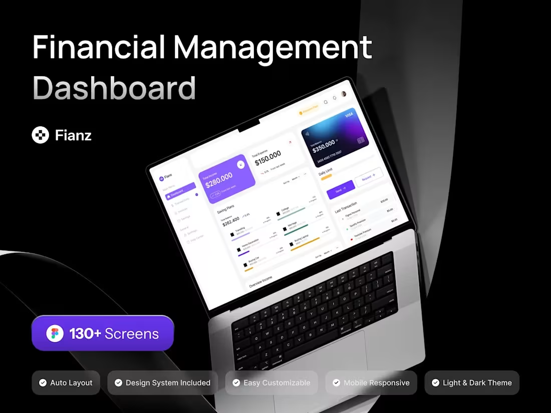
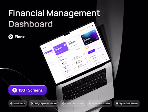
Dashboard Website App
1. High-Fidelity Mockups: Detailed, visually polished mockups of the web dashboard, including branding, typography, color schemes, and design elements to ensure consistency with the brand identity.
2. UI Style Guide: A comprehensive guide outlining design standards such as color palette, typography, buttons, icons, and other design elements used in the web dashboard.
3. UI Kit: A collection of reusable UI components (buttons, input fields, charts, tables, etc.) for developers to use when building the dashboard.
4. Design Handoff Documentation: Clear, organized files with design assets, annotations, and specifications for easy handoff to the development team, including guidelines for integration.
5. Final Design Files: All design files in the required formats Figma (Fig)
Example work
Dani's other services
Starting at$50
Duration2 weeks
Tags
Adobe XD
Figma
UI Designer
UX Designer
Web Designer
Service provided by
Dani Alief M Semarang, Indonesia
- 10
- Followers
Web Dashboard App DesignDani Alief M
I offer a website app dashboard design to solving your problems by crafting them up neatly and with clean style and organize design system with reuse component
What's included
Dashboard Website App
1. High-Fidelity Mockups: Detailed, visually polished mockups of the web dashboard, including branding, typography, color schemes, and design elements to ensure consistency with the brand identity.
2. UI Style Guide: A comprehensive guide outlining design standards such as color palette, typography, buttons, icons, and other design elements used in the web dashboard.
3. UI Kit: A collection of reusable UI components (buttons, input fields, charts, tables, etc.) for developers to use when building the dashboard.
4. Design Handoff Documentation: Clear, organized files with design assets, annotations, and specifications for easy handoff to the development team, including guidelines for integration.
5. Final Design Files: All design files in the required formats Figma (Fig)
Example work
Dani's other services
$50