
"Elevate Your Brand with Custom Website Designs That Captivate"Raghvendra Singh
I offer custom website design services that blend creativity with functionality, ensuring each site is visually stunning and user-friendly. What sets me apart is my collaborative approach, where I work closely with clients to capture their vision and tailor solutions to their specific needs. With a focus on responsive design and seamless user experiences, I create websites that not only look great but also drive results.
What's included
Design Mockups
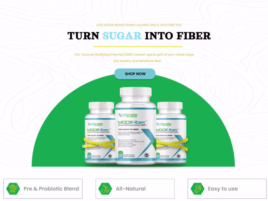
Design mockups serve as a visual representation of your website's layout and aesthetic before development begins. These high-fidelity designs illustrate key elements such as typography, color schemes, and overall user interface. By providing a clear picture of how the final product will look, mockups facilitate feedback and ensure alignment with your vision. This collaborative step allows us to refine the design based on your input, ensuring that the user experience is both visually appealing and functional. You'll receive detailed mockups for key pages, helping you visualize the site’s flow and structure, and allowing us to make necessary adjustments before moving into development.
Responsive Design
Responsive design ensures that your website provides an optimal viewing experience across a wide range of devices, from desktops to tablets and smartphones. By utilizing flexible layouts, images, and CSS media queries, we create a site that adapts seamlessly to different screen sizes and orientations. This approach enhances usability, making navigation effortless for users regardless of the device they use. Additionally, responsive design improves SEO, as search engines prioritize mobile-friendly sites. With our focus on responsive design, your website will not only look stunning but also deliver a consistent and engaging experience for all visitors, ultimately driving higher engagement and conversions.
Raghvendra's other services

Contact for pricing
Tags
Canva
Figma
Frontend Engineer
UX Designer
Web Developer
Service provided by
Raghvendra Singh Sarso, India
"Elevate Your Brand with Custom Website Designs That Captivate"Raghvendra Singh
Contact for pricing
Tags
Canva
Figma
Frontend Engineer
UX Designer
Web Developer
I offer custom website design services that blend creativity with functionality, ensuring each site is visually stunning and user-friendly. What sets me apart is my collaborative approach, where I work closely with clients to capture their vision and tailor solutions to their specific needs. With a focus on responsive design and seamless user experiences, I create websites that not only look great but also drive results.
What's included
Design Mockups
Design mockups serve as a visual representation of your website's layout and aesthetic before development begins. These high-fidelity designs illustrate key elements such as typography, color schemes, and overall user interface. By providing a clear picture of how the final product will look, mockups facilitate feedback and ensure alignment with your vision. This collaborative step allows us to refine the design based on your input, ensuring that the user experience is both visually appealing and functional. You'll receive detailed mockups for key pages, helping you visualize the site’s flow and structure, and allowing us to make necessary adjustments before moving into development.
Responsive Design
Responsive design ensures that your website provides an optimal viewing experience across a wide range of devices, from desktops to tablets and smartphones. By utilizing flexible layouts, images, and CSS media queries, we create a site that adapts seamlessly to different screen sizes and orientations. This approach enhances usability, making navigation effortless for users regardless of the device they use. Additionally, responsive design improves SEO, as search engines prioritize mobile-friendly sites. With our focus on responsive design, your website will not only look stunning but also deliver a consistent and engaging experience for all visitors, ultimately driving higher engagement and conversions.
Raghvendra's other services
Contact for pricing