
Front-End Web DevelopmentTarunpreet Singh
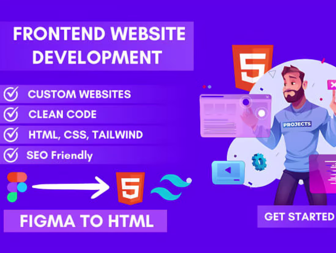
Specializing in dynamic and responsive web interfaces, Tarunpreet delivered high-quality front-end solutions using cutting-edge technologies for an enhanced user experience.
What's included
Responsive Web Design
Responsive Web Design (RWD) is a web development approach that ensures a website looks and functions well on all devices and screen sizes, from desktops to tablets and smartphones. It adapts the layout, images, and content dynamically to provide an optimal user experience across different screen resolutions.
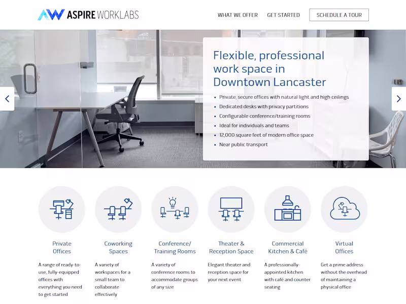
Donna Music Website (WordPress + ACF)
Key Features of a Website:
User-Friendly CMS, Customizable Themes & Plugins, SEO-Friendly, Mobile Responsive, Secure & Scalable and Multi-User Support.
Tarunpreet's other services
Starting at$199.99
Duration5 days
Tags
Bootstrap
CSS3
HTML5
JavaScript
WordPress
Web Designer
Web Developer
Website CSS
Service provided by
Tarunpreet Singh Dinanagar, India
Front-End Web DevelopmentTarunpreet Singh
Starting at$199.99
Duration5 days
Tags
Bootstrap
CSS3
HTML5
JavaScript
WordPress
Web Designer
Web Developer
Website CSS
Specializing in dynamic and responsive web interfaces, Tarunpreet delivered high-quality front-end solutions using cutting-edge technologies for an enhanced user experience.
What's included
Responsive Web Design
Responsive Web Design (RWD) is a web development approach that ensures a website looks and functions well on all devices and screen sizes, from desktops to tablets and smartphones. It adapts the layout, images, and content dynamically to provide an optimal user experience across different screen resolutions.
Donna Music Website (WordPress + ACF)
Key Features of a Website:
User-Friendly CMS, Customizable Themes & Plugins, SEO-Friendly, Mobile Responsive, Secure & Scalable and Multi-User Support.
Tarunpreet's other services
$199.99