
Logo Design For Real Estate ClientGull Zaman
AL HAREEM Real Estate & Marketing
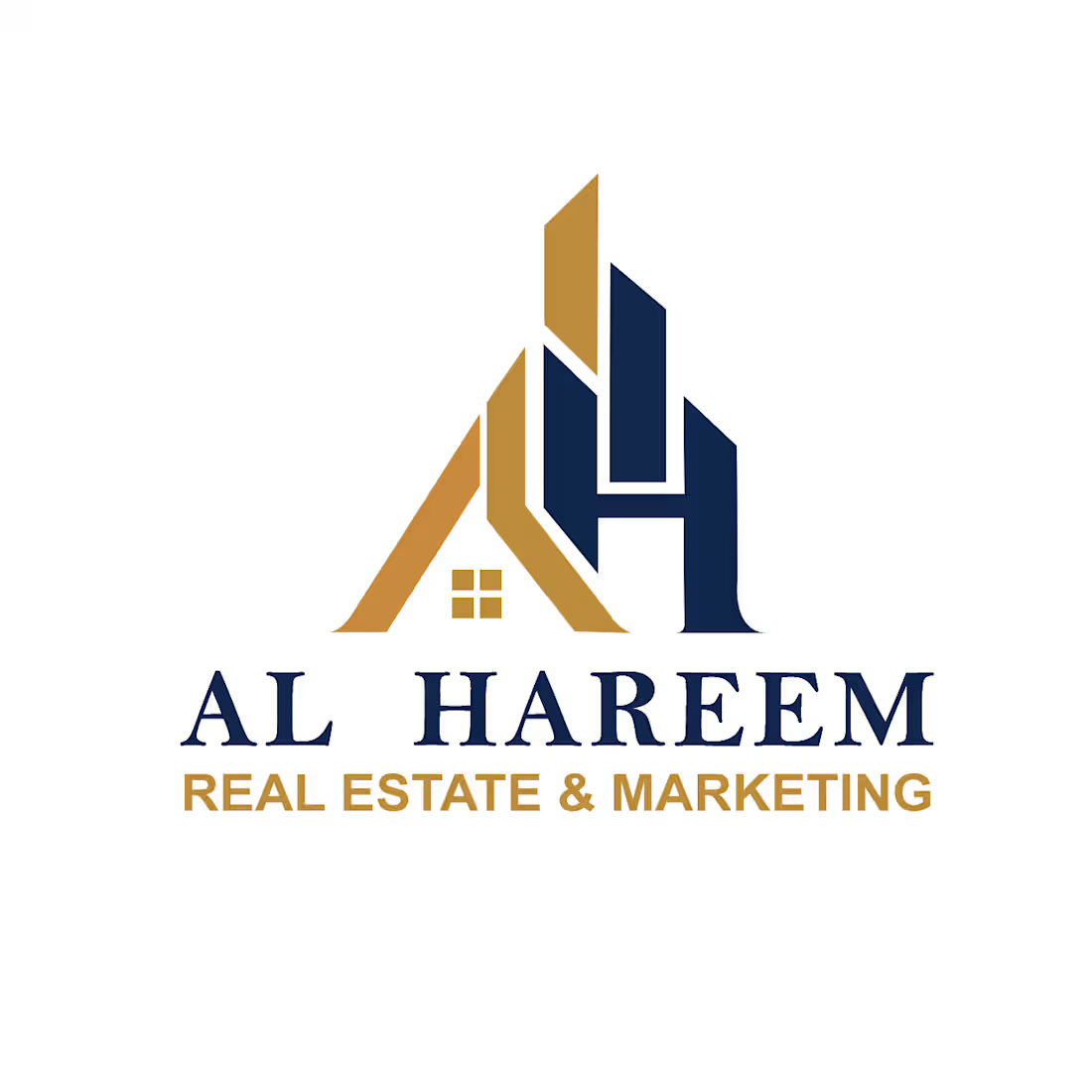
The visual identity for AL HAREEM Real Estate & Marketing is designed to project trust, sophistication, growth, and premium market authority. It seamlessly blends residential home imagery with commercial high-rise structures through smart monogram integration.
Key Design Elements & Client Value
1. Monogram Integration ("A" & "H")
Visual Structure: The mark cleverly integrates the company initials 'A' (in gold) and 'H' (in deep blue) into a single, cohesive emblem.
Business Benefit: Monogram logos create strong brand recall and instant recognition across signage, business cards, social media profiles, and marketing materials.
2. Dual Real Estate Symbolism (Residential & Commercial)
Roofline & Window Motif: The left section of the letter 'A' forms a clean roof peak housing a four-pane window, directly signaling residential properties, homes, and community trust.
Skyscraper / High-Rise Silhouettes: The vertical upward-pointing structures forming the 'H' represent high-rise commercial buildings, modern architecture, and development growth.
Business Benefit: It clearly communicates that AL HAREEM handles both residential housing and large-scale commercial/development ventures without needing extra text to explain it.
3. Strategic Color Palette
Refined Gold: Represents prestige, wealth, security, high value, and excellence. It highlights the premium nature of your listings and marketing services.
Navy Blue: Represents trust, professional integrity, stability, and corporate authority. It reassures investors and buyers that their investments are in reliable hands.
Business Benefit: This color pair is proven in property and financial sectors to build confidence among high-net-worth buyers and property investors.
4. Clear & Authoritative Typography
Primary Brand Name ("AL HAREEM"): Uses a bold, classic serif font that projects stability, legacy, and premium standards.
Sub-tagline ("REAL ESTATE & MARKETING"): Uses a clean, modern sans-serif font in gold, ensuring high legibility even at smaller scale on digital ads, banners, and letterheads.
How This Logo Helps My Client’s Business
Builds Instant Trust: Property transactions require high security. The stable geometric structure and navy/gold palette establish instant credibility for prospective buyers and sellers.
Versatile Branding Across Media: The crisp vector lines ensure the emblem scales seamlessly—from small app icons and stamps to large billboard advertising, outdoor property banners, and vehicle wraps.
Dual-Market Positioning: By balancing residential icons (roof + window) and commercial shapes (towers), the brand attracts both everyday home buyers and corporate property investors simultaneously.
Market Distinction: Elevates AL HAREEM Real Estate & Marketing above generic real estate agencies, positioning them as an established, premium agency in the competitive market.
Example work
Contact for pricing
Duration1 week
Tags
Adobe Illustrator
Adobe Photoshop

Brand Designer
Graphic Designer
Illustrator
Marketing
Real Estate
Logo Designing
Real estate agency
Service provided by
Gull Zaman Lahore, Pakistan
- 1
- Followers
Logo Design For Real Estate ClientGull Zaman
Contact for pricing
Duration1 week
Tags
Adobe Illustrator
Adobe Photoshop
Brand Designer
Graphic Designer
Illustrator
Marketing
Real Estate
Logo Designing
Real estate agency
AL HAREEM Real Estate & Marketing
The visual identity for AL HAREEM Real Estate & Marketing is designed to project trust, sophistication, growth, and premium market authority. It seamlessly blends residential home imagery with commercial high-rise structures through smart monogram integration.
Key Design Elements & Client Value
1. Monogram Integration ("A" & "H")
Visual Structure: The mark cleverly integrates the company initials 'A' (in gold) and 'H' (in deep blue) into a single, cohesive emblem.
Business Benefit: Monogram logos create strong brand recall and instant recognition across signage, business cards, social media profiles, and marketing materials.
2. Dual Real Estate Symbolism (Residential & Commercial)
Roofline & Window Motif: The left section of the letter 'A' forms a clean roof peak housing a four-pane window, directly signaling residential properties, homes, and community trust.
Skyscraper / High-Rise Silhouettes: The vertical upward-pointing structures forming the 'H' represent high-rise commercial buildings, modern architecture, and development growth.
Business Benefit: It clearly communicates that AL HAREEM handles both residential housing and large-scale commercial/development ventures without needing extra text to explain it.
3. Strategic Color Palette
Refined Gold: Represents prestige, wealth, security, high value, and excellence. It highlights the premium nature of your listings and marketing services.
Navy Blue: Represents trust, professional integrity, stability, and corporate authority. It reassures investors and buyers that their investments are in reliable hands.
Business Benefit: This color pair is proven in property and financial sectors to build confidence among high-net-worth buyers and property investors.
4. Clear & Authoritative Typography
Primary Brand Name ("AL HAREEM"): Uses a bold, classic serif font that projects stability, legacy, and premium standards.
Sub-tagline ("REAL ESTATE & MARKETING"): Uses a clean, modern sans-serif font in gold, ensuring high legibility even at smaller scale on digital ads, banners, and letterheads.
How This Logo Helps My Client’s Business
Builds Instant Trust: Property transactions require high security. The stable geometric structure and navy/gold palette establish instant credibility for prospective buyers and sellers.
Versatile Branding Across Media: The crisp vector lines ensure the emblem scales seamlessly—from small app icons and stamps to large billboard advertising, outdoor property banners, and vehicle wraps.
Dual-Market Positioning: By balancing residential icons (roof + window) and commercial shapes (towers), the brand attracts both everyday home buyers and corporate property investors simultaneously.
Market Distinction: Elevates AL HAREEM Real Estate & Marketing above generic real estate agencies, positioning them as an established, premium agency in the competitive market.
Example work
Contact for pricing