
UI/UX Design for Web and Mobile ApplicationsPratyush r Ghadai

He delivered intuitive UI/UX designs that enhanced user experience across web and mobile platforms, focusing on perfection to meet client needs efficiently.
What's included
Wireframes
Low-Fidelity Wireframes: Basic structure and layout without detailed styling.
High-Fidelity Wireframes: More polished layouts, closer to the final design.
Visual Design Deliverables
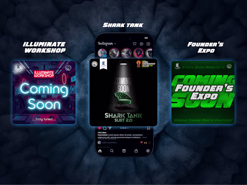
1.High-Fidelity Screens: Pixel-perfect designs for all major pages/screens.
2.Responsive Designs: Versions of screens optimized for mobile, tablet, and desktop.
2.Interactive Prototypes: Clickable prototypes (Figma) to demonstrate functionality and user flows.
3.Animations/Micro-interactions: Lottie files, GIFs, or animations for UI components.
Design Assets
Icons: Custom or pre-designed icons used in the UI.
Images: High-quality images, illustrations, or placeholders for content.
Style Guide/Design System:
Color palette (Hex, RGB, CMYK codes).
Typography (font families, weights, sizes).
UI components (buttons, forms, cards, modals, etc.) with states (hover, active, disabled).
Grid and layout specifications.
Spacing and padding guidelines.
Hand-off Files for Developers
Design Files: Editable source files (Figma, Adobe XD, Sketch).
Assets Exported: Icons, images, and other assets in required formats and resolutions (e.g., .PNG, .SVG, .JPG).
Design Annotations: Notes or explanations for spacing, alignment, and behavior of UI components.
Developer Handoff Tools: Usage of tools like Figma’s Inspect for seamless collaboration.
Mockups and Presentation
Mockups: Visual representation of the design in real-world contexts (e.g., on devices or marketing materials).
Design Presentation: A walkthrough of the design process, explaining choices for typography, colors, and layout.
Testing and Feedback Iterations
Usability Test Results (if applicable): Reports or findings from user testing.
Revised Designs: Updated files after incorporating feedback from stakeholders or users.
Documentation
Design Guidelines Document: Comprehensive guide for maintaining design consistency.
Interaction Guidelines: Explanation of user flows, navigation, and interaction logic.

Starting at$100
Duration1 week
Tags
Adobe XD
Figma
Sketch
UI Designer
UX Designer
Service provided by
Pratyush r Ghadai Bhubaneswar, India
UI/UX Design for Web and Mobile ApplicationsPratyush r Ghadai
Starting at$100
Duration1 week
Tags
Adobe XD
Figma
Sketch
UI Designer
UX Designer
He delivered intuitive UI/UX designs that enhanced user experience across web and mobile platforms, focusing on perfection to meet client needs efficiently.
What's included
Wireframes
Low-Fidelity Wireframes: Basic structure and layout without detailed styling.
High-Fidelity Wireframes: More polished layouts, closer to the final design.
Visual Design Deliverables
1.High-Fidelity Screens: Pixel-perfect designs for all major pages/screens.
2.Responsive Designs: Versions of screens optimized for mobile, tablet, and desktop.
2.Interactive Prototypes: Clickable prototypes (Figma) to demonstrate functionality and user flows.
3.Animations/Micro-interactions: Lottie files, GIFs, or animations for UI components.
Design Assets
Icons: Custom or pre-designed icons used in the UI.
Images: High-quality images, illustrations, or placeholders for content.
Style Guide/Design System:
Color palette (Hex, RGB, CMYK codes).
Typography (font families, weights, sizes).
UI components (buttons, forms, cards, modals, etc.) with states (hover, active, disabled).
Grid and layout specifications.
Spacing and padding guidelines.
Hand-off Files for Developers
Design Files: Editable source files (Figma, Adobe XD, Sketch).
Assets Exported: Icons, images, and other assets in required formats and resolutions (e.g., .PNG, .SVG, .JPG).
Design Annotations: Notes or explanations for spacing, alignment, and behavior of UI components.
Developer Handoff Tools: Usage of tools like Figma’s Inspect for seamless collaboration.
Mockups and Presentation
Mockups: Visual representation of the design in real-world contexts (e.g., on devices or marketing materials).
Design Presentation: A walkthrough of the design process, explaining choices for typography, colors, and layout.
Testing and Feedback Iterations
Usability Test Results (if applicable): Reports or findings from user testing.
Revised Designs: Updated files after incorporating feedback from stakeholders or users.
Documentation
Design Guidelines Document: Comprehensive guide for maintaining design consistency.
Interaction Guidelines: Explanation of user flows, navigation, and interaction logic.
$100