
Reusable Component Library from Figma / Design GuidelinesSigna Creatives
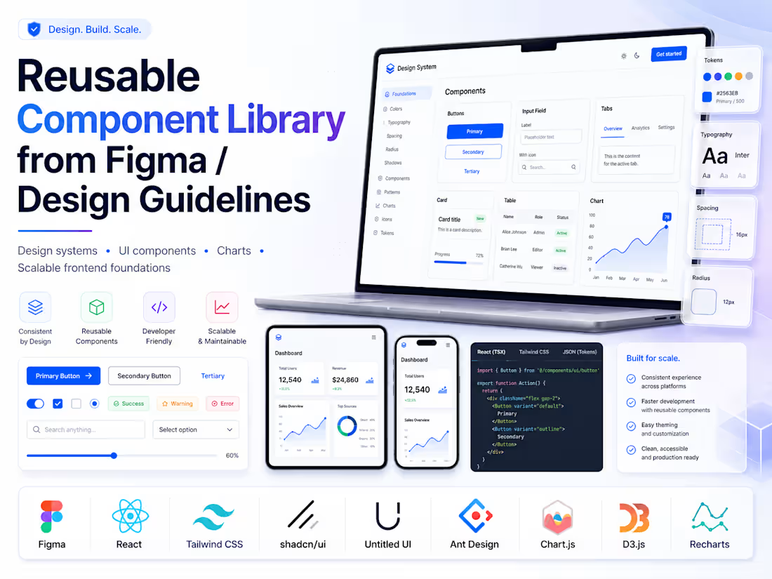
Turn your Figma designs or brand guidelines into reusable React/Next.js components with Tailwind CSS.
I help teams turn Figma designs or design guidelines into a reusable frontend component library using React, Next.js, and Tailwind CSS.
Instead of building one-off screens, I create clean foundational components that your team can reuse across the product.
This can include buttons, inputs, cards, modals, dropdowns, forms, tables, tabs, layout wrappers, badges, empty states, dashboard sections, and reusable page patterns.
Each component is built with consistent spacing, typography, color usage, responsive behavior, reusable variants, accessibility basics, and design-token thinking.
What's included
Reusable React/Next.js component structure
Tailwind CSS-based styling
Design guideline implementation
Foundational UI components
Component variants and states
Responsive behavior
Basic accessibility considerations
Usage notes for developers
FAQs

Starting at$1,200
Duration2 weeks
Tags
Figma

Next.js

React

Tailwind CSS

Design System
Frontend Engineer
UI Development
Component Library
Web App Development
Service provided by
Signa Creatives Lucknow, India
- 1
- Followers
Reusable Component Library from Figma / Design GuidelinesSigna Creatives
Starting at$1,200
Duration2 weeks
Tags
Figma
Next.js
React
Tailwind CSS
Design System
Frontend Engineer
UI Development
Component Library
Web App Development
Turn your Figma designs or brand guidelines into reusable React/Next.js components with Tailwind CSS.
I help teams turn Figma designs or design guidelines into a reusable frontend component library using React, Next.js, and Tailwind CSS.
Instead of building one-off screens, I create clean foundational components that your team can reuse across the product.
This can include buttons, inputs, cards, modals, dropdowns, forms, tables, tabs, layout wrappers, badges, empty states, dashboard sections, and reusable page patterns.
Each component is built with consistent spacing, typography, color usage, responsive behavior, reusable variants, accessibility basics, and design-token thinking.
What's included
Reusable React/Next.js component structure
Tailwind CSS-based styling
Design guideline implementation
Foundational UI components
Component variants and states
Responsive behavior
Basic accessibility considerations
Usage notes for developers
FAQs
$1,200