Crafting Seamless Experiences: Your UI/UX Design SolutionVenuki Rajapakse
I provide expert UI/UX design services, specializing in crafting user-centric interfaces that are not only aesthetically pleasing but also enhance functionality and user engagement across digital platforms. What sets me apart is my holistic approach, combining in-depth user research with creative design to ensure that every interface is intuitive, seamless, and tailored to meet the specific needs of your audience, ultimately driving user satisfaction and business success.
What's included
Wireframes and Prototypes
Low-Fidelity Wireframes: Basic sketches or digital outlines that depict the structure and layout of key pages or screens.
High-Fidelity Wireframes: Detailed and polished wireframes that provide a clearer view of the final design.
Interactive Prototypes: Clickable models that simulate user interaction, allowing for early testing and feedback.
User Flow Diagrams: Visual representations of the paths users take to complete tasks within the application.
UI Design Elements
Visual Style Guide: Comprehensive guidelines on colors, typography, icons, and overall visual elements to ensure design consistency.
Custom Icon Sets: Unique icons designed to match the aesthetic and functional requirements of your interface.
UI Components Library: Reusable design elements such as buttons, forms, and navigation bars to maintain uniformity across the application.
Mockups: Detailed, high-resolution representations of the final design, including desktop and mobile views.
Branding Integration Brand Consistency Checks
Brand Consistency Checks: Ensuring that the design aligns with the overall brand identity and guidelines.
Custom Illustrations: Unique illustrations that enhance the visual appeal and align with the brand’s voice.
Venuki's other services
Contact for pricing
Tags
Adobe Illustrator
Adobe Photoshop
Figma
Graphic Designer
UI Designer
UX Designer
Service provided by
Venuki Rajapakse Melbourne VIC, Australia
Crafting Seamless Experiences: Your UI/UX Design SolutionVenuki Rajapakse
Contact for pricing
Tags
Adobe Illustrator
Adobe Photoshop
Figma
Graphic Designer
UI Designer
UX Designer
I provide expert UI/UX design services, specializing in crafting user-centric interfaces that are not only aesthetically pleasing but also enhance functionality and user engagement across digital platforms. What sets me apart is my holistic approach, combining in-depth user research with creative design to ensure that every interface is intuitive, seamless, and tailored to meet the specific needs of your audience, ultimately driving user satisfaction and business success.
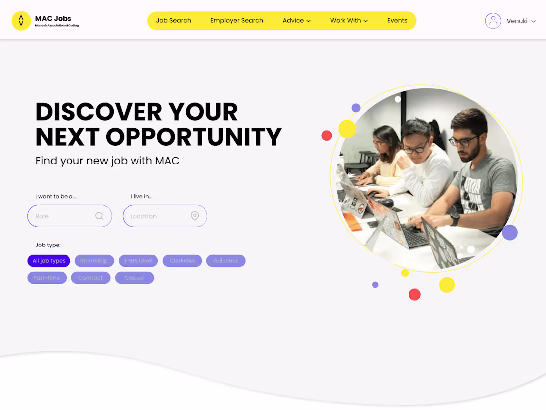
What's included
Wireframes and Prototypes
Low-Fidelity Wireframes: Basic sketches or digital outlines that depict the structure and layout of key pages or screens.
High-Fidelity Wireframes: Detailed and polished wireframes that provide a clearer view of the final design.
Interactive Prototypes: Clickable models that simulate user interaction, allowing for early testing and feedback.
User Flow Diagrams: Visual representations of the paths users take to complete tasks within the application.
UI Design Elements
Visual Style Guide: Comprehensive guidelines on colors, typography, icons, and overall visual elements to ensure design consistency.
Custom Icon Sets: Unique icons designed to match the aesthetic and functional requirements of your interface.
UI Components Library: Reusable design elements such as buttons, forms, and navigation bars to maintain uniformity across the application.
Mockups: Detailed, high-resolution representations of the final design, including desktop and mobile views.
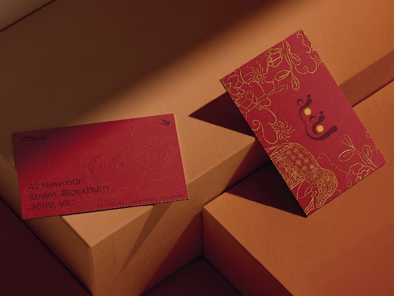
Branding Integration Brand Consistency Checks
Brand Consistency Checks: Ensuring that the design aligns with the overall brand identity and guidelines.
Custom Illustrations: Unique illustrations that enhance the visual appeal and align with the brand’s voice.
Venuki's other services
Contact for pricing