
Strategic Brand IdentityPraveen Kumar
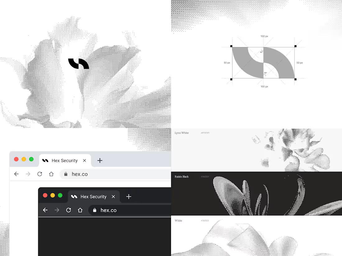
A complete brand identity, built from the ground up and handed to you as one clean, organized Figma file. Not just a logo, the whole system behind it, so your brand holds up whether it's on a pitch deck, a product screen, or a merch.
We map every single touchpoint. You will receive a comprehensive master guideline (delivered cleanly in Figma) containing:
Brand Foundation & Strategy: Core positioning, messaging pillars, tone of voice, and brand values.
Complete Logo System: Primary logo, secondary marks, responsive lockups, clear space rules, and do/don't usage guidelines.
Typography Architecture: Typeface pairings, digital sizing logic, and structural hierarchy optimized for both marketing sites and dense SaaS UIs.
Extensive Color System: Primary, secondary, and functional UI palettes with strict usage rules for light and dark modes.
Visual Elements & Iconography: Custom icon sets, brand textures, imagery guidelines, and structural UI elements.
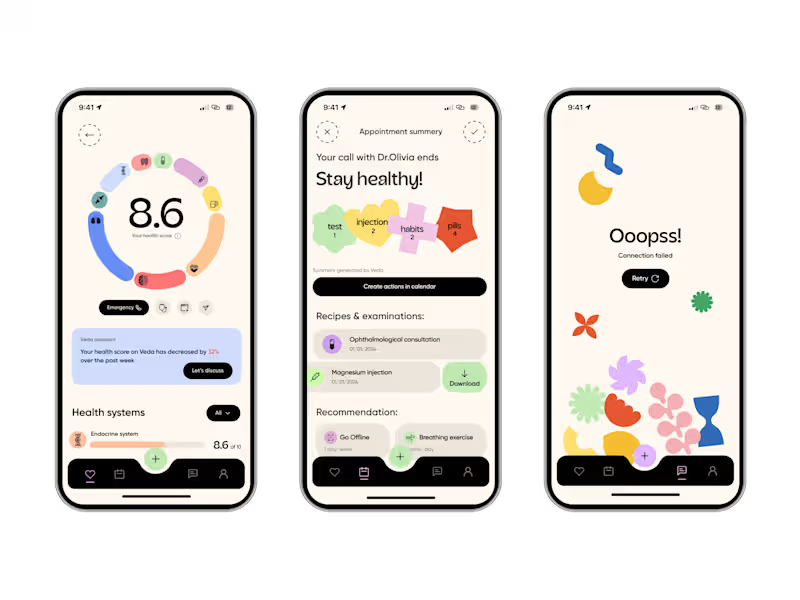
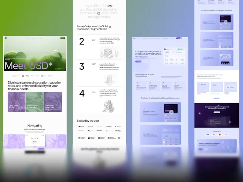
Real-World Applications: The visual system stress-tested and applied to actual touchpoints (e.g., desktop/mobile UI screens, social media templates, digital presence, and physical merchandise mockups).
The Timeline
Week 1 (Diagnostic): Kickoff, competitive audit, and defining the brand foundation.
Week 2 (Direction): Presentation of the core visual route.
Week 3 (System Build): Expanding the identity across typography, color, iconography, and textures.
Week 4 (Application & Handoff): Finalizing the real-world applications, touchpoints, and the master Figma brand kit.
FAQs
Example work
Praveen's other services
Starting at$10,000
Duration2 weeks
Tags
Figma

Brand Designer
Brand Strategist
Creative Designer
Logo Designer
Product Designer
Typographer
Visual Designer
FinTech & Payments
Service provided by
Praveen Kumar maxBengaluru, India
- $100k+
- Earned
- 19
- Paid projects
- 4.65
- Rating
- 756
- Followers
Strategic Brand IdentityPraveen Kumar
Starting at$10,000
Duration2 weeks
Tags
Figma
Brand Designer
Brand Strategist
Creative Designer
Logo Designer
Product Designer
Typographer
Visual Designer
FinTech & Payments
A complete brand identity, built from the ground up and handed to you as one clean, organized Figma file. Not just a logo, the whole system behind it, so your brand holds up whether it's on a pitch deck, a product screen, or a merch.
We map every single touchpoint. You will receive a comprehensive master guideline (delivered cleanly in Figma) containing:
Brand Foundation & Strategy: Core positioning, messaging pillars, tone of voice, and brand values.
Complete Logo System: Primary logo, secondary marks, responsive lockups, clear space rules, and do/don't usage guidelines.
Typography Architecture: Typeface pairings, digital sizing logic, and structural hierarchy optimized for both marketing sites and dense SaaS UIs.
Extensive Color System: Primary, secondary, and functional UI palettes with strict usage rules for light and dark modes.
Visual Elements & Iconography: Custom icon sets, brand textures, imagery guidelines, and structural UI elements.
Real-World Applications: The visual system stress-tested and applied to actual touchpoints (e.g., desktop/mobile UI screens, social media templates, digital presence, and physical merchandise mockups).
The Timeline
Week 1 (Diagnostic): Kickoff, competitive audit, and defining the brand foundation.
Week 2 (Direction): Presentation of the core visual route.
Week 3 (System Build): Expanding the identity across typography, color, iconography, and textures.
Week 4 (Application & Handoff): Finalizing the real-world applications, touchpoints, and the master Figma brand kit.
FAQs
Example work
Praveen's other services
$10,000