
Design System & DocumentationDami Ojetunji
I deliver end-to-end design systems that unite your design and engineering teams through a single source of truth, accelerating product development and time-to-market. My unique approach ensures immediate implementation and future scalability, guaranteeing your system adapts seamlessly.
What's included
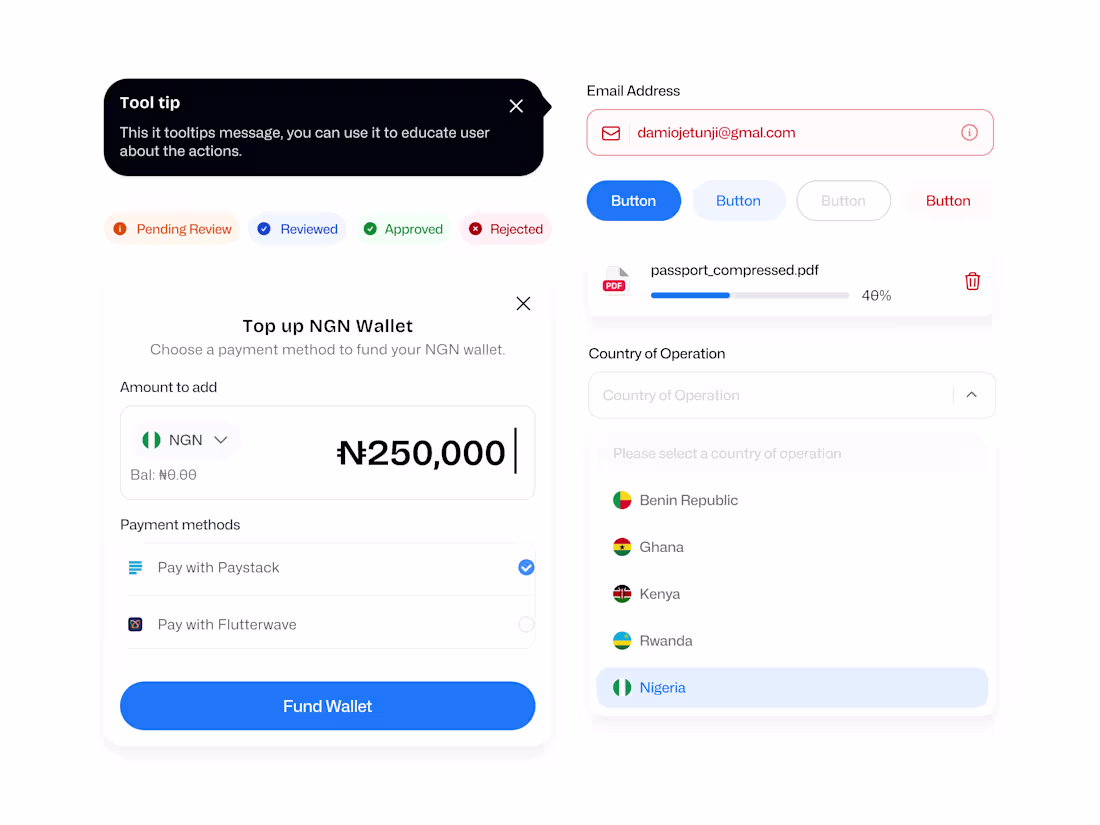
Core Component Library
A set of ready-to-use UI components (e.g., buttons, inputs) built and documented with detailed instructions for each component, explaining correct context, state management, and accessibility considerations.
Colour Palette
Defined and documented primary, secondary, semantics (success, error, warning), and neutral colour scales, following accessibility (WCAG) compliance.
Typography Scale
A defined system for font families, weights, sizes, and line heights, ensuring hierarchy and readability across different use case.
Component Usage & Documentation
Comprehensive documentation detailing the design principles, usage guidelines, and application rules for tokens and foundational styles built and documented in the primary design tool (i.e., Figma).
FAQs
Dami's other services

Contact for pricing
Tags
Figma
Design Systems Specialist
Product Designer
UX Designer
Service provided by
Dami Ojetunji Lagos, Nigeria
- 1
- Followers
Design System & DocumentationDami Ojetunji
I deliver end-to-end design systems that unite your design and engineering teams through a single source of truth, accelerating product development and time-to-market. My unique approach ensures immediate implementation and future scalability, guaranteeing your system adapts seamlessly.
What's included
Core Component Library
A set of ready-to-use UI components (e.g., buttons, inputs) built and documented with detailed instructions for each component, explaining correct context, state management, and accessibility considerations.
Colour Palette
Defined and documented primary, secondary, semantics (success, error, warning), and neutral colour scales, following accessibility (WCAG) compliance.
Typography Scale
A defined system for font families, weights, sizes, and line heights, ensuring hierarchy and readability across different use case.
Component Usage & Documentation
Comprehensive documentation detailing the design principles, usage guidelines, and application rules for tokens and foundational styles built and documented in the primary design tool (i.e., Figma).
FAQs
Dami's other services
Contact for pricing