
UI Component LIbrarySamuel Bakare

I build scalable, reusable UI component libraries using React or Next.js, powered by TypeScript, Tailwind CSS, and shadcn/ui. Whether you're launching a new product or standardizing design across multiple apps, I create well-structured, accessible, and theme-ready components tailored to your brand.
What's included
Fully Functional UI Component Library
Reusable, accessible, and responsive components built with React or Next.js, using TypeScript and Tailwind CSS.
Component Documentation
Developer-focused docs (via Storybook, MDX, or Notion) with usage examples, props, and customization guidelines.
Design-Accurate Implementation
Pixel-perfect components aligned with your Figma or design system, including themes, spacing, and branding.
TypeScript Types & Props Definitions
Strongly typed components for safe, predictable integration and developer productivity.
Customizable Theming Support
Components built with flexibility in mind, allowing for easy color, spacing, and typography adjustments.
Setup & Integration Guide
Step-by-step documentation to help your team integrate the component library into your existing project or monorepo.
GitHub Repo or Component Package
Codebase delivered via GitHub, or as an installable package (npm/private registry) depending on your preference.
Ongoing Support - Optional
Post-delivery maintenance, updates, or new component additions based on your team's evolving needs.
FAQs
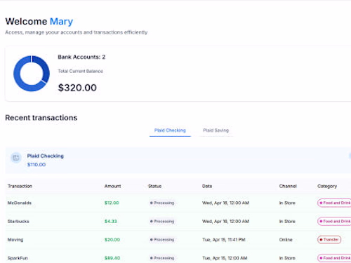
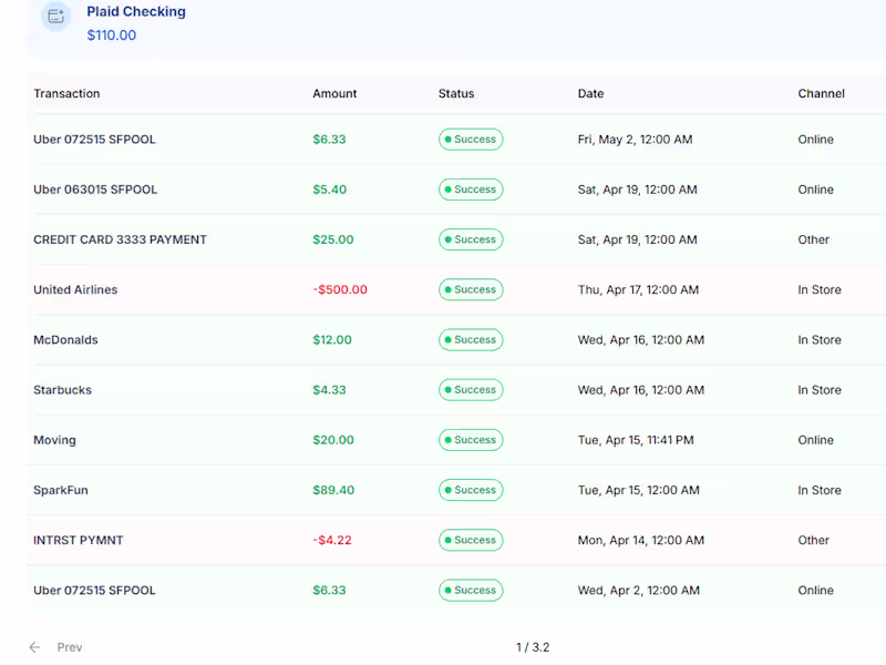
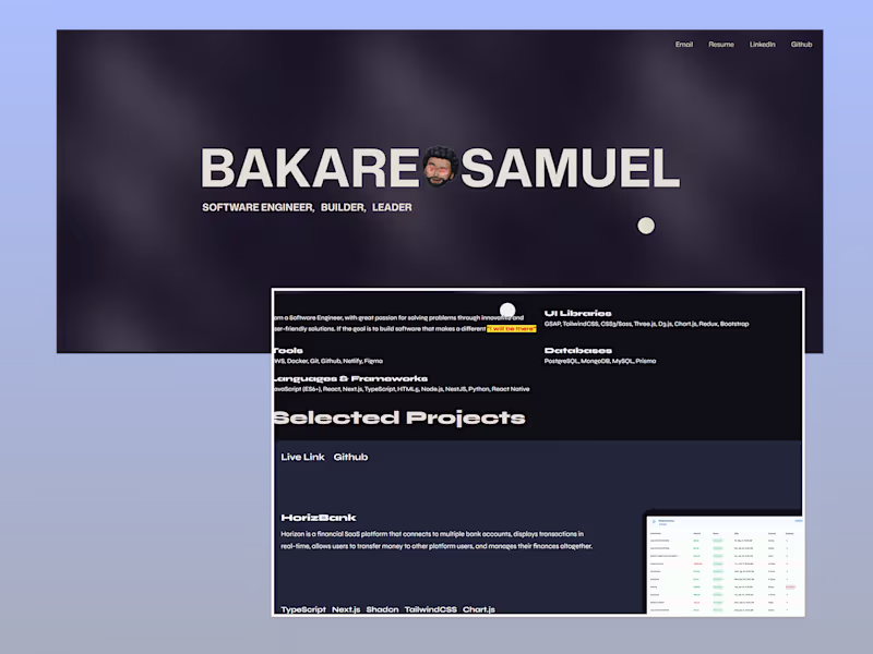
Example work
Samuel's other services
Starting at$50 /hr
Tags
Next.js
React
Shadcn UI
Tailwind CSS
TypeScript
Frontend Engineer
Fullstack Engineer
Service provided by
Samuel Bakare Lagos, Nigeria
- 5.00
- Rating
- 9
- Followers
UI Component LIbrarySamuel Bakare
Starting at$50 /hr
Tags
Next.js
React
Shadcn UI
Tailwind CSS
TypeScript
Frontend Engineer
Fullstack Engineer
I build scalable, reusable UI component libraries using React or Next.js, powered by TypeScript, Tailwind CSS, and shadcn/ui. Whether you're launching a new product or standardizing design across multiple apps, I create well-structured, accessible, and theme-ready components tailored to your brand.
What's included
Fully Functional UI Component Library
Reusable, accessible, and responsive components built with React or Next.js, using TypeScript and Tailwind CSS.
Component Documentation
Developer-focused docs (via Storybook, MDX, or Notion) with usage examples, props, and customization guidelines.
Design-Accurate Implementation
Pixel-perfect components aligned with your Figma or design system, including themes, spacing, and branding.
TypeScript Types & Props Definitions
Strongly typed components for safe, predictable integration and developer productivity.
Customizable Theming Support
Components built with flexibility in mind, allowing for easy color, spacing, and typography adjustments.
Setup & Integration Guide
Step-by-step documentation to help your team integrate the component library into your existing project or monorepo.
GitHub Repo or Component Package
Codebase delivered via GitHub, or as an installable package (npm/private registry) depending on your preference.
Ongoing Support - Optional
Post-delivery maintenance, updates, or new component additions based on your team's evolving needs.
FAQs
Example work
Samuel's other services
$50 /hr