
I will setup shopify dropshipping store build ecommerce websiteKoleosho Damilare
Expert Shopify Dropshipping Store Setup & E-Commerce Website Development
📌 What I Offer:
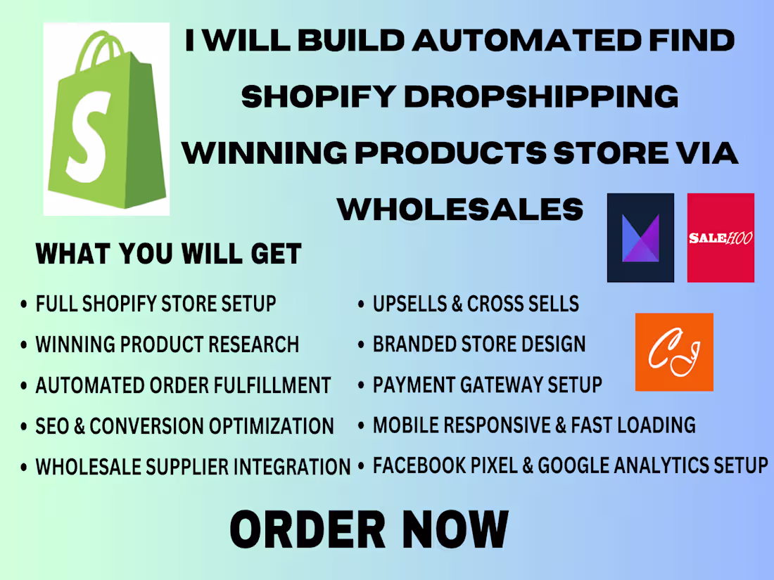
I specialize in creating high-converting Shopify dropshipping stores tailored to your niche. From product selection to branding, store design, and optimization, I’ll build a professional, mobile-friendly, and sales-ready e-commerce website that attracts customers and maximizes conversions.
What’s Included:
✔ Custom Shopify Store Setup – Fully branded, user-friendly design with a premium theme (Dawn, Debut, or paid themes like Turbo/Impulse).
✔ Dropshipping Integration – Connect with AliExpress, CJ Dropshipping, or Zendrop for seamless order fulfillment.
✔ Product Research & Selection – Help you find winning products with high demand and low competition.
✔ Logo & Branding – Basic logo design and brand identity (color scheme, fonts, store aesthetics).
✔ High-Converting Product Pages – SEO-optimized descriptions, crisp images, persuasive copy, and trust badges.
✔ Mobile-Optimized Design – Responsive layout for smooth shopping on all devices.
✔ Essential Shopify Apps – Install key apps for order tracking, reviews, upselling, and email marketing.
✔ Payment & Shipping Setup – Configure Shopify Payments, PayPal, and shipping rates for smooth checkout.
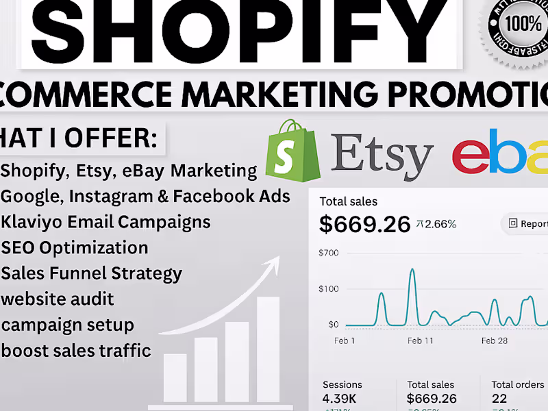
✔ Basic SEO & Marketing Setup – On-page SEO, Google Analytics, and Facebook Pixel integration.
Why Choose Me?
Fast Turnaround – Get your store ready in 3-7 days (depending on complexity).
No Coding Needed – Clean, professional design without technical hassle.
Dropshipping Expertise – Proven strategies to help you start selling quickly.
Ongoing Support – Post-setup guidance to help you scale.
📢 Ideal For:
Entrepreneurs starting a dropshipping business
Sellers who want a ready-to-launch Shopify store
Brands needing a high-converting, visually appealing e-commerce site
💡 Let’s Build Your Dream Store!
Message me with your niche or product ideas, and I’ll craft a money-making Shopify dropshipping store for you.
📩 Contact me now to get started!
What's included
Responsive design
Responsive design is an approach to web development that ensures a website adapts seamlessly to different screen sizes and devices, such as desktops, tablets, and smartphones. The goal is to provide an optimal viewing and interaction experience—easy reading, navigation, and minimal resizing or scrolling—across all devices.
Benefits of Responsive Design:
Improved User Experience: Content is accessible and readable on any device.
SEO-Friendly: Google prioritizes mobile-friendly sites in search rankings.
Cost-Effective: One website works across all devices (no separate mobile site).
Future-Proof: Adapts to new screen sizes and resolutions.
Starting at$200
Duration7 days
Tags
Shopify
Squarespace
Webflow
WixVibe
WordPress
Frontend Engineer
UX Designer
Web Developer
Service provided by
Koleosho Damilare Ibadan, Nigeria
I will setup shopify dropshipping store build ecommerce websiteKoleosho Damilare
Starting at$200
Duration7 days
Tags
Shopify
Squarespace
Webflow
WixVibe
WordPress
Frontend Engineer
UX Designer
Web Developer
Expert Shopify Dropshipping Store Setup & E-Commerce Website Development
📌 What I Offer:
I specialize in creating high-converting Shopify dropshipping stores tailored to your niche. From product selection to branding, store design, and optimization, I’ll build a professional, mobile-friendly, and sales-ready e-commerce website that attracts customers and maximizes conversions.
What’s Included:
✔ Custom Shopify Store Setup – Fully branded, user-friendly design with a premium theme (Dawn, Debut, or paid themes like Turbo/Impulse).
✔ Dropshipping Integration – Connect with AliExpress, CJ Dropshipping, or Zendrop for seamless order fulfillment.
✔ Product Research & Selection – Help you find winning products with high demand and low competition.
✔ Logo & Branding – Basic logo design and brand identity (color scheme, fonts, store aesthetics).
✔ High-Converting Product Pages – SEO-optimized descriptions, crisp images, persuasive copy, and trust badges.
✔ Mobile-Optimized Design – Responsive layout for smooth shopping on all devices.
✔ Essential Shopify Apps – Install key apps for order tracking, reviews, upselling, and email marketing.
✔ Payment & Shipping Setup – Configure Shopify Payments, PayPal, and shipping rates for smooth checkout.
✔ Basic SEO & Marketing Setup – On-page SEO, Google Analytics, and Facebook Pixel integration.
Why Choose Me?
Fast Turnaround – Get your store ready in 3-7 days (depending on complexity).
No Coding Needed – Clean, professional design without technical hassle.
Dropshipping Expertise – Proven strategies to help you start selling quickly.
Ongoing Support – Post-setup guidance to help you scale.
📢 Ideal For:
Entrepreneurs starting a dropshipping business
Sellers who want a ready-to-launch Shopify store
Brands needing a high-converting, visually appealing e-commerce site
💡 Let’s Build Your Dream Store!
Message me with your niche or product ideas, and I’ll craft a money-making Shopify dropshipping store for you.
📩 Contact me now to get started!
What's included
Responsive design
Responsive design is an approach to web development that ensures a website adapts seamlessly to different screen sizes and devices, such as desktops, tablets, and smartphones. The goal is to provide an optimal viewing and interaction experience—easy reading, navigation, and minimal resizing or scrolling—across all devices.
Benefits of Responsive Design:
Improved User Experience: Content is accessible and readable on any device.
SEO-Friendly: Google prioritizes mobile-friendly sites in search rankings.
Cost-Effective: One website works across all devices (no separate mobile site).
Future-Proof: Adapts to new screen sizes and resolutions.
$200