
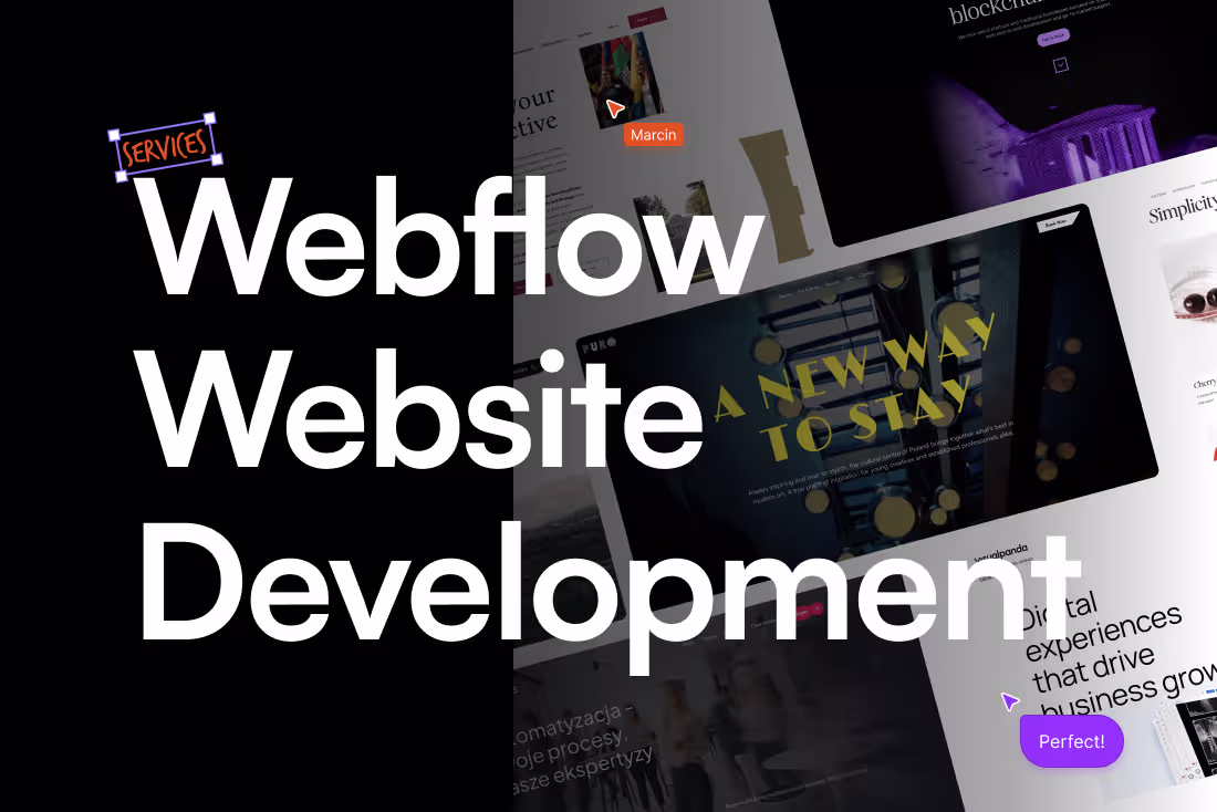
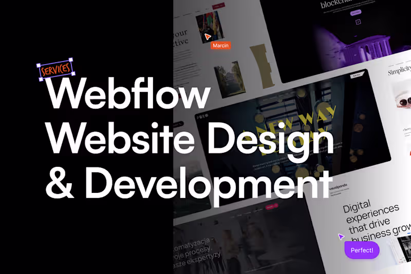
Webflow Website DevelopmentMarcin Ostrowski
Already have a website design ready? I’ll translate it into a fully functional Webflow build that stays true to the original vision while making it responsive, scalable, and ready for launch.
Development in Webflow isn’t just about recreating layouts. It’s about building structured class systems, defining breakpoints, and implementing interactions in a way that supports the experience not overwhelms it.
Whether the design comes from Figma or another tool, the goal is to turn static screens into a living site that feels smooth, lightweight, and easy to manage once it’s live.
Built properly from the start, so it scales without friction later.
How we shape it
I start by reviewing the design structure layouts, components, and responsiveness logic.
From there, I rebuild everything inside Webflow using reusable class systems, scalable layout architecture, and interactions where they add clarity. Each breakpoint and behavior is implemented with performance and maintainability in mind.
What this turns into
A fully developed Webflow website responsive across devices, built on structured classes, reusable components, and ready to launch.
Easy to edit, easy to scale, and structured for long-term use.
FAQs
Example work

Marcin's other services
Starting at$2,000
Duration2 weeks
Tags
Webflow
Web Designer
Web Developer
Webflow Designer
Webflow Developer
Service provided by
Marcin Ostrowski proWarsaw, Poland
- 3
- Followers
Webflow Website DevelopmentMarcin Ostrowski
Starting at$2,000
Duration2 weeks
Tags
Webflow
Web Designer
Web Developer
Webflow Designer
Webflow Developer
Already have a website design ready? I’ll translate it into a fully functional Webflow build that stays true to the original vision while making it responsive, scalable, and ready for launch.
Development in Webflow isn’t just about recreating layouts. It’s about building structured class systems, defining breakpoints, and implementing interactions in a way that supports the experience not overwhelms it.
Whether the design comes from Figma or another tool, the goal is to turn static screens into a living site that feels smooth, lightweight, and easy to manage once it’s live.
Built properly from the start, so it scales without friction later.
How we shape it
I start by reviewing the design structure layouts, components, and responsiveness logic.
From there, I rebuild everything inside Webflow using reusable class systems, scalable layout architecture, and interactions where they add clarity. Each breakpoint and behavior is implemented with performance and maintainability in mind.
What this turns into
A fully developed Webflow website responsive across devices, built on structured classes, reusable components, and ready to launch.
Easy to edit, easy to scale, and structured for long-term use.
FAQs
Example work
Marcin's other services
$2,000