
App UI/UX designSooraj yadav
Summary
This service focuses on redesigning your existing mobile app to make it clearer, more modern, and easier to use. I refine the UX, redesign key screens, update the visuals, and create a clean component structure your developers can easily implement. It’s a fast, effective way to improve your product without committing to a full rebuild.
What's included
UI design
UX Review
A detailed review of your existing app to identify usability issues, flow friction, and structural inconsistencies. Clear UX fixes for navigation, hierarchy, and key interactions.
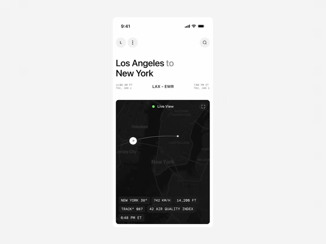
Redesigned Key Screens
A clean, modern redesign of your most important screens (typically 5–10), focusing on clarity, layout improvement, visual polish, and consistency.
Updated UI in Figma
High-fidelity designs reflecting a refined visual direction. Includes updated typography, spacing, colors, components, and visual hierarchy.
Component Refresh
A small but scalable component set that cleans up your current UI and makes future design updates more consistent.
Interaction & Motion Direction
Simple motion guidelines for transitions, gestures, or micro-interactions that help your app feel smoother and more intuitive.
Interactive Prototype
A clickable Figma prototype showcasing the updated flow and visual direction, ideal for alignment with your team or stakeholders.
Developer-Ready Handoff
Clean Figma setup, assets, component documentation, redlines, and implementation support if your development team needs clarification.
FAQs
Sooraj's other services

Starting at$500
Duration2 weeks
Tags
Figma
Jitter
Sketch
UX Designer
UX Engineer
Service provided by
Sooraj yadav Lucknow, India
- $1k+
- Earned
- 6
- Paid projects
- 5.00
- Rating
- 15
- Followers
App UI/UX designSooraj yadav
Summary
This service focuses on redesigning your existing mobile app to make it clearer, more modern, and easier to use. I refine the UX, redesign key screens, update the visuals, and create a clean component structure your developers can easily implement. It’s a fast, effective way to improve your product without committing to a full rebuild.
What's included
UI design
UX Review
A detailed review of your existing app to identify usability issues, flow friction, and structural inconsistencies. Clear UX fixes for navigation, hierarchy, and key interactions.
Redesigned Key Screens
A clean, modern redesign of your most important screens (typically 5–10), focusing on clarity, layout improvement, visual polish, and consistency.
Updated UI in Figma
High-fidelity designs reflecting a refined visual direction. Includes updated typography, spacing, colors, components, and visual hierarchy.
Component Refresh
A small but scalable component set that cleans up your current UI and makes future design updates more consistent.
Interaction & Motion Direction
Simple motion guidelines for transitions, gestures, or micro-interactions that help your app feel smoother and more intuitive.
Interactive Prototype
A clickable Figma prototype showcasing the updated flow and visual direction, ideal for alignment with your team or stakeholders.
Developer-Ready Handoff
Clean Figma setup, assets, component documentation, redlines, and implementation support if your development team needs clarification.
FAQs
Sooraj's other services
$500