
Elevated Web Design: Where Function Meets Aesthetic StorytellingHannah Anaele
I provide a full-service web design process, from discovery and strategy to launch and handover, ensuring your website is functional, visually captivating, and user-friendly. With a focus on minimalist design and cultural storytelling, I create responsive websites that align with your brand identity and engage your audience. My approach combines seamless content integration, SEO optimization, and thorough testing to deliver a cohesive and impactful online experience.
What's included
Discovery & Strategy
The process begins with an in-depth consultation to fully understand your brand’s story, mission, and values. I explore your business goals, target audience, and market positioning to uncover key insights that will inform the website’s direction. This includes reviewing existing materials, identifying your unique selling points, and analyzing competitors. The result is a clear, tailored design strategy that serves as the foundation for creating a website that aligns with your vision while effectively meeting user needs and driving business growth.
Wireframes
This stage involves creating low-fidelity, black-and-white layouts that serve as the skeletal framework for your website. The focus is on arranging content, defining navigation pathways, and establishing the hierarchy of elements on each page to ensure a logical and user-friendly flow. Wireframes allow us to visualize the structure of the site without the distraction of colors, fonts, or detailed visuals. They act as a collaborative tool, ensuring alignment on functionality and content placement before progressing to the design phase, ultimately saving time and ensuring a seamless user experience.
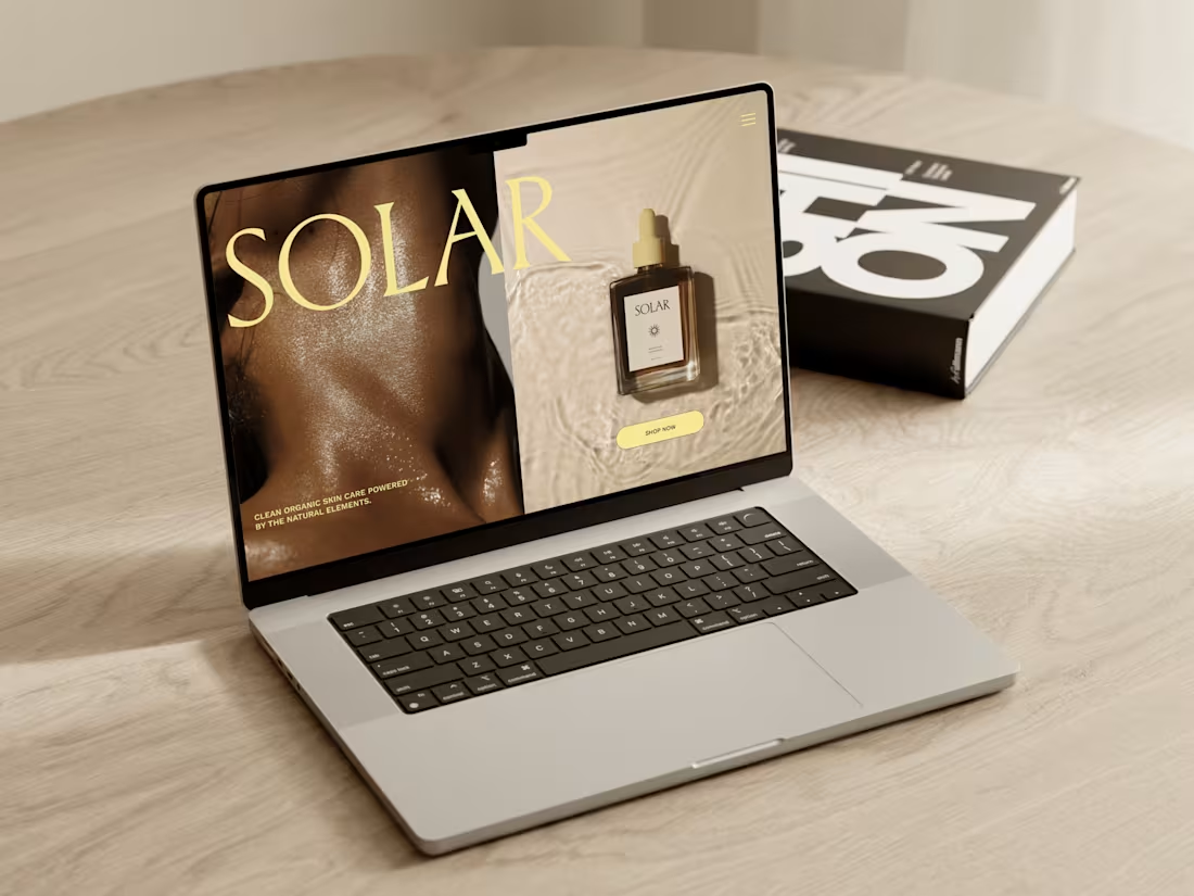
Visual Design
In this phase, I transform the wireframes into a fully realized design that embodies your brand’s identity. This includes selecting a color palette, typography, imagery, and graphics that resonate with your audience and convey your unique essence. The goal is to create a visually compelling and cohesive design that not only enhances the aesthetic appeal of your website but also strengthens your brand message. Every design element is carefully chosen to reflect your values, personality, and vision, ensuring that the website feels authentic and engaging while maintaining functionality and ease of use.
Responsive Development
This stage focuses on ensuring your website provides an optimal viewing experience across all devices—desktop, tablet, and mobile. The design is adapted and tested to be fully functional on various screen sizes, ensuring that images, text, and navigation are properly aligned and easily accessible, regardless of the device. By using flexible layouts, scalable images, and media queries, I make sure that your website adjusts seamlessly to different resolutions, maintaining a consistent and user-friendly experience. This approach helps increase user engagement, reduces bounce rates, and ensures your site is accessible to a broader audience.
Content Integration
In this phase, I seamlessly incorporate your text, images, videos, and other media into the website’s design, ensuring that each element is placed for maximum impact and clarity. Content is carefully formatted to align with the visual hierarchy, maintaining readability and aesthetic appeal. This process ensures that your messaging is communicated effectively while keeping the design cohesive and user-friendly.
SEO Optimization
This stage involves implementing essential on-page SEO techniques to enhance your website’s search engine visibility. I optimize elements such as title tags, meta descriptions, header tags, and image alt text to ensure they are aligned with relevant keywords and search trends. Additionally, I structure content for easy readability, improve page load speed, and ensure mobile-friendliness, all of which contribute to better search rankings and increased organic traffic.
Testing & Feedback
In this phase, I conduct comprehensive testing to ensure that all website functions—such as navigation, forms, links, and interactive elements—work seamlessly across all devices and browsers. I also review the design to ensure it aligns with your vision and performs as intended. Your feedback is incorporated to make any necessary adjustments, ensuring the final product meets both functional requirements and design expectations.
Launch & Handover
Once the website is fully tested and approved, I prepare it for launch by ensuring all technical aspects are in place and the site is live. I provide you with all necessary files, access credentials, and offer training if needed, so you can confidently manage and update your site moving forward.
Hannah's other services

Contact for pricing
Tags
Figma


Framer

Readymag

Squarespace

Brand Design
UI Designer
Web Designer
Service provided by
Hannah Anaele United Kingdom
Elevated Web Design: Where Function Meets Aesthetic StorytellingHannah Anaele
Contact for pricing
Tags
Figma
Framer
Readymag
Squarespace
Brand Design
UI Designer
Web Designer
I provide a full-service web design process, from discovery and strategy to launch and handover, ensuring your website is functional, visually captivating, and user-friendly. With a focus on minimalist design and cultural storytelling, I create responsive websites that align with your brand identity and engage your audience. My approach combines seamless content integration, SEO optimization, and thorough testing to deliver a cohesive and impactful online experience.
What's included
Discovery & Strategy
The process begins with an in-depth consultation to fully understand your brand’s story, mission, and values. I explore your business goals, target audience, and market positioning to uncover key insights that will inform the website’s direction. This includes reviewing existing materials, identifying your unique selling points, and analyzing competitors. The result is a clear, tailored design strategy that serves as the foundation for creating a website that aligns with your vision while effectively meeting user needs and driving business growth.
Wireframes
This stage involves creating low-fidelity, black-and-white layouts that serve as the skeletal framework for your website. The focus is on arranging content, defining navigation pathways, and establishing the hierarchy of elements on each page to ensure a logical and user-friendly flow. Wireframes allow us to visualize the structure of the site without the distraction of colors, fonts, or detailed visuals. They act as a collaborative tool, ensuring alignment on functionality and content placement before progressing to the design phase, ultimately saving time and ensuring a seamless user experience.
Visual Design
In this phase, I transform the wireframes into a fully realized design that embodies your brand’s identity. This includes selecting a color palette, typography, imagery, and graphics that resonate with your audience and convey your unique essence. The goal is to create a visually compelling and cohesive design that not only enhances the aesthetic appeal of your website but also strengthens your brand message. Every design element is carefully chosen to reflect your values, personality, and vision, ensuring that the website feels authentic and engaging while maintaining functionality and ease of use.
Responsive Development
This stage focuses on ensuring your website provides an optimal viewing experience across all devices—desktop, tablet, and mobile. The design is adapted and tested to be fully functional on various screen sizes, ensuring that images, text, and navigation are properly aligned and easily accessible, regardless of the device. By using flexible layouts, scalable images, and media queries, I make sure that your website adjusts seamlessly to different resolutions, maintaining a consistent and user-friendly experience. This approach helps increase user engagement, reduces bounce rates, and ensures your site is accessible to a broader audience.
Content Integration
In this phase, I seamlessly incorporate your text, images, videos, and other media into the website’s design, ensuring that each element is placed for maximum impact and clarity. Content is carefully formatted to align with the visual hierarchy, maintaining readability and aesthetic appeal. This process ensures that your messaging is communicated effectively while keeping the design cohesive and user-friendly.
SEO Optimization
This stage involves implementing essential on-page SEO techniques to enhance your website’s search engine visibility. I optimize elements such as title tags, meta descriptions, header tags, and image alt text to ensure they are aligned with relevant keywords and search trends. Additionally, I structure content for easy readability, improve page load speed, and ensure mobile-friendliness, all of which contribute to better search rankings and increased organic traffic.
Testing & Feedback
In this phase, I conduct comprehensive testing to ensure that all website functions—such as navigation, forms, links, and interactive elements—work seamlessly across all devices and browsers. I also review the design to ensure it aligns with your vision and performs as intended. Your feedback is incorporated to make any necessary adjustments, ensuring the final product meets both functional requirements and design expectations.
Launch & Handover
Once the website is fully tested and approved, I prepare it for launch by ensuring all technical aspects are in place and the site is live. I provide you with all necessary files, access credentials, and offer training if needed, so you can confidently manage and update your site moving forward.
Hannah's other services
Contact for pricing