
I improve digital products with user research and UX design.Iria Otero
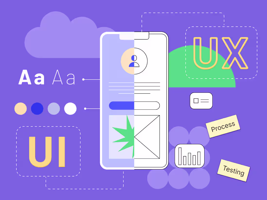
I offer a comprehensive Final UX Design Package that includes user personas, journey maps, wireframes, high-fidelity mockups, and interactive prototypes, ensuring a seamless user experience from concept to execution.
What sets me apart is my focus on user-centered design backed by thorough usability testing and accessibility considerations, ensuring that every design decision is informed by real user feedback and needs.
My collaborative approach also guarantees alignment with your team throughout the process for optimal results.
What's included
Final UX Design Package
Here’s a detailed breakdown of what could be included:
1. User Personas: Detailed profiles representing target users, including demographics, goals, and pain points to guide design decisions.
2. User Journey Maps: Visual representations of the user’s experience, highlighting key interactions, emotions, and potential pain points throughout their journey.
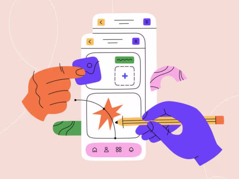
3. Wireframes: Low-fidelity layouts for each key screen, showcasing the structure and functionality without the distraction of visual design.
4. High-Fidelity Mockups: Polished, visual representations of the final design, illustrating colors, typography, and overall aesthetics.
5. Interactive Prototypes: Clickable prototypes that simulate user interactions, allowing stakeholders to experience the flow and functionality before development.
6. Usability Testing Report: Summary of usability tests conducted, including findings, user feedback, and recommendations for improvements.
7. Design Specifications: Detailed documentation of design elements, including fonts, colors, spacing, and component behavior for developers.
8. Style Guide: A comprehensive guide outlining design principles, UI components, and usage guidelines to ensure consistency across the product.
9. Accessibility Recommendations: Guidelines to ensure the design meets accessibility standards, making the product usable for all users.
10. Implementation Support: Ongoing collaboration with the development team to address any design-related questions and ensure accurate implementation.
This package provides a holistic view of the user experience design process, equipping stakeholders with everything they need for successful implementation.
Iria's other services
Starting at$4,000
Duration4 weeks
Tags
Adobe XD
Figma
Jira
Miro
UserTesting
Product Designer
UX Designer
UX Researcher
Service provided by
Iria Otero Amsterdam, Netherlands
- 1
- Followers
I improve digital products with user research and UX design.Iria Otero
Starting at$4,000
Duration4 weeks
Tags
Adobe XD
Figma
Jira
Miro
UserTesting
Product Designer
UX Designer
UX Researcher
I offer a comprehensive Final UX Design Package that includes user personas, journey maps, wireframes, high-fidelity mockups, and interactive prototypes, ensuring a seamless user experience from concept to execution.
What sets me apart is my focus on user-centered design backed by thorough usability testing and accessibility considerations, ensuring that every design decision is informed by real user feedback and needs.
My collaborative approach also guarantees alignment with your team throughout the process for optimal results.
What's included
Final UX Design Package
Here’s a detailed breakdown of what could be included:
1. User Personas: Detailed profiles representing target users, including demographics, goals, and pain points to guide design decisions.
2. User Journey Maps: Visual representations of the user’s experience, highlighting key interactions, emotions, and potential pain points throughout their journey.
3. Wireframes: Low-fidelity layouts for each key screen, showcasing the structure and functionality without the distraction of visual design.
4. High-Fidelity Mockups: Polished, visual representations of the final design, illustrating colors, typography, and overall aesthetics.
5. Interactive Prototypes: Clickable prototypes that simulate user interactions, allowing stakeholders to experience the flow and functionality before development.
6. Usability Testing Report: Summary of usability tests conducted, including findings, user feedback, and recommendations for improvements.
7. Design Specifications: Detailed documentation of design elements, including fonts, colors, spacing, and component behavior for developers.
8. Style Guide: A comprehensive guide outlining design principles, UI components, and usage guidelines to ensure consistency across the product.
9. Accessibility Recommendations: Guidelines to ensure the design meets accessibility standards, making the product usable for all users.
10. Implementation Support: Ongoing collaboration with the development team to address any design-related questions and ensure accurate implementation.
This package provides a holistic view of the user experience design process, equipping stakeholders with everything they need for successful implementation.
Iria's other services
$4,000