
Design System & Component LibraryOghenetega Adievughware
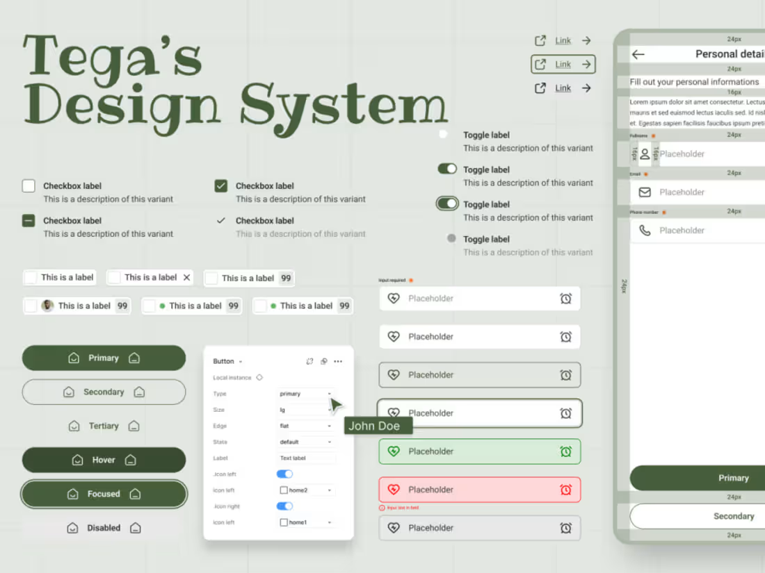
I build and refine design systems that keep your product consistent, scalable, and easy to maintain — from the ground up or fixing what's already there.
What's included:
Full component library (buttons, forms, navigation, cards, modals, etc.)
Design tokens for color, typography, spacing, and elevation
Documentation with usage guidelines and do's/don'ts
Accessibility considerations baked into components
Dev-ready handoff specs
Process:
Audit — review existing UI (if any) for inconsistencies, gaps, and technical debt
Foundations — define tokens, grid, typography scale, and color system
Components — build reusable, variant-ready components in Figma
Documentation — write clear guidelines so your team can use the system independently
Handoff — structured files ready for engineering
Who it's for:
Teams at any stage — whether you're an early-stage startup building your first system, a scaling company untangling inconsistent UI, or an enterprise team standardizing across products.
Tools: Figma (component libraries, variants, auto-layout, and shared styles)
More information:
Responsive components: Over 50+ components that works for all UI design either web or mobile. Such components are listed below:
Button,
Link
Badge,
Avatar,
Tag,
Tooltip,
Progress indicator,
Spinner,
Text field,
Checkbox,
Radio button,
Dropdown,
Toggle,
Slider,
Date picker,
Time picker,
Search bar,
Stepper,
Navabr,
Sidebar,
Breadcrumbs,
Pagination,
Tabs,
Accordion,
Toast notification,
Snackbar,
Alert,
Modal,
Empty state,
Skeleton loader,
Card,
Table,
List,
Grid,
Timeline etc
FAQs
Starting at$1,500
Duration4 weeks
Tags
Figma

Design Systems Specialist
Design Tokens
Mobile Designer
UI/UX Design
Atomic Design
Component libraries
Design Accessibility
Designs Ops
Service provided by
Oghenetega Adievughware Warri, Nigeria
- 1
- Followers
Design System & Component LibraryOghenetega Adievughware
Starting at$1,500
Duration4 weeks
Tags
Figma
Design Systems Specialist
Design Tokens
Mobile Designer
UI/UX Design
Atomic Design
Component libraries
Design Accessibility
Designs Ops
I build and refine design systems that keep your product consistent, scalable, and easy to maintain — from the ground up or fixing what's already there.
What's included:
Full component library (buttons, forms, navigation, cards, modals, etc.)
Design tokens for color, typography, spacing, and elevation
Documentation with usage guidelines and do's/don'ts
Accessibility considerations baked into components
Dev-ready handoff specs
Process:
Audit — review existing UI (if any) for inconsistencies, gaps, and technical debt
Foundations — define tokens, grid, typography scale, and color system
Components — build reusable, variant-ready components in Figma
Documentation — write clear guidelines so your team can use the system independently
Handoff — structured files ready for engineering
Who it's for:
Teams at any stage — whether you're an early-stage startup building your first system, a scaling company untangling inconsistent UI, or an enterprise team standardizing across products.
Tools: Figma (component libraries, variants, auto-layout, and shared styles)
More information:
Responsive components: Over 50+ components that works for all UI design either web or mobile. Such components are listed below:
Button,
Link
Badge,
Avatar,
Tag,
Tooltip,
Progress indicator,
Spinner,
Text field,
Checkbox,
Radio button,
Dropdown,
Toggle,
Slider,
Date picker,
Time picker,
Search bar,
Stepper,
Navabr,
Sidebar,
Breadcrumbs,
Pagination,
Tabs,
Accordion,
Toast notification,
Snackbar,
Alert,
Modal,
Empty state,
Skeleton loader,
Card,
Table,
List,
Grid,
Timeline etc
FAQs
$1,500