
Landing PagesMaaz M.
One Job. Done Right.
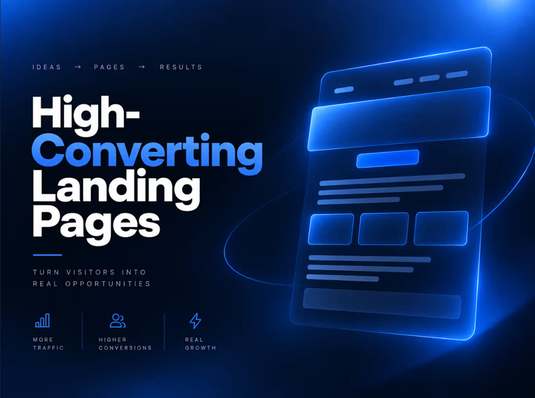
A landing page has one job, convert visitors into leads or customers. I design and build custom, mobile-optimized landing pages built around your offer, with clean UI, fast load times, and clear calls to action. No generic templates, every page is built to match your brand and message.
Most landing pages fail quietly. A visitor clicks through from an ad or a campaign, lands on a page that loads slowly, looks like a dozen other pages built from the same template, and leaves without taking action, not because the offer wasn't good, but because the page never gave them a clear reason to act. A landing page that actually converts isn't about looking impressive, it's about removing every bit of friction between a visitor arriving and that visitor taking the next step.
What You Get
Every landing page I build starts with your actual offer, not a generic layout with your logo dropped in. I design around what you're selling, who you're selling it to, and what action you want a visitor to take, whether that's booking a call, signing up, or making a purchase. The result is a clean, focused UI with no clutter competing for attention, fast load times so visitors don't bounce before the page even finishes rendering, and clear, deliberate calls to action placed where they actually make sense in the visitor's journey, not just tacked on at the bottom. It's fully mobile-optimized as well, since a meaningful share of your traffic is arriving on a phone, and a page that looks great on desktop but breaks on mobile is losing conversions before the visitor even reads your headline.
The Process
We start with a conversation about your offer, your audience, and what a successful conversion looks like for this page, whether that's a form submission, a booking, or a sale. From there, I design the page around that specific goal, build it with performance and mobile responsiveness as core requirements rather than an afterthought, and refine it based on your feedback before it goes live. Once launched, I make sure it's tracking correctly so you can see how it's actually performing, not just assume it's working.
Ideal For
This service is built for businesses running paid ad campaigns that need a page matching the promise made in the ad, product launches that need a focused page to drive early signups or sales, and any business whose current site tries to do too much on one page instead of giving visitors one clear path forward.
Why It's Different
A generic template might look fine at a glance, but it wasn't built around your offer, your audience, or your brand voice, and visitors can tell. Every page I build is designed from your actual message outward, so the layout, the copy hierarchy, and the calls to action all work together toward the one goal that page exists for, converting the visitor in front of it.
Let's Build It
If you have a campaign, launch, or offer that deserves a page built specifically to convert for it, let's build it. Send me a brief description of your offer and what action you want visitors to take, and I'll get back to you with next steps, a realistic timeline, and pricing based on your specific scope.
FAQs

Starting at$22 /hr
Tags
Figma

Next.js

React

Webflow

WebGL

Copywriter
Landing Page
SEO Writer
UI/UX
Service provided by
Maaz M. Karachi, Pakistan
- 5.00
- Rating
- 11
- Followers
Landing PagesMaaz M.
Starting at$22 /hr
Tags
Figma
Next.js
React
Webflow
WebGL
Copywriter
Landing Page
SEO Writer
UI/UX
One Job. Done Right.
A landing page has one job, convert visitors into leads or customers. I design and build custom, mobile-optimized landing pages built around your offer, with clean UI, fast load times, and clear calls to action. No generic templates, every page is built to match your brand and message.
Most landing pages fail quietly. A visitor clicks through from an ad or a campaign, lands on a page that loads slowly, looks like a dozen other pages built from the same template, and leaves without taking action, not because the offer wasn't good, but because the page never gave them a clear reason to act. A landing page that actually converts isn't about looking impressive, it's about removing every bit of friction between a visitor arriving and that visitor taking the next step.
What You Get
Every landing page I build starts with your actual offer, not a generic layout with your logo dropped in. I design around what you're selling, who you're selling it to, and what action you want a visitor to take, whether that's booking a call, signing up, or making a purchase. The result is a clean, focused UI with no clutter competing for attention, fast load times so visitors don't bounce before the page even finishes rendering, and clear, deliberate calls to action placed where they actually make sense in the visitor's journey, not just tacked on at the bottom. It's fully mobile-optimized as well, since a meaningful share of your traffic is arriving on a phone, and a page that looks great on desktop but breaks on mobile is losing conversions before the visitor even reads your headline.
The Process
We start with a conversation about your offer, your audience, and what a successful conversion looks like for this page, whether that's a form submission, a booking, or a sale. From there, I design the page around that specific goal, build it with performance and mobile responsiveness as core requirements rather than an afterthought, and refine it based on your feedback before it goes live. Once launched, I make sure it's tracking correctly so you can see how it's actually performing, not just assume it's working.
Ideal For
This service is built for businesses running paid ad campaigns that need a page matching the promise made in the ad, product launches that need a focused page to drive early signups or sales, and any business whose current site tries to do too much on one page instead of giving visitors one clear path forward.
Why It's Different
A generic template might look fine at a glance, but it wasn't built around your offer, your audience, or your brand voice, and visitors can tell. Every page I build is designed from your actual message outward, so the layout, the copy hierarchy, and the calls to action all work together toward the one goal that page exists for, converting the visitor in front of it.
Let's Build It
If you have a campaign, launch, or offer that deserves a page built specifically to convert for it, let's build it. Send me a brief description of your offer and what action you want visitors to take, and I'll get back to you with next steps, a realistic timeline, and pricing based on your specific scope.
FAQs
$22 /hr