
Wordpress Website DesignSagar D
If you're looking for a reliable and experienced WordPress developer to create a fully responsive website for you, then you've come to the right place! A fully responsive website is essential for any business looking to establish a strong online presence, as it ensures that your website looks great and functions perfectly on all devices, including desktop computers, tablets, and smartphones.
As a WordPress developer, I have extensive experience in designing and developing fully responsive WordPress websites that are tailored to meet the specific needs of each individual client. I use the latest design trends and development techniques to create visually stunning websites that are easy to navigate and user-friendly.
When you hire me to develop your WordPress site, you can expect a professional and efficient service that is focused on delivering results. I will work closely with you to understand your specific requirements and develop a custom solution that meets your needs and exceeds your expectations.
In addition to designing and developing your WordPress site, I can also provide ongoing support and maintenance to ensure that your site remains up-to-date and fully functional at all times. I use the latest security measures to protect your site from hackers and other threats, and I provide regular backups to ensure that your data is always safe and secure.
Whether you need a simple brochure site or a complex eCommerce platform, I have the skills and expertise to create a fully responsive WordPress site that is tailored to your specific needs. So why wait? Contact me today to get started and take your online presence to the next level!
What's included
Fully responsive wordpress website design
Are you looking for a professional website that can adapt to any screen size or device? Look no further! I am here to help you develop a fully responsive WordPress site that meets all your needs.
What is a responsive website?
A responsive website is a site that can adapt to any screen size or device, ensuring an optimal user experience regardless of the device used to access it. With the ever-increasing use of mobile devices to access the internet, having a responsive website is critical to reaching your audience.
Why WordPress?
WordPress is a powerful and popular content management system that powers over 40% of the internet. It is an excellent choice for developing responsive websites due to its flexibility and versatility. With a vast library of plugins and themes, you can customize your site to your liking while ensuring its responsiveness.
What can you expect from me?
I am an experienced WordPress developer who can help you create a responsive website that is not only visually appealing but also optimized for speed and performance. My development process involves:
Understanding your requirements: I will work closely with you to understand your needs and requirements, ensuring that your website meets your expectations.
Design and development: Using the latest design and development tools, I will create a custom website that is both visually appealing and responsive.
Testing: Before launching your website, I will rigorously test it to ensure that it works correctly on all devices and screen sizes.
Launch and optimization: Once your site is ready, I will launch it and ensure that it is optimized for search engines, speed, and performance.
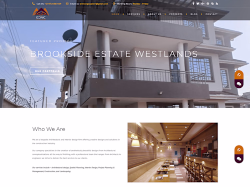
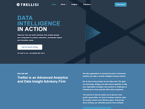
Example work

Sagar's other services

Starting at$50
Tags
Adobe Photoshop
Elementor
WordPress
UI Designer
Web Designer
Web Developer
Service provided by
Sagar D India
Wordpress Website DesignSagar D
Starting at$50
Tags
Adobe Photoshop
Elementor
WordPress
UI Designer
Web Designer
Web Developer
If you're looking for a reliable and experienced WordPress developer to create a fully responsive website for you, then you've come to the right place! A fully responsive website is essential for any business looking to establish a strong online presence, as it ensures that your website looks great and functions perfectly on all devices, including desktop computers, tablets, and smartphones.
As a WordPress developer, I have extensive experience in designing and developing fully responsive WordPress websites that are tailored to meet the specific needs of each individual client. I use the latest design trends and development techniques to create visually stunning websites that are easy to navigate and user-friendly.
When you hire me to develop your WordPress site, you can expect a professional and efficient service that is focused on delivering results. I will work closely with you to understand your specific requirements and develop a custom solution that meets your needs and exceeds your expectations.
In addition to designing and developing your WordPress site, I can also provide ongoing support and maintenance to ensure that your site remains up-to-date and fully functional at all times. I use the latest security measures to protect your site from hackers and other threats, and I provide regular backups to ensure that your data is always safe and secure.
Whether you need a simple brochure site or a complex eCommerce platform, I have the skills and expertise to create a fully responsive WordPress site that is tailored to your specific needs. So why wait? Contact me today to get started and take your online presence to the next level!
What's included
Fully responsive wordpress website design
Are you looking for a professional website that can adapt to any screen size or device? Look no further! I am here to help you develop a fully responsive WordPress site that meets all your needs.
What is a responsive website?
A responsive website is a site that can adapt to any screen size or device, ensuring an optimal user experience regardless of the device used to access it. With the ever-increasing use of mobile devices to access the internet, having a responsive website is critical to reaching your audience.
Why WordPress?
WordPress is a powerful and popular content management system that powers over 40% of the internet. It is an excellent choice for developing responsive websites due to its flexibility and versatility. With a vast library of plugins and themes, you can customize your site to your liking while ensuring its responsiveness.
What can you expect from me?
I am an experienced WordPress developer who can help you create a responsive website that is not only visually appealing but also optimized for speed and performance. My development process involves:
Understanding your requirements: I will work closely with you to understand your needs and requirements, ensuring that your website meets your expectations.
Design and development: Using the latest design and development tools, I will create a custom website that is both visually appealing and responsive.
Testing: Before launching your website, I will rigorously test it to ensure that it works correctly on all devices and screen sizes.
Launch and optimization: Once your site is ready, I will launch it and ensure that it is optimized for search engines, speed, and performance.
Example work
Sagar's other services
$50