
Modern App Design | Intuitive UI/UX for iOS & AndroidPanha Kim
I design mobile apps that are both visually stunning and highly functional. By combining UX research, user flows, and pixel-perfect UI, I deliver apps that not only look modern but also provide an intuitive experience for users across iOS and Android. My designs are built with scalability and developer handoff in mind, ensuring smooth collaboration and faster launches.
What's included
UI/UX Design Prototype
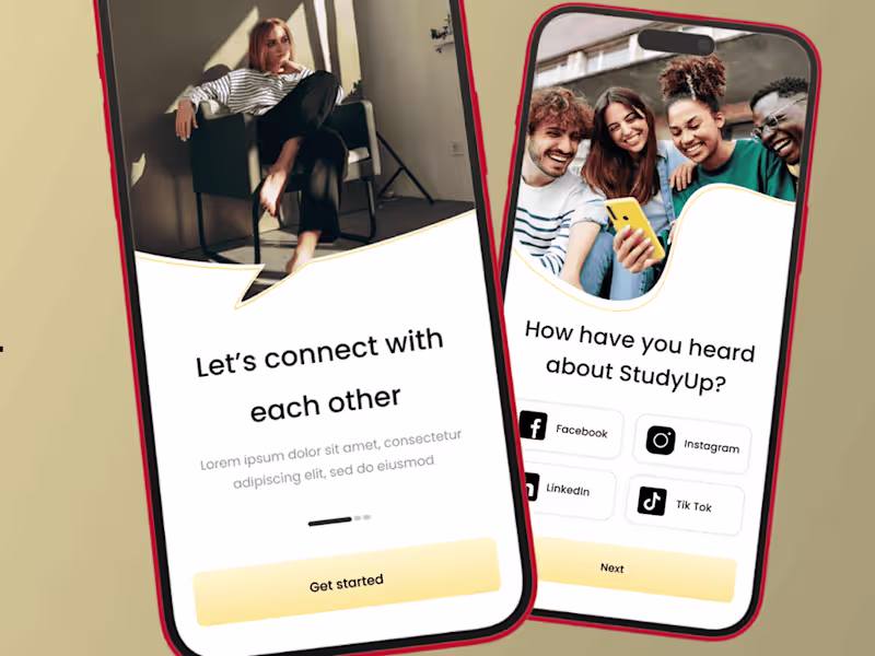
• An interactive, clickable prototype built in Figma or Adobe XD.
• Demonstrates the full app flow, including navigation, screen transitions, and key user interactions.
• Allows stakeholders to test and validate user journeys before development starts.
• Useful for gathering early feedback and pitching to investors or internal teams.
High-Fidelity Screens
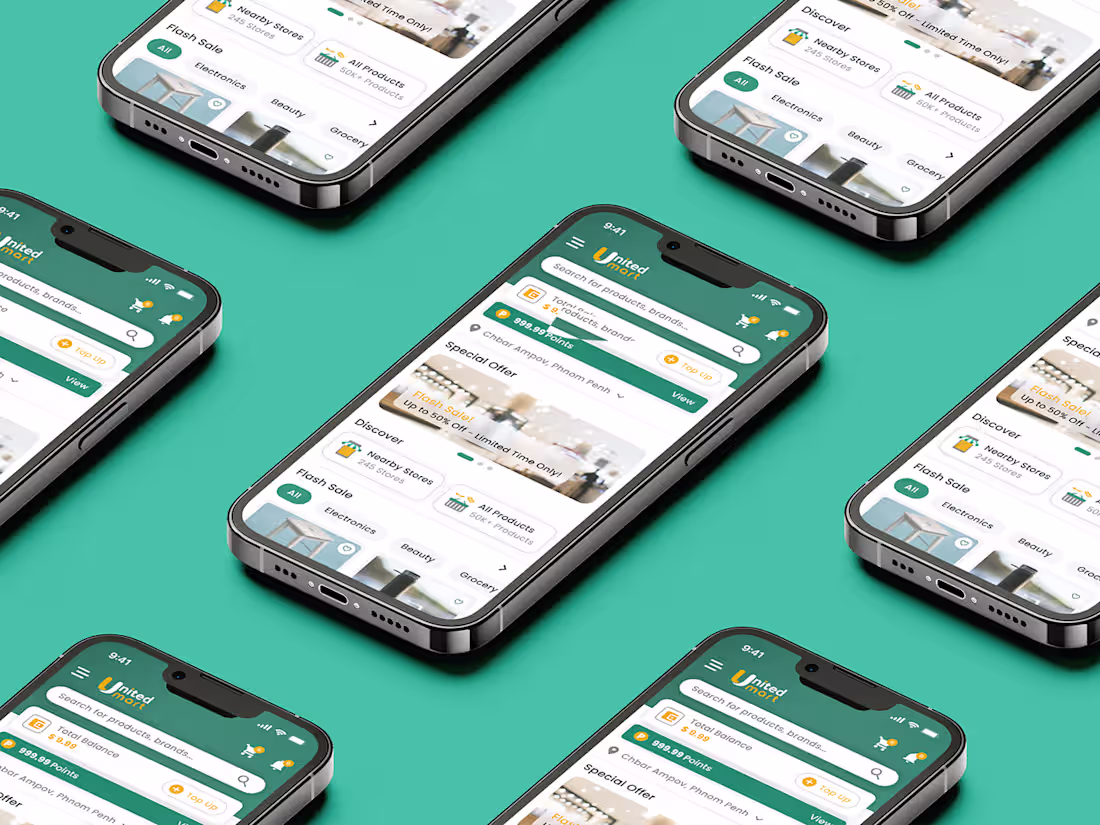
• Pixel-perfect app screens designed for both iOS and Android, following Human Interface Guidelines (Apple) and Material Design (Google).
• Includes responsive layouts for different screen sizes and device orientations.
• Attention to typography, color palette, iconography, spacing, and accessibility for a consistent and professional look.
• Ready to be handed off directly to developers with minimal rework.
Design System & Style Guide
• A centralized design library with reusable components (buttons, forms, cards, navigation bars, etc.).
• Typography hierarchy (fonts, weights, sizes) and color palettes defined with accessibility in mind (contrast checks).
• Consistent iconography, illustration, and imagery guidelines to ensure brand identity.
• Enables scalability—making it easy to design new features without breaking consistency.
Handoff Package
• All design source files (Figma/Adobe XD/Sketch) are neatly organized.
• Exportable assets (icons, illustrations, logos, images) optimized for both iOS and Android.
• Developer documentation with redlines, spacing, padding, and interaction notes.
• Annotation layer showing behavior for each component (hover states, tap states, transitions).
• Collaboration support via Figma Inspect / Zeplin or similar tools for smoother integration with the dev team.
FAQs
Example work

Panha's other services
Starting at$1,500
Duration2 weeks
Tags
Figma
Framer
Interaction Designer
Mobile Designer
Web Designer
Service provided by
Panha Kim Phnom Penh, Cambodia
- $1k+
- Earned
- 1
- Paid projects
- 5.00
- Rating
- 5
- Followers
Modern App Design | Intuitive UI/UX for iOS & AndroidPanha Kim
Starting at$1,500
Duration2 weeks
Tags
Figma
Framer
Interaction Designer
Mobile Designer
Web Designer
I design mobile apps that are both visually stunning and highly functional. By combining UX research, user flows, and pixel-perfect UI, I deliver apps that not only look modern but also provide an intuitive experience for users across iOS and Android. My designs are built with scalability and developer handoff in mind, ensuring smooth collaboration and faster launches.
What's included
UI/UX Design Prototype
• An interactive, clickable prototype built in Figma or Adobe XD.
• Demonstrates the full app flow, including navigation, screen transitions, and key user interactions.
• Allows stakeholders to test and validate user journeys before development starts.
• Useful for gathering early feedback and pitching to investors or internal teams.
High-Fidelity Screens
• Pixel-perfect app screens designed for both iOS and Android, following Human Interface Guidelines (Apple) and Material Design (Google).
• Includes responsive layouts for different screen sizes and device orientations.
• Attention to typography, color palette, iconography, spacing, and accessibility for a consistent and professional look.
• Ready to be handed off directly to developers with minimal rework.
Design System & Style Guide
• A centralized design library with reusable components (buttons, forms, cards, navigation bars, etc.).
• Typography hierarchy (fonts, weights, sizes) and color palettes defined with accessibility in mind (contrast checks).
• Consistent iconography, illustration, and imagery guidelines to ensure brand identity.
• Enables scalability—making it easy to design new features without breaking consistency.
Handoff Package
• All design source files (Figma/Adobe XD/Sketch) are neatly organized.
• Exportable assets (icons, illustrations, logos, images) optimized for both iOS and Android.
• Developer documentation with redlines, spacing, padding, and interaction notes.
• Annotation layer showing behavior for each component (hover states, tap states, transitions).
• Collaboration support via Figma Inspect / Zeplin or similar tools for smoother integration with the dev team.
FAQs
Example work
Panha's other services
$1,500