
UI/UX DesignerAlly Aqilah
It's crucial to tailor the deliverables to the specific project and the client's needs. Regular communication and collaboration with the client ensure that the provided deliverables align with their expectations and project goals.
What's included
Wireframes
Low-fidelity wireframes outlining the layout and structure of user interfaces.
Prototypes
Interactive prototypes demonstrating the flow and functionality of the user interface.
Visual Designs
High-fidelity mockups with detailed visual elements, including colors, typography, and imagery.
User Flows
Diagrams illustrating the user's journey through the interface.
Interactive Elements
Designed UI components such as buttons, icons, forms, and navigation bars.
Design Guidelines
Document detailing design principles, style guides, and branding guidelines.
Responsive Design
Designs adapted for various screen sizes (mobile, tablet, desktop)
Animations and Transitions
Examples of how UI elements transition and animate during interactions.
Final UI Assets
Exported assets (images, icons, graphics) in the required formats.
Documentation
Instructions or documentation for developers to implement the design.
Collaboration Files
Shared files in formats like Figma, Adobe XD, or Sketch for collaborative work.
Source Files
Native design files with layers and components intact.
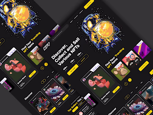
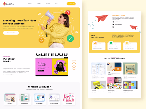
Example work
Ally's other services

Contact for pricing
Tags
Adobe Illustrator
Adobe Photoshop
Adobe XD
Figma
Sketch
UI Designer
UX Designer
Service provided by
Ally Aqilah Indonesia
UI/UX DesignerAlly Aqilah
Contact for pricing
Tags
Adobe Illustrator
Adobe Photoshop
Adobe XD
Figma
Sketch
UI Designer
UX Designer
It's crucial to tailor the deliverables to the specific project and the client's needs. Regular communication and collaboration with the client ensure that the provided deliverables align with their expectations and project goals.
What's included
Wireframes
Low-fidelity wireframes outlining the layout and structure of user interfaces.
Prototypes
Interactive prototypes demonstrating the flow and functionality of the user interface.
Visual Designs
High-fidelity mockups with detailed visual elements, including colors, typography, and imagery.
User Flows
Diagrams illustrating the user's journey through the interface.
Interactive Elements
Designed UI components such as buttons, icons, forms, and navigation bars.
Design Guidelines
Document detailing design principles, style guides, and branding guidelines.
Responsive Design
Designs adapted for various screen sizes (mobile, tablet, desktop)
Animations and Transitions
Examples of how UI elements transition and animate during interactions.
Final UI Assets
Exported assets (images, icons, graphics) in the required formats.
Documentation
Instructions or documentation for developers to implement the design.
Collaboration Files
Shared files in formats like Figma, Adobe XD, or Sketch for collaborative work.
Source Files
Native design files with layers and components intact.
Example work
Ally's other services
Contact for pricing