
Mobile App DesignHenry Eguakun
I will design cool and intuitive interface for your mobile Application.
What's included
Style Guide
Typography: Define the typefaces, font sizes, and font weights to be used for headings, body text, buttons, and other UI elements.
Color Palette: Specify the primary and secondary colors, as well as any additional colors for various UI elements, including backgrounds, text, buttons, and interactive elements.
Iconography: Choose and document a consistent set of icons that align with the design style and provide guidelines on their usage.
Buttons and Form Elements: Define the styles for buttons, checkboxes, radio buttons, text inputs, dropdowns, and other form elements.
Spacing and Layout: Establish guidelines for spacing between UI elements, margins, padding, and overall layout structure.
Visual Hierarchy: Provide guidelines on how to create a clear visual hierarchy, emphasizing important elements and creating a logical flow for the users.
Wireframe
I'll deliver wireframe for each screens, in other to make the design process seamless
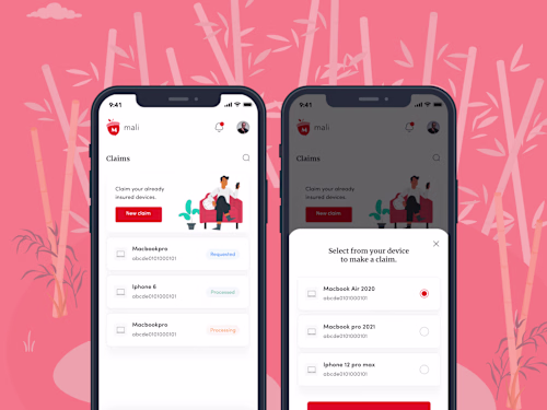
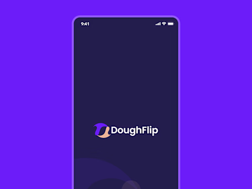
UI Screens
Create a set of visual representations of the mobile app screens, demonstrating the proposed UI design. This includes but is not limited to:
Home Screen: Showcase the main screen of the app, highlighting key features and navigation.
User Profile: Design a screen that displays user information, preferences, and options for customization.
Settings: Create a screen that allows users to modify app settings, account details, and privacy preferences.
Onboarding Screens: Design screens that guide users through the app's features and functionality during the onboarding process.
Navigation: Demonstrate consistent and intuitive navigation throughout the app, including menus, tabs, and search functionality.
Interactive Prototype
If possible, create an interactive prototype using design tools or prototyping software to allow stakeholders to experience the app's functionality and flow.
Example work
Henry's other services

Starting at$30 /hr
Tags
Adobe XD
Figma
Mobile Designer
UI Designer
Visual Designer
Service provided by
Henry Eguakun Nigeria
- 3
- Followers
Mobile App DesignHenry Eguakun
Starting at$30 /hr
Tags
Adobe XD
Figma
Mobile Designer
UI Designer
Visual Designer
I will design cool and intuitive interface for your mobile Application.
What's included
Style Guide
Typography: Define the typefaces, font sizes, and font weights to be used for headings, body text, buttons, and other UI elements.
Color Palette: Specify the primary and secondary colors, as well as any additional colors for various UI elements, including backgrounds, text, buttons, and interactive elements.
Iconography: Choose and document a consistent set of icons that align with the design style and provide guidelines on their usage.
Buttons and Form Elements: Define the styles for buttons, checkboxes, radio buttons, text inputs, dropdowns, and other form elements.
Spacing and Layout: Establish guidelines for spacing between UI elements, margins, padding, and overall layout structure.
Visual Hierarchy: Provide guidelines on how to create a clear visual hierarchy, emphasizing important elements and creating a logical flow for the users.
Wireframe
I'll deliver wireframe for each screens, in other to make the design process seamless
UI Screens
Create a set of visual representations of the mobile app screens, demonstrating the proposed UI design. This includes but is not limited to:
Home Screen: Showcase the main screen of the app, highlighting key features and navigation.
User Profile: Design a screen that displays user information, preferences, and options for customization.
Settings: Create a screen that allows users to modify app settings, account details, and privacy preferences.
Onboarding Screens: Design screens that guide users through the app's features and functionality during the onboarding process.
Navigation: Demonstrate consistent and intuitive navigation throughout the app, including menus, tabs, and search functionality.
Interactive Prototype
If possible, create an interactive prototype using design tools or prototyping software to allow stakeholders to experience the app's functionality and flow.
Example work
Henry's other services
$30 /hr