
Overview
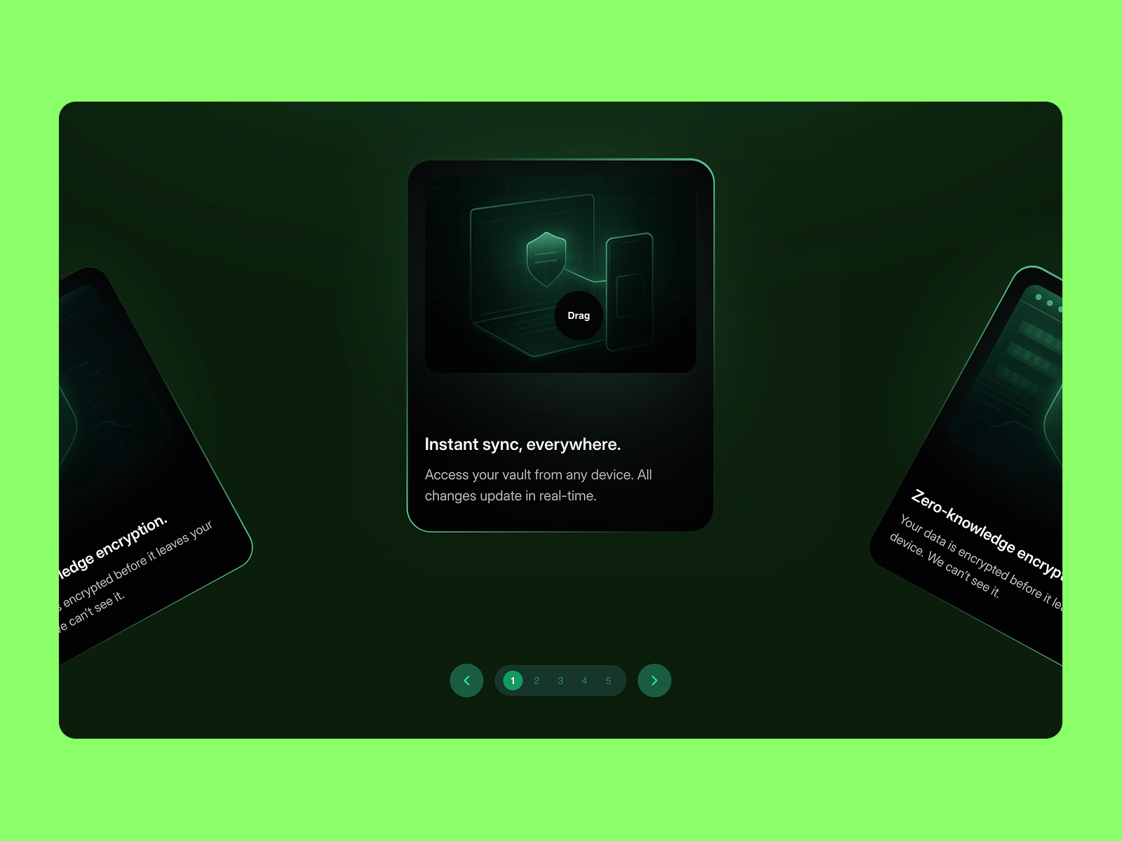
The Arc Slider is a sophisticated carousel component that arranges cards along a curved path, creating an immersive 3D-like browsing experience. Unlike traditional linear carousels, this component adds depth and visual interest while maintaining excellent usability and performance.
Core Features
🎯 Drag & Scroll Interaction
Smooth drag-to-spin with friction-based momentum physics
Intelligent snap-to-card with customizable friction (0.5-0.98)
Touch-optimized for native mobile feel with velocity tracking
Adjustable spin speed (0.1x - 5x)
Infinite loop - seamlessly wraps from last to first card
⌨️ Complete Keyboard Navigation
Arrow Left/Right: Navigate between cards
Home/End: Jump to first/last card
Full screen reader support with ARIA labels
Live region announcements (e.g., "Card 3 of 5")
Visual focus indicators for accessibility compliance
📱 Mobile-First Design
Native-feeling touch gestures optimized for iOS and Android
Haptic feedback: Audio ticks on iOS, vibration on Android (iPhone timer-like feel)
Prevents accidental text/image selection during drag
Responsive on all screen sizes
Adaptive click threshold (15px mobile, 10px desktop)
🎨 Custom Cursor Experience (Desktop)
Smart context-aware cursor text ("Drag", "Click", "Previous", "Next")
Magnetic attraction to navigation arrows (80px radius)
Smooth spring physics with configurable size (40-120px)
Auto-detects interactive elements (links, buttons)
Hidden on touch devices for clean mobile UX
🎛️ Navigation Controls
Pagination: Dots or numbers with custom active/inactive colors
Arrow Buttons: Previous/Next with glassmorphism styling
Magnetic Effect: Cursor snaps to arrow buttons for easier clicking
Auto-Play: Optional with adjustable interval (1-10 seconds)
Pause Behaviors: Pauses on hover (desktop), drag, click, or keyboard use
✨ Visual Customization
Radius control - adjust arc curvature
Card width
Center card scaling for focus emphasis
Visible cards control density
Vertical offset - perfect Y-axis positioning
Custom colors for pagination, arrows, and icons
Smooth opacity fade for off-screen cards
♿ Accessibility Built-In
WCAG 2.1 compliant
Full keyboard navigation
Screen reader announcements
Semantic HTML with proper ARIA roles
Focus management
High contrast support
⚙️ Technical Highlights
Built with Framer Motion for 60fps performance
Zero external dependencies beyond Framer
Optimized rendering with useTransform hooks
Smart re-renders only when needed
Works perfectly in Framer preview and published sites
Export-ready for production
Perfect For
Portfolios: Showcase work samples with style
Product Showcases: Highlight features or product lineup
Team Pages: Display team members with flair
Testimonials: Engaging customer review carousel
Feature Highlights: SaaS product features
Image Galleries: Photography or design portfolios
Case Studies: Project showcase with depth
Customization Options (20+ Framer Controls)
Slots: Up to 20 cards
Radius, Card Width, Center Scale
Visible Cards, Spin Speed, Friction
Vertical Offset (Y-axis positioning)
Show/Hide Arrows and Pagination
Pagination Type (Dots or Numbers)
All Color Controls (Active, Inactive, Background, Arrows, Icons)
Auto-Play Toggle & Interval
Haptic Feedback Toggle
Cursor Text & Size
Event Handler: onCardClick
Browser Support
Chrome, Safari, Firefox, Edge (latest versions)
iOS Safari, Chrome Mobile, Samsung Internet
Degrades gracefully on older browsers
What's Included
Fully documented Framer component
Production-ready code
All states and interactions pre-configured
Mobile and desktop optimized
No additional setup required
Use Cases in Action
Add to any Framer page as a component instance
Populate slots with any Framer frames, components, or images
Customize via the property panel
Works with CMS collections (manually populate slots)
Pair with other components for rich layouts
Ready to elevate your Framer projects? Add depth, interactivity, and polish with the Arc Slider.
Tags: carousel, slider, arc, 3D, drag, scroll, interactive, animation, showcase, portfolio, gallery, cards, swipe, mobile, accessibility, haptic
Get it for$10.00
Tags
Framer
Framer Developer
framer component
framer motion
framer slider
Product created by
Chaman Verma proShimla, India
- $5k+
- Earned
- 7
- Paid projects
- 5.00
- Rating
- 50
- Followers
Chaman's other products

Ultimate Audio Player for Framer Website
$9.00
Liquid Gooey Dropdown - A dropdown that melts into existence.
$12.00
Get it for$10.00
Tags
Framer
Framer Developer
framer component
framer motion
framer slider
Overview
The Arc Slider is a sophisticated carousel component that arranges cards along a curved path, creating an immersive 3D-like browsing experience. Unlike traditional linear carousels, this component adds depth and visual interest while maintaining excellent usability and performance.
Core Features
🎯 Drag & Scroll Interaction
Smooth drag-to-spin with friction-based momentum physics
Intelligent snap-to-card with customizable friction (0.5-0.98)
Touch-optimized for native mobile feel with velocity tracking
Adjustable spin speed (0.1x - 5x)
Infinite loop - seamlessly wraps from last to first card
⌨️ Complete Keyboard Navigation
Arrow Left/Right: Navigate between cards
Home/End: Jump to first/last card
Full screen reader support with ARIA labels
Live region announcements (e.g., "Card 3 of 5")
Visual focus indicators for accessibility compliance
📱 Mobile-First Design
Native-feeling touch gestures optimized for iOS and Android
Haptic feedback: Audio ticks on iOS, vibration on Android (iPhone timer-like feel)
Prevents accidental text/image selection during drag
Responsive on all screen sizes
Adaptive click threshold (15px mobile, 10px desktop)
🎨 Custom Cursor Experience (Desktop)
Smart context-aware cursor text ("Drag", "Click", "Previous", "Next")
Magnetic attraction to navigation arrows (80px radius)
Smooth spring physics with configurable size (40-120px)
Auto-detects interactive elements (links, buttons)
Hidden on touch devices for clean mobile UX
🎛️ Navigation Controls
Pagination: Dots or numbers with custom active/inactive colors
Arrow Buttons: Previous/Next with glassmorphism styling
Magnetic Effect: Cursor snaps to arrow buttons for easier clicking
Auto-Play: Optional with adjustable interval (1-10 seconds)
Pause Behaviors: Pauses on hover (desktop), drag, click, or keyboard use
✨ Visual Customization
Radius control - adjust arc curvature
Card width
Center card scaling for focus emphasis
Visible cards control density
Vertical offset - perfect Y-axis positioning
Custom colors for pagination, arrows, and icons
Smooth opacity fade for off-screen cards
♿ Accessibility Built-In
WCAG 2.1 compliant
Full keyboard navigation
Screen reader announcements
Semantic HTML with proper ARIA roles
Focus management
High contrast support
⚙️ Technical Highlights
Built with Framer Motion for 60fps performance
Zero external dependencies beyond Framer
Optimized rendering with useTransform hooks
Smart re-renders only when needed
Works perfectly in Framer preview and published sites
Export-ready for production
Perfect For
Portfolios: Showcase work samples with style
Product Showcases: Highlight features or product lineup
Team Pages: Display team members with flair
Testimonials: Engaging customer review carousel
Feature Highlights: SaaS product features
Image Galleries: Photography or design portfolios
Case Studies: Project showcase with depth
Customization Options (20+ Framer Controls)
Slots: Up to 20 cards
Radius, Card Width, Center Scale
Visible Cards, Spin Speed, Friction
Vertical Offset (Y-axis positioning)
Show/Hide Arrows and Pagination
Pagination Type (Dots or Numbers)
All Color Controls (Active, Inactive, Background, Arrows, Icons)
Auto-Play Toggle & Interval
Haptic Feedback Toggle
Cursor Text & Size
Event Handler: onCardClick
Browser Support
Chrome, Safari, Firefox, Edge (latest versions)
iOS Safari, Chrome Mobile, Samsung Internet
Degrades gracefully on older browsers
What's Included
Fully documented Framer component
Production-ready code
All states and interactions pre-configured
Mobile and desktop optimized
No additional setup required
Use Cases in Action
Add to any Framer page as a component instance
Populate slots with any Framer frames, components, or images
Customize via the property panel
Works with CMS collections (manually populate slots)
Pair with other components for rich layouts
Ready to elevate your Framer projects? Add depth, interactivity, and polish with the Arc Slider.
Tags: carousel, slider, arc, 3D, drag, scroll, interactive, animation, showcase, portfolio, gallery, cards, swipe, mobile, accessibility, haptic
Chaman's other products
Ultimate Audio Player for Framer Website
$9.00
Liquid Gooey Dropdown - A dropdown that melts into existence.
$12.00
$10.00