
A draggable card stack for Framer that lets users swipe, flick, or navigate through layered content with smooth, elastic motion.
Built for interactive showcases, testimonials, portfolios, or feature highlights.
Core behavior
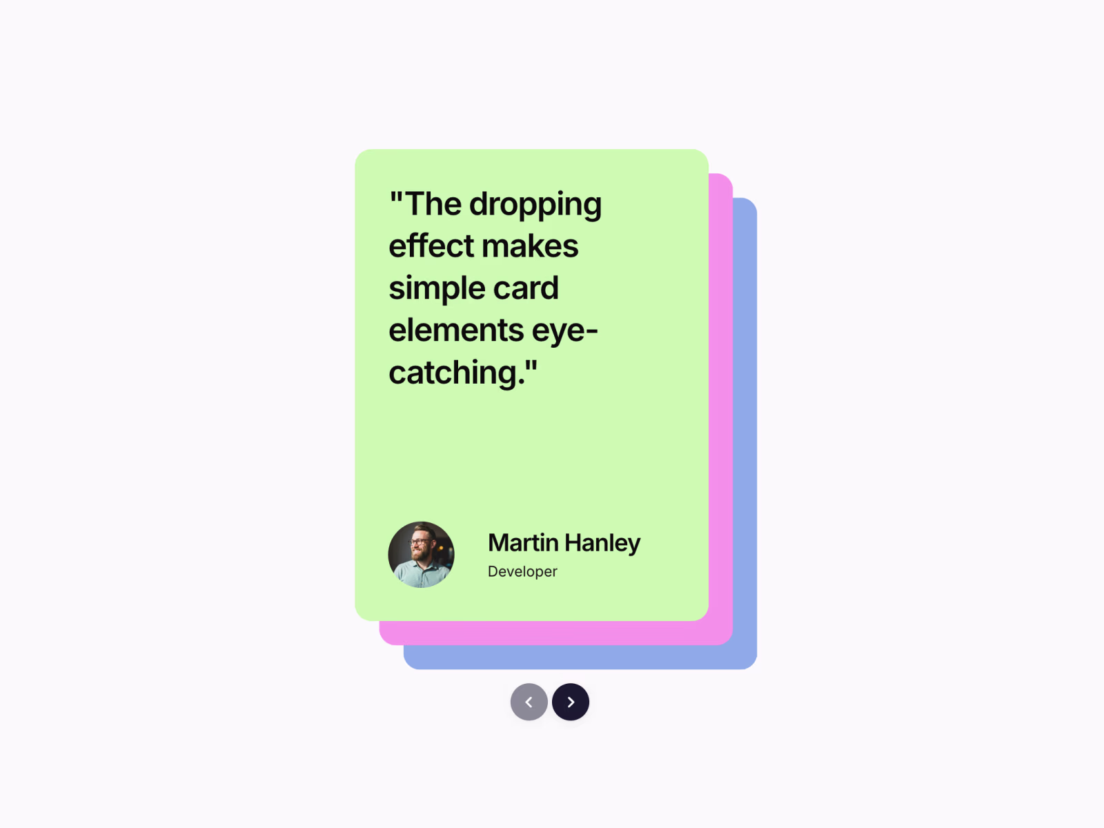
Displays 2 to 5 visible cards stacked with diagonal X and Y offsets. The top card sits in front while the remaining cards cascade behind it.
The top card is draggable. Pull it past a configurable threshold and it drops off screen. The remaining cards shift forward and a new card fades in from the back of the stack.
The Previous action reverses the sequence. A card animates in from above and the stack reorders smoothly.
Keyboard navigation is supported. Left and Right arrow keys work when the component is in view, activated only when visible in the viewport.
If there are too few children to maintain visual depth, the component duplicates items to preserve the visible stack count plus buffer.
Interaction details
Card transitions use a custom easing curve for controlled motion.
Drag interaction applies elastic resistance for a natural feel.
If the drag threshold is not met, the card snaps back with an elastic easing.
Controls
Includes circular Previous and Next buttons with chevron icons. You can upload a custom arrow icon.
Buttons scale slightly on hover for subtle feedback.
Fully responsive. Offsets, control sizes, and spacing adapt to smaller containers.
Framer property controls
Adjust directly inside Framer:
X and Y stack offsets
Number of visible cards
Animation duration
Drag threshold
Control visibility
Control size and colors
Custom arrow icon upload
Drop it into any layout and use standard child layers as cards.
Refund Policy
Due to the digital nature of this product, all sales are final. Refunds are not offered once the component has been purchased and downloaded.
If you experience issues with the component or need help setting it up, feel free to reach out and I’ll be happy to help.
Get it for$12.00
Tags
Framer


Product created by
Sanna Granqvist proGothenburg, Sweden
- $1k+
- Earned
- 2
- Paid projects
- 5.00
- Rating
- 140
- Followers
Sanna's other products

Framer Component: Curved Text Ticker Pro
$12.00
Framer Component: Gradient Strips BG
$12.00
Get it for$12.00
Tags
Framer
A draggable card stack for Framer that lets users swipe, flick, or navigate through layered content with smooth, elastic motion.
Built for interactive showcases, testimonials, portfolios, or feature highlights.
Core behavior
Displays 2 to 5 visible cards stacked with diagonal X and Y offsets. The top card sits in front while the remaining cards cascade behind it.
The top card is draggable. Pull it past a configurable threshold and it drops off screen. The remaining cards shift forward and a new card fades in from the back of the stack.
The Previous action reverses the sequence. A card animates in from above and the stack reorders smoothly.
Keyboard navigation is supported. Left and Right arrow keys work when the component is in view, activated only when visible in the viewport.
If there are too few children to maintain visual depth, the component duplicates items to preserve the visible stack count plus buffer.
Interaction details
Card transitions use a custom easing curve for controlled motion.
Drag interaction applies elastic resistance for a natural feel.
If the drag threshold is not met, the card snaps back with an elastic easing.
Controls
Includes circular Previous and Next buttons with chevron icons. You can upload a custom arrow icon.
Buttons scale slightly on hover for subtle feedback.
Fully responsive. Offsets, control sizes, and spacing adapt to smaller containers.
Framer property controls
Adjust directly inside Framer:
X and Y stack offsets
Number of visible cards
Animation duration
Drag threshold
Control visibility
Control size and colors
Custom arrow icon upload
Drop it into any layout and use standard child layers as cards.
Refund Policy
Due to the digital nature of this product, all sales are final. Refunds are not offered once the component has been purchased and downloaded.
If you experience issues with the component or need help setting it up, feel free to reach out and I’ll be happy to help.
Sanna's other products
Framer Component: Curved Text Ticker Pro
$12.00
Framer Component: Gradient Strips BG
$12.00
$12.00