

Layered Card 3D Carousel is a visually refined Framer component that stacks cards in a depth-based layout, bringing subtle 3D motion and hierarchy to your content.
Cards smoothly transition forward and backward, creating a natural sense of focus while keeping surrounding items visible and contextual.
Designed for modern product pages, landing sections, and feature showcases where clarity and visual rhythm matter.
Experience the Layered Card 3D Carousel in action 👉 https://layered-card-caraousel.framer.website/
Key Features
Layered 3D Depth
Cards scale, shift, and layer naturally to create a realistic depth effect without heavy animation.
Smooth & Intentional Motion
Carefully tuned transitions that feel calm, responsive, and premium — not distracting.
Focus-First Layout
Active card stays visually dominant while surrounding cards provide context.
Fully Responsive
Works seamlessly across desktop, tablet, and mobile layouts.
Framer-Native Controls
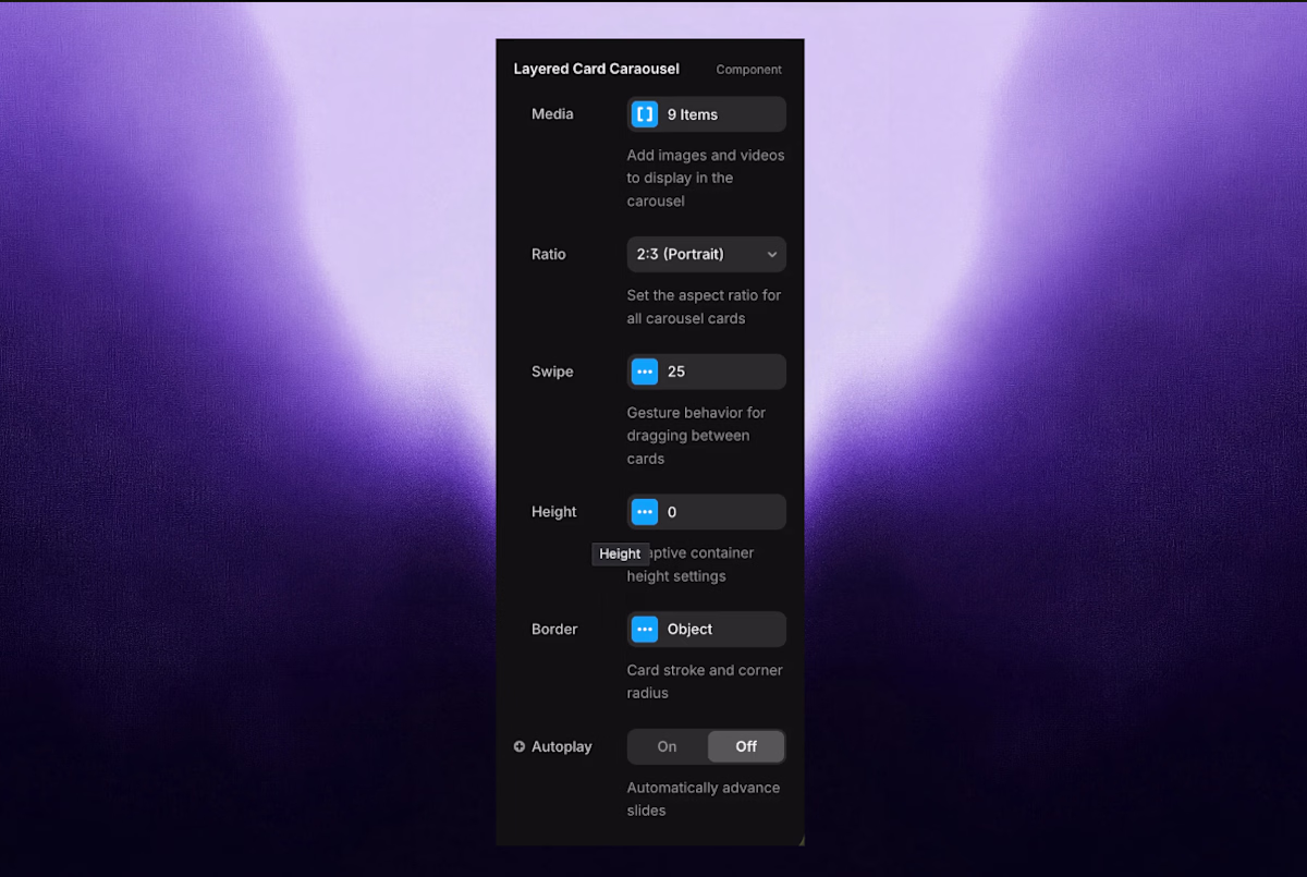
Customize spacing, scale, rotation, opacity, and card count directly from the Framer panel.
Use Cases
Feature highlights
Testimonials & reviews
Product previews
Case studies
Visual storytelling sections
Landing page hero interactions
Customization Options
Card spacing & depth
Scale intensity
Rotation angle
Animation speed & easing
Active card emphasis
Card content (text, images, components)
No custom code required.
Performance Friendly
Built with Framer-native interactions to ensure:
Smooth performance
Minimal layout shift
Clean handoff between design and publish
Why This Component
Most carousels are flat or overly animated.
This component focuses on depth, hierarchy, and restraint — helping content stand out without visual noise.
If you want motion that feels designed, not decorative, this carousel fits naturally into modern Framer layouts.
Compatibility
Compatible with any Framer layout
Easy to duplicate and reuse across pages
Get it for$5.00
Tags
Framer
3D Designer
Framer Developer
Product created by
Tanishq Gautam India
- $10k+
- Earned
- 22
- Paid projects
- 4.92
- Rating
- 51
- Followers
Get it for$5.00
Tags
Framer
3D Designer
Framer Developer
Layered Card 3D Carousel is a visually refined Framer component that stacks cards in a depth-based layout, bringing subtle 3D motion and hierarchy to your content.
Cards smoothly transition forward and backward, creating a natural sense of focus while keeping surrounding items visible and contextual.
Designed for modern product pages, landing sections, and feature showcases where clarity and visual rhythm matter.
Experience the Layered Card 3D Carousel in action 👉 https://layered-card-caraousel.framer.website/
Key Features
Layered 3D Depth
Cards scale, shift, and layer naturally to create a realistic depth effect without heavy animation.
Smooth & Intentional Motion
Carefully tuned transitions that feel calm, responsive, and premium — not distracting.
Focus-First Layout
Active card stays visually dominant while surrounding cards provide context.
Fully Responsive
Works seamlessly across desktop, tablet, and mobile layouts.
Framer-Native Controls
Customize spacing, scale, rotation, opacity, and card count directly from the Framer panel.
Use Cases
Feature highlights
Testimonials & reviews
Product previews
Case studies
Visual storytelling sections
Landing page hero interactions
Customization Options
Card spacing & depth
Scale intensity
Rotation angle
Animation speed & easing
Active card emphasis
Card content (text, images, components)
No custom code required.
Performance Friendly
Built with Framer-native interactions to ensure:
Smooth performance
Minimal layout shift
Clean handoff between design and publish
Why This Component
Most carousels are flat or overly animated.
This component focuses on depth, hierarchy, and restraint — helping content stand out without visual noise.
If you want motion that feels designed, not decorative, this carousel fits naturally into modern Framer layouts.
Compatibility
Compatible with any Framer layout
Easy to duplicate and reuse across pages
$5.00