
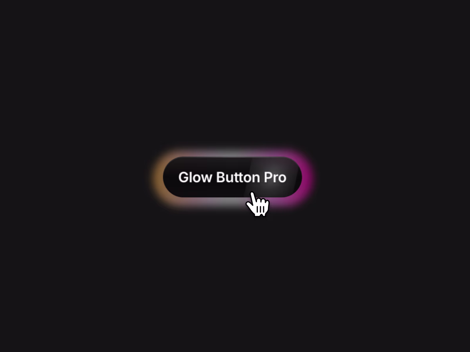
Five glow modes, spring physics, magnetic cursor, and glass effects — all in one button component. Drop it in, pick your style, and ship.
About this Component
Glow Button Pro is a CTA button with five distinct glow styles, spring-physics interactions, and enough visual controls to skip the custom component entirely.
Glow modes
Pick one and build from there. Simple adds a soft box-shadow halo. Conic Spin runs a rotating gradient around the edges. Linear pushes a directional glow outward. Blobs places organic radial shapes that shift around the button. None keeps it flat. All five support up to three colors with oklch blending, so gradients stay accurate across the full color range.
Visual layering
On top of whichever glow mode you choose, you can add a gradient ring border, glass effect with backdrop blur, depth gradient fill, specular highlight, and noise texture overlay. Hover triggers a shimmer sweep across the button face.
Interactions
Hover and tap scale with spring physics. The cursor pulls the button magnetically. The glow tracks the mouse position. Text glow and glow boost each activate on hover independently from the base state.
Appear animations
Fade, fade-up, fade-down, or fade with scale — all with stagger support, so a row of buttons sequences instead of popping in at once.
Accessibility
Respects prefers-reduced-motion, has a keyboard focus-visible outline, and renders as a native <button> with optional link behavior.
Controls
Glow Mode / Glow Colors (up to 3) / Outline Mode / Glass Effect / Depth Gradient / Specular Highlight / Noise Texture / Hover Shimmer / Hover Scale / Tap Scale / Magnetic Strength / Glow Follow Mouse / Text Glow on Hover / Glow Boost on Hover / Appear Animation / Stagger Delay / Font
Get it for$12.00
Tags
Framer
Product created by
Sanna Granqvist proGothenburg, Sweden
- $10k+
- Earned
- 2
- Paid projects
- 5.00
- Rating
- 187
- Followers
Sanna's other products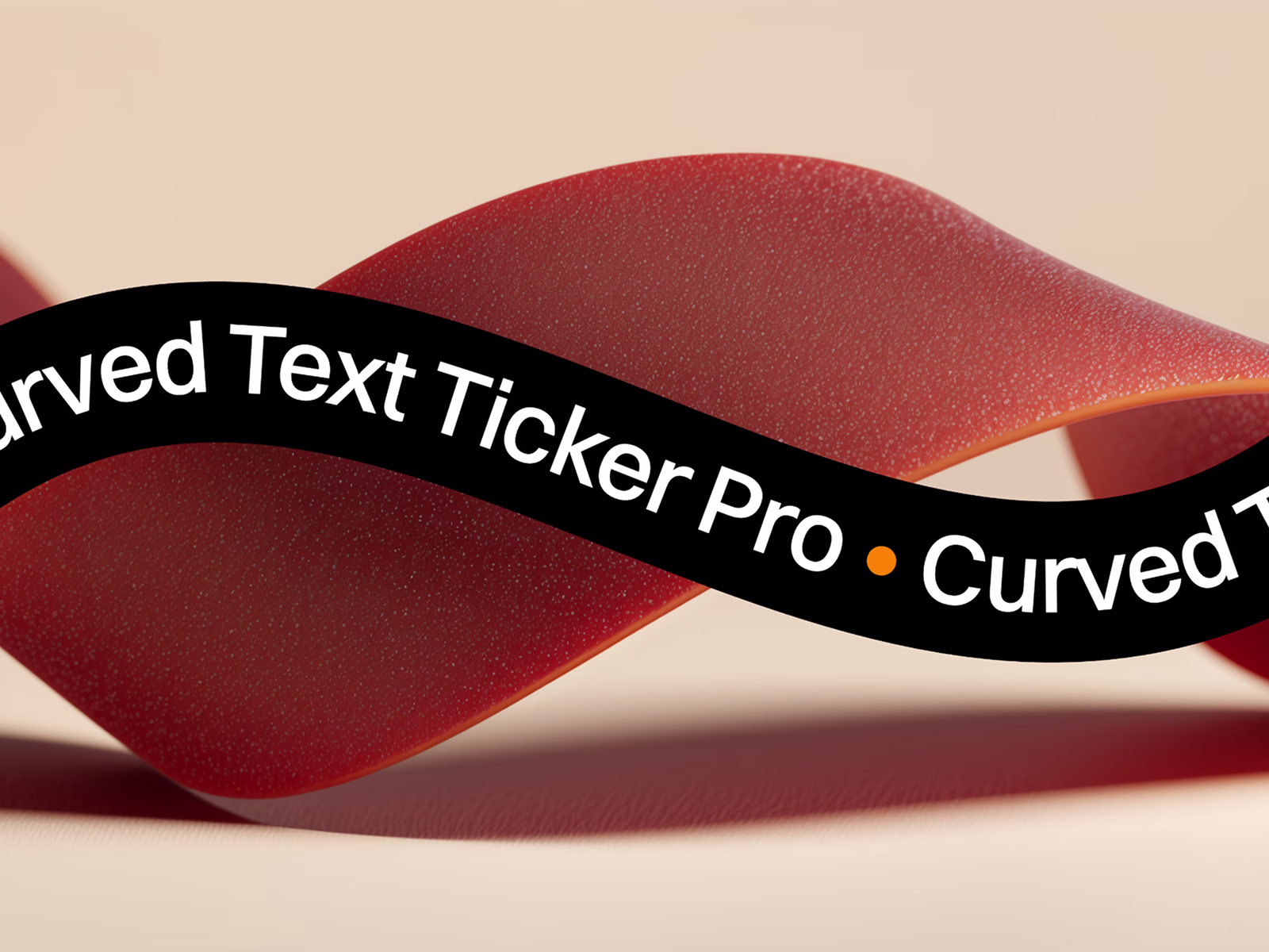
Framer Component: Curved Text Ticker Pro
$12.00
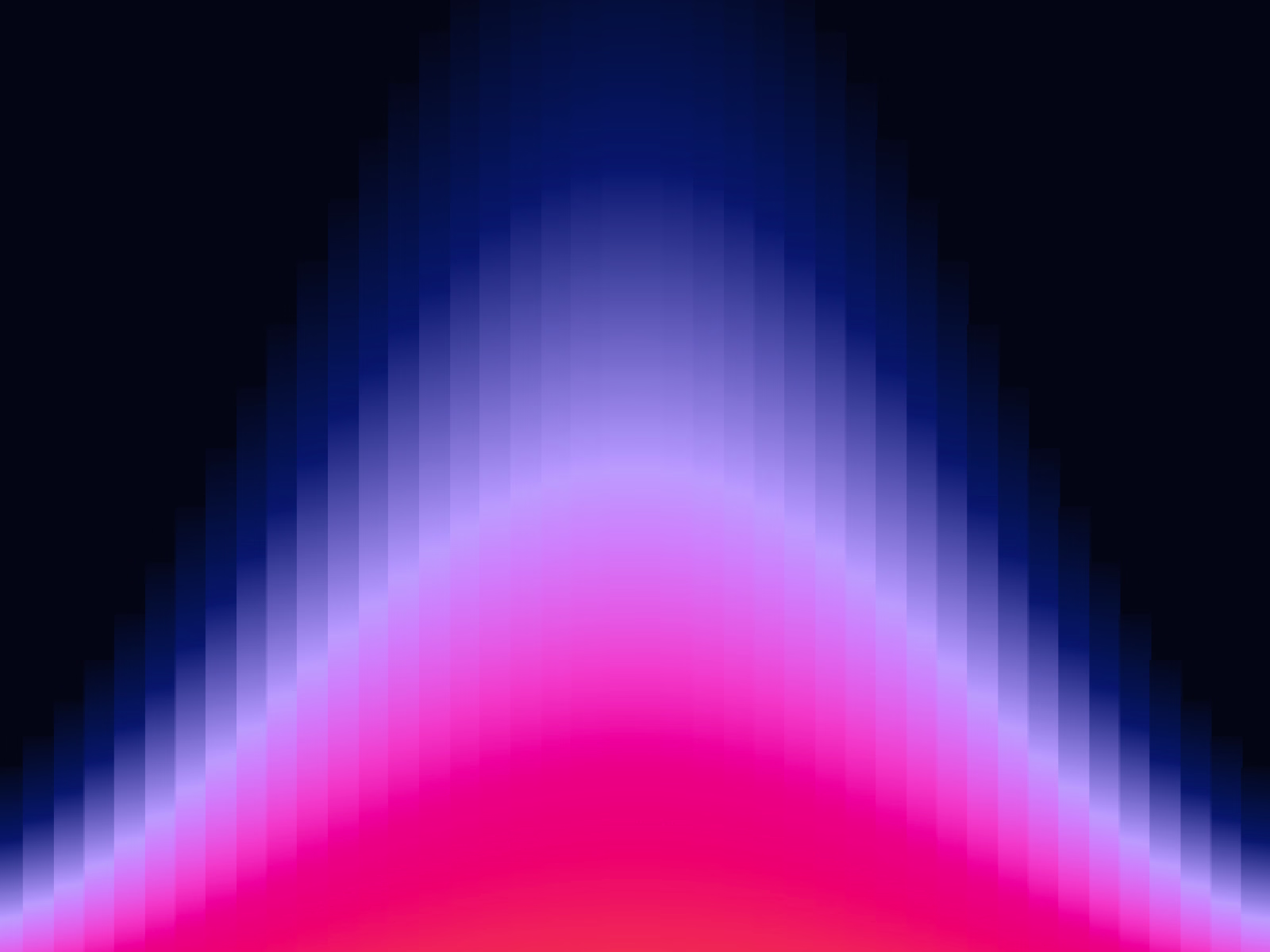
Framer Component: Gradient Strips BG
$12.00
Get it for$12.00
Tags
Framer
Five glow modes, spring physics, magnetic cursor, and glass effects — all in one button component. Drop it in, pick your style, and ship.
About this Component
Glow Button Pro is a CTA button with five distinct glow styles, spring-physics interactions, and enough visual controls to skip the custom component entirely.
Glow modes
Pick one and build from there. Simple adds a soft box-shadow halo. Conic Spin runs a rotating gradient around the edges. Linear pushes a directional glow outward. Blobs places organic radial shapes that shift around the button. None keeps it flat. All five support up to three colors with oklch blending, so gradients stay accurate across the full color range.
Visual layering
On top of whichever glow mode you choose, you can add a gradient ring border, glass effect with backdrop blur, depth gradient fill, specular highlight, and noise texture overlay. Hover triggers a shimmer sweep across the button face.
Interactions
Hover and tap scale with spring physics. The cursor pulls the button magnetically. The glow tracks the mouse position. Text glow and glow boost each activate on hover independently from the base state.
Appear animations
Fade, fade-up, fade-down, or fade with scale — all with stagger support, so a row of buttons sequences instead of popping in at once.
Accessibility
Respects prefers-reduced-motion, has a keyboard focus-visible outline, and renders as a native <button> with optional link behavior.
Controls
Glow Mode / Glow Colors (up to 3) / Outline Mode / Glass Effect / Depth Gradient / Specular Highlight / Noise Texture / Hover Shimmer / Hover Scale / Tap Scale / Magnetic Strength / Glow Follow Mouse / Text Glow on Hover / Glow Boost on Hover / Appear Animation / Stagger Delay / Font
Sanna's other products
Framer Component: Curved Text Ticker Pro
$12.00
Framer Component: Gradient Strips BG
$12.00
$12.00