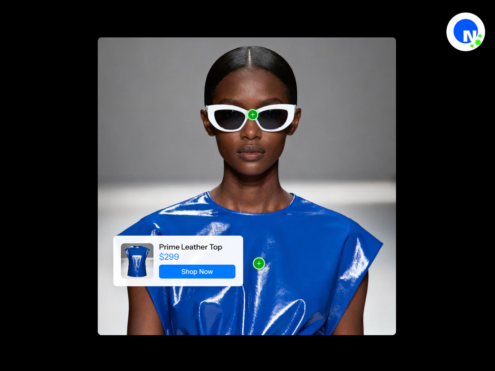
Transform any image or video into an interactive showcase with clickable hotspots revealing product details, pricing, and purchase options—perfect for e-commerce and product tours.
Details
Create engaging product experiences with the interactive hotspot component. Transform static images or dynamic videos into interactive showcases where viewers can click or hover over specific areas to reveal detailed product information, pricing, and purchase options. Each hotspot pulses with customizable animations to draw attention and guide user interaction through a smooth, professional experience.
The component intelligently positions information cards near hotspots while automatically avoiding screen edges and overlaps, ensuring information is always readable and accessible. Each hotspot can also override the automatic placement with a manually set position — left, right, top, or bottom — giving you full control over the layout. With built-in support for both image and video backgrounds, product thumbnails, pricing displays, and call-to-action buttons, you can create complete shopping experiences without leaving the media. Whether you're showcasing products on an eCommerce store, presenting fashion lookbooks, tech product features, video demonstrations, or interior design walkthroughs, this component delivers an intuitive and visually stunning user experience.
Features
Dual media support with image or video backgrounds for versatile presentations
Video playback controls including autoplay, loop, mute, and player controls
Interactive hotspots with pulsing beacon animations for visual attention
Click or hover trigger modes for flexible user interaction
Intelligent card positioning that automatically adapts to available space
Per-hotspot card position override with left, right, top, and bottom options
Customizable hotspot appearance with circle or square shapes
Multiple center icon options including plus, dot, ring, cross, or custom icons
Product cards with thumbnail images, titles, and pricing
Built-in call-to-action buttons with hover effects and external linking
Responsive design with mobile-optimized card placement and centering
Adjustable pulse animations with size, intensity, and speed controls
Static hotspot pulse option for continuous breathing animation
Smooth transitions and animations powered by Framer Motion
Outside-click detection for intuitive card dismissal
Support for multiple hotspots per image/video with unique product details
Fully customizable colors & typography
Customizable mute/unmute button with adjustable size, color, and position
Controls
Media Type & Background
Media Type – Toggle between Image or Video mode
Product Image – Upload the main background image (shown in Image mode)
Video File – Upload video file in MP4, WebM, MOV, or OGG format (shown in Video mode)
Video Poster – Thumbnail image displayed before video loads (Video mode only)
Autoplay – Automatically start video playback (Video mode only)
Loop – Continuously repeat video playback (Video mode only)
Mute Button
Show Mute Button – Toggle the on-screen mute/unmute button (Video mode only)
Mute Button Position – Place the button in any corner of the video (Top Left, Top Right, Bottom Left, Bottom Right)
Mute Button Size – Diameter of the mute button (24–64px)
Mute Icon Color – Color of the speaker icon
Mute Button Background – Background color of the mute button, supports transparency
Hotspots Configuration
Hotspots – Add multiple hotspots with individual settings:
Title – Product or feature name
Price – Product pricing display (optional)
Product Image – Thumbnail image for the information card
X Position – Horizontal placement on the media (0–100%)
Y Position – Vertical placement on the media (0–100%)
CTA Text – Call-to-action button label
Link URL – External link for the CTA button
Card Position – Override automatic card placement for this hotspot (Auto, Left, Right, Top, Bottom). When set to Auto, the card positions itself intelligently based on available space; any other setting locks the card to that side of the hotspot
Hotspot Appearance
Hotspot Color – Primary color for hotspot indicators
Hotspot Size – Diameter of hotspot circles (16–48px)
Hotspot Shape – Choose between Circle or Square
Center Icon – Select icon style (Plus, Dot, Ring, Cross, Custom)
Custom Icon – Upload custom icon image (shown when Custom is selected)
Icon Color – Color of the center icon
Pulse Animation
Pulse Animation – Toggle expanding ring animation
Pulse Size – Maximum scale of the pulse effect (1.2–3x)
Pulse Opacity – Transparency of the pulse ring (0.1–0.8)
Pulse Speed – Animation cycle duration (0.5–5 seconds)
Static Circle Pulse – Toggle breathing animation on the hotspot itself
Static Pulse Size – Scale of the breathing effect (1.05–1.3x)
Static Pulse Speed – Breathing animation duration (0.5–3 seconds)
Interaction
Show Card On – Choose Click or Hover trigger mode
Card Styling
Card Background – Background color for information cards
Card Text – Text color for information cards
Card Font – Typography settings for card content
Title Font – Typography settings for product titles
Price Font – Typography settings for pricing
Price Color – Color for price text
Card Max Width – Maximum card width (200–400px)
Button Styling
CTA Button Color – Default button background color
CTA Button Hover Color – Button color on hover
CTA Button Text Color – Default button text color
CTA Button Hover Text Color – Button text color on hover
CTA Button Font – Typography settings for button text
Animation
Animation Duration – Speed of card transitions (0.1–1 seconds)
Perfect For
E-Commerce & Shopping
Product showcases and lookbooks with shoppable items
Fashion outfit breakdowns on model videos or photos
Jewelry close-ups with clickable gemstone details
Unboxing videos with product feature callouts
Product comparison displays with side-by-side details
Video Demonstrations
Tech product feature highlights during demo videos
Software walkthrough videos with feature explanations
Cooking videos with ingredient and equipment details
Tutorial videos with tool and material callouts
Fitness videos highlighting specific exercises or equipment
Real Estate & Interior Design
Property tour videos with room feature highlights
Interior design room tours with furniture details
Virtual staging with shoppable furniture links
Renovation before/after videos with product details
Architectural walkthroughs with material specifications
Marketing & Presentations
Interactive infographics and educational diagrams
Portfolio presentations with project breakdowns
Event space layouts with vendor information
Trade show booth tours with product details
Brand story videos with milestone highlights
Travel & Hospitality
Travel guides with location highlights
Hotel room tours with amenity details
Restaurant menu items on preparation videos
Destination videos with attraction information
Resort facility tours with activity details
Education & Culture
Museum exhibitions with artifact information
Educational videos with concept explanations
Historical site tours with contextual information
Art gallery tours with artist details
Workspace tours highlighting equipment and tools
Beauty & Fashion
Makeup tutorial videos with product details
Skincare routine videos with step-by-step products
Hair styling videos with tool and product info
Fashion show videos with designer collection details
Behind-the-scenes videos with gear and setup info
Policy
Due to the nature of digital products, this product is non-refundable. We encourage you to read all the details, view and explore the product as much as you need prior to purchase.
Contact
For any questions or support, email support@netbloom.dev - we're here to help.
Get it for$10.00
Tags
Framer
Framer Designer
Framer Developer
Product created by
Netbloom 🌺 United States
- 9
- Followers
Netbloom's other products
Stories Slideshow | Framer Component
$10.00
Pro Music Player | Framer Component
$10.00
Get it for$10.00
Tags
Framer
Framer Designer
Framer Developer
Transform any image or video into an interactive showcase with clickable hotspots revealing product details, pricing, and purchase options—perfect for e-commerce and product tours.
Details
Create engaging product experiences with the interactive hotspot component. Transform static images or dynamic videos into interactive showcases where viewers can click or hover over specific areas to reveal detailed product information, pricing, and purchase options. Each hotspot pulses with customizable animations to draw attention and guide user interaction through a smooth, professional experience.
The component intelligently positions information cards near hotspots while automatically avoiding screen edges and overlaps, ensuring information is always readable and accessible. Each hotspot can also override the automatic placement with a manually set position — left, right, top, or bottom — giving you full control over the layout. With built-in support for both image and video backgrounds, product thumbnails, pricing displays, and call-to-action buttons, you can create complete shopping experiences without leaving the media. Whether you're showcasing products on an eCommerce store, presenting fashion lookbooks, tech product features, video demonstrations, or interior design walkthroughs, this component delivers an intuitive and visually stunning user experience.
Features
Dual media support with image or video backgrounds for versatile presentations
Video playback controls including autoplay, loop, mute, and player controls
Interactive hotspots with pulsing beacon animations for visual attention
Click or hover trigger modes for flexible user interaction
Intelligent card positioning that automatically adapts to available space
Per-hotspot card position override with left, right, top, and bottom options
Customizable hotspot appearance with circle or square shapes
Multiple center icon options including plus, dot, ring, cross, or custom icons
Product cards with thumbnail images, titles, and pricing
Built-in call-to-action buttons with hover effects and external linking
Responsive design with mobile-optimized card placement and centering
Adjustable pulse animations with size, intensity, and speed controls
Static hotspot pulse option for continuous breathing animation
Smooth transitions and animations powered by Framer Motion
Outside-click detection for intuitive card dismissal
Support for multiple hotspots per image/video with unique product details
Fully customizable colors & typography
Customizable mute/unmute button with adjustable size, color, and position
Controls
Media Type & Background
Media Type – Toggle between Image or Video mode
Product Image – Upload the main background image (shown in Image mode)
Video File – Upload video file in MP4, WebM, MOV, or OGG format (shown in Video mode)
Video Poster – Thumbnail image displayed before video loads (Video mode only)
Autoplay – Automatically start video playback (Video mode only)
Loop – Continuously repeat video playback (Video mode only)
Mute Button
Show Mute Button – Toggle the on-screen mute/unmute button (Video mode only)
Mute Button Position – Place the button in any corner of the video (Top Left, Top Right, Bottom Left, Bottom Right)
Mute Button Size – Diameter of the mute button (24–64px)
Mute Icon Color – Color of the speaker icon
Mute Button Background – Background color of the mute button, supports transparency
Hotspots Configuration
Hotspots – Add multiple hotspots with individual settings:
Title – Product or feature name
Price – Product pricing display (optional)
Product Image – Thumbnail image for the information card
X Position – Horizontal placement on the media (0–100%)
Y Position – Vertical placement on the media (0–100%)
CTA Text – Call-to-action button label
Link URL – External link for the CTA button
Card Position – Override automatic card placement for this hotspot (Auto, Left, Right, Top, Bottom). When set to Auto, the card positions itself intelligently based on available space; any other setting locks the card to that side of the hotspot
Hotspot Appearance
Hotspot Color – Primary color for hotspot indicators
Hotspot Size – Diameter of hotspot circles (16–48px)
Hotspot Shape – Choose between Circle or Square
Center Icon – Select icon style (Plus, Dot, Ring, Cross, Custom)
Custom Icon – Upload custom icon image (shown when Custom is selected)
Icon Color – Color of the center icon
Pulse Animation
Pulse Animation – Toggle expanding ring animation
Pulse Size – Maximum scale of the pulse effect (1.2–3x)
Pulse Opacity – Transparency of the pulse ring (0.1–0.8)
Pulse Speed – Animation cycle duration (0.5–5 seconds)
Static Circle Pulse – Toggle breathing animation on the hotspot itself
Static Pulse Size – Scale of the breathing effect (1.05–1.3x)
Static Pulse Speed – Breathing animation duration (0.5–3 seconds)
Interaction
Show Card On – Choose Click or Hover trigger mode
Card Styling
Card Background – Background color for information cards
Card Text – Text color for information cards
Card Font – Typography settings for card content
Title Font – Typography settings for product titles
Price Font – Typography settings for pricing
Price Color – Color for price text
Card Max Width – Maximum card width (200–400px)
Button Styling
CTA Button Color – Default button background color
CTA Button Hover Color – Button color on hover
CTA Button Text Color – Default button text color
CTA Button Hover Text Color – Button text color on hover
CTA Button Font – Typography settings for button text
Animation
Animation Duration – Speed of card transitions (0.1–1 seconds)
Perfect For
E-Commerce & Shopping
Product showcases and lookbooks with shoppable items
Fashion outfit breakdowns on model videos or photos
Jewelry close-ups with clickable gemstone details
Unboxing videos with product feature callouts
Product comparison displays with side-by-side details
Video Demonstrations
Tech product feature highlights during demo videos
Software walkthrough videos with feature explanations
Cooking videos with ingredient and equipment details
Tutorial videos with tool and material callouts
Fitness videos highlighting specific exercises or equipment
Real Estate & Interior Design
Property tour videos with room feature highlights
Interior design room tours with furniture details
Virtual staging with shoppable furniture links
Renovation before/after videos with product details
Architectural walkthroughs with material specifications
Marketing & Presentations
Interactive infographics and educational diagrams
Portfolio presentations with project breakdowns
Event space layouts with vendor information
Trade show booth tours with product details
Brand story videos with milestone highlights
Travel & Hospitality
Travel guides with location highlights
Hotel room tours with amenity details
Restaurant menu items on preparation videos
Destination videos with attraction information
Resort facility tours with activity details
Education & Culture
Museum exhibitions with artifact information
Educational videos with concept explanations
Historical site tours with contextual information
Art gallery tours with artist details
Workspace tours highlighting equipment and tools
Beauty & Fashion
Makeup tutorial videos with product details
Skincare routine videos with step-by-step products
Hair styling videos with tool and product info
Fashion show videos with designer collection details
Behind-the-scenes videos with gear and setup info
Policy
Due to the nature of digital products, this product is non-refundable. We encourage you to read all the details, view and explore the product as much as you need prior to purchase.
Contact
For any questions or support, email support@netbloom.dev - we're here to help.
Netbloom's other products
Stories Slideshow | Framer Component
$10.00
Pro Music Player | Framer Component
$10.00
$10.00