
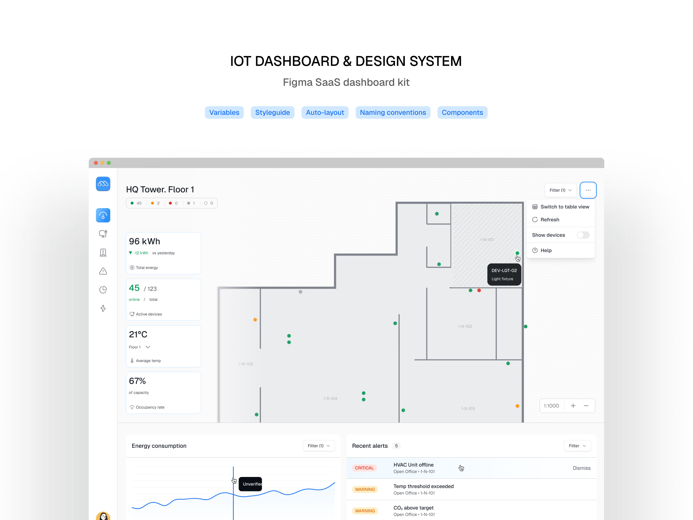
A Figma dashboard kit built the way I build client design systems: tokens first, components second, screens last.
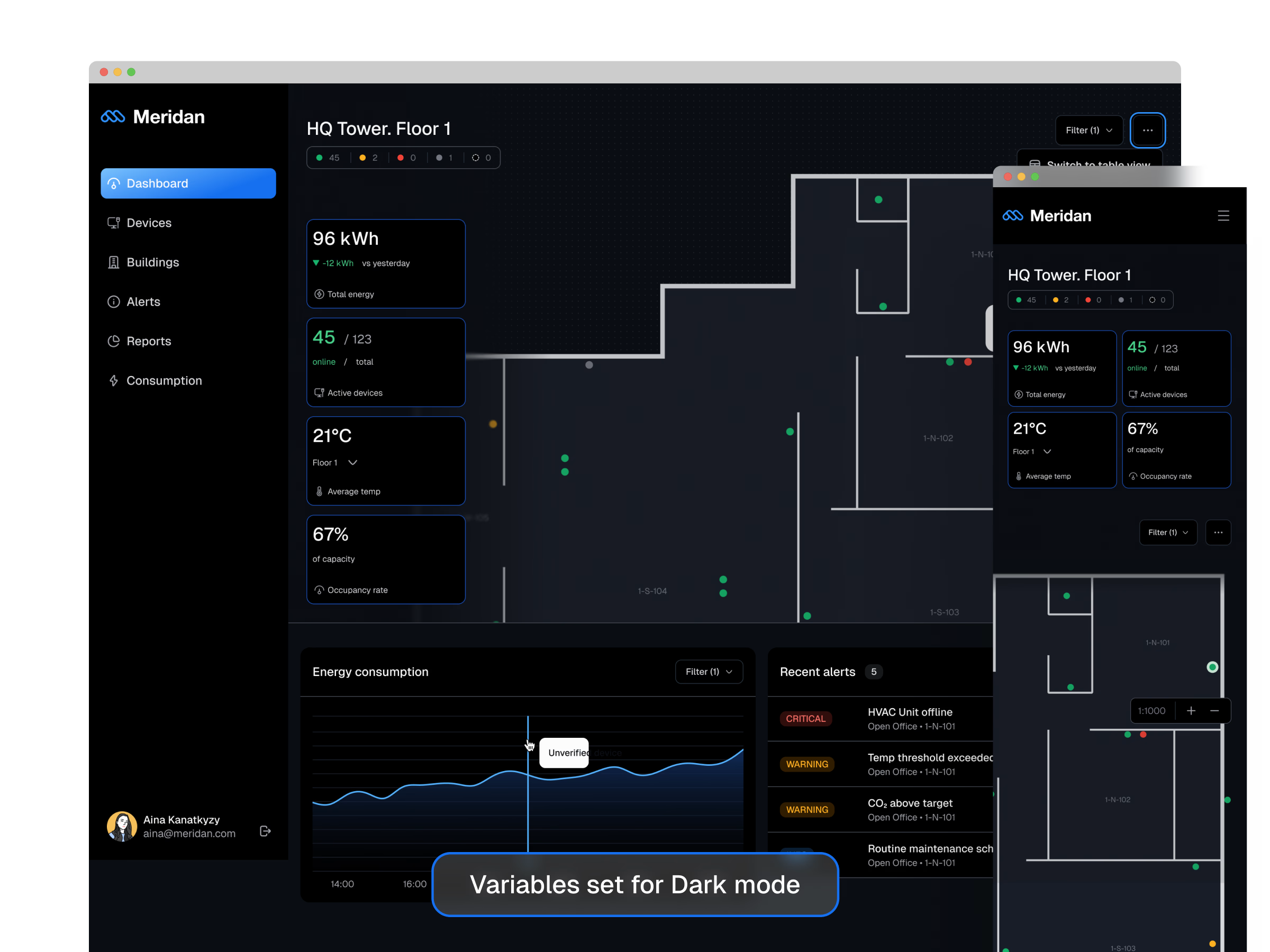
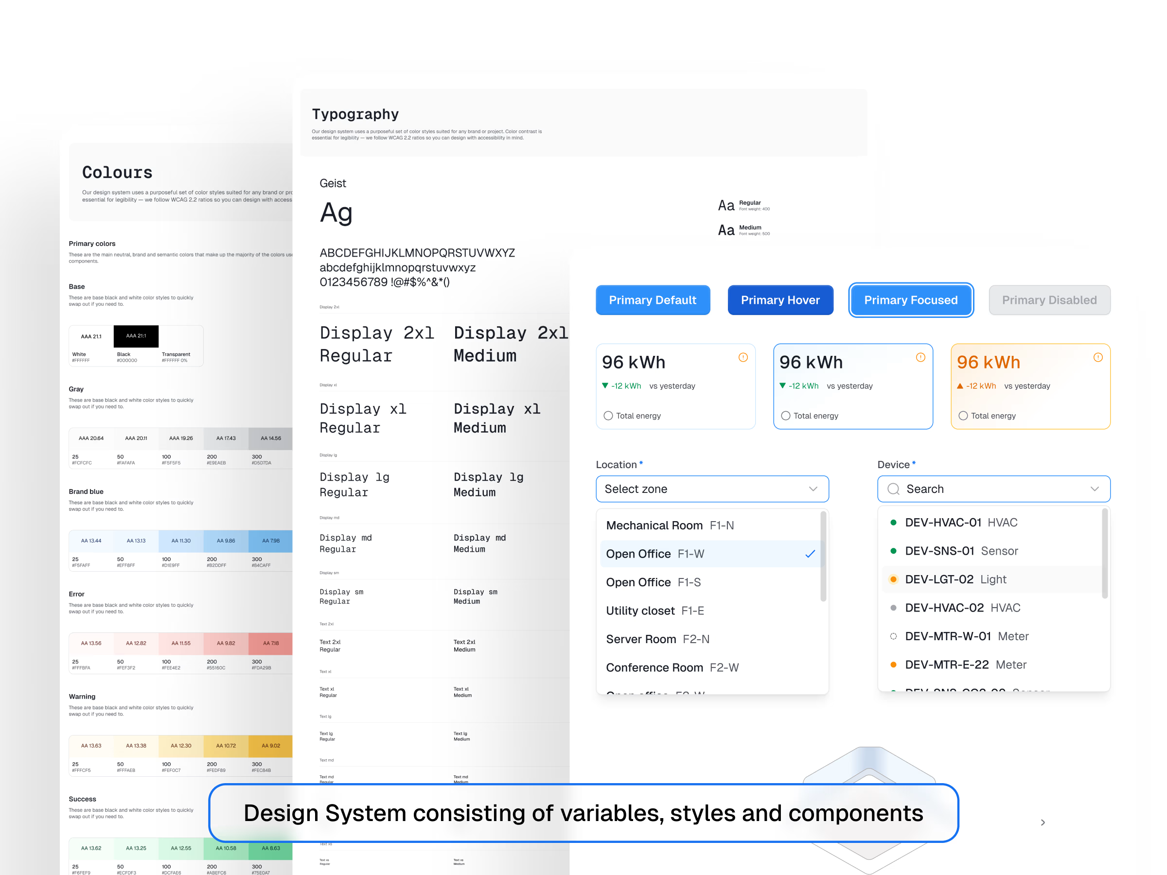
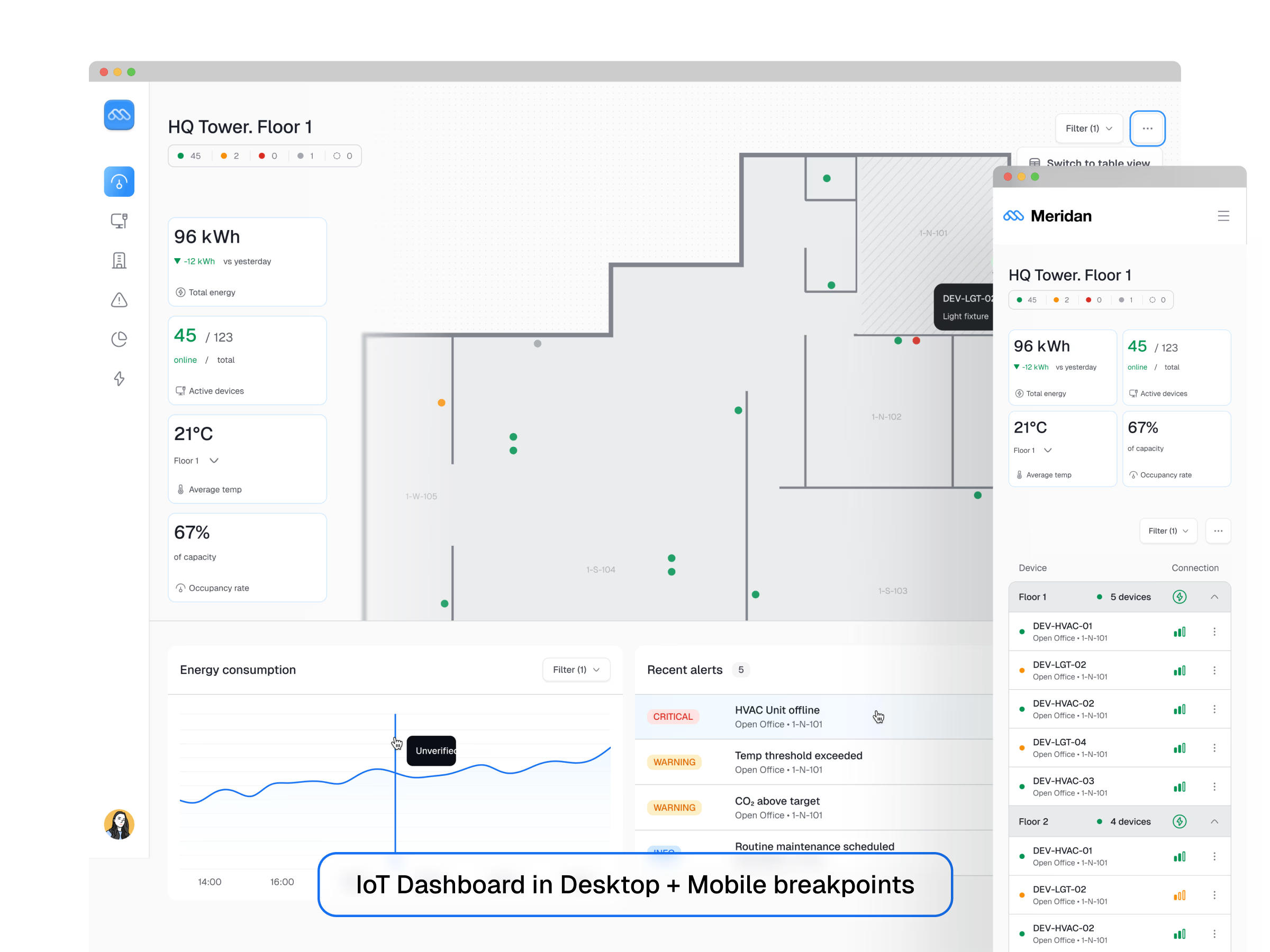
Includes dashboard screens across desktop, mobile, light, and dark mode. Full component library and a complete token architecture underneath — color, typography, spacing, radius, shadow.
This kit doubles as a sample of how I approach design systems for clients: semantic variables, auto-layout throughout, clear naming conventions, documentation included.
Good fit for: teams starting a new SaaS product, founders who need a fast dashboard base, or anyone who wants to study a production-structured Figma file.
If you like the system thinking here, this is the same approach I bring to client design system and UX audit work — happy to talk if you're building something similar.
Get it for$0.00
Meridan Lite
$0.00
SaaS Dashboard Lite is a free glimpse at the result. You will get 4 IoT dashboards screens (table and floor plan view) in light and dark mode.
Tags
Design System
SaaS Dashboard
Product created by
Aina Kanatkyzy proKazakhstan
- $25k+
- Earned
- 14
- Paid projects
- 4.90
- Rating
- 138
- Followers
Aina's other products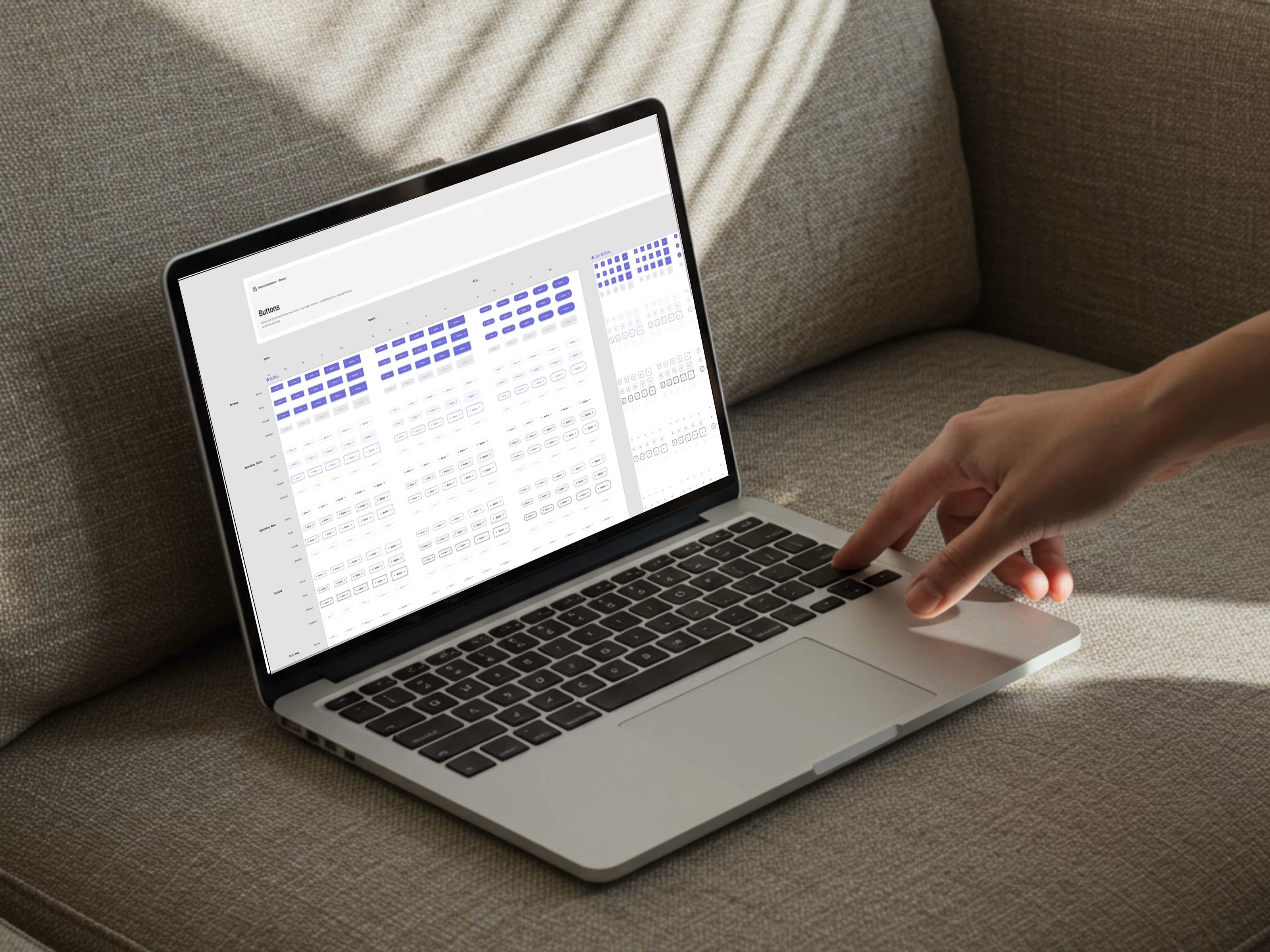
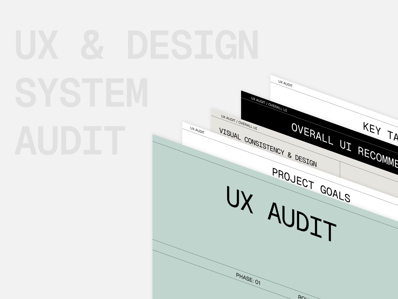
Design Strategy Call
$150.00
UX Quick Win
$450.00
Get it for$0.00
Meridan Lite
$0.00
SaaS Dashboard Lite is a free glimpse at the result. You will get 4 IoT dashboards screens (table and floor plan view) in light and dark mode.
Tags
Design System
SaaS Dashboard
A Figma dashboard kit built the way I build client design systems: tokens first, components second, screens last.
Includes dashboard screens across desktop, mobile, light, and dark mode. Full component library and a complete token architecture underneath — color, typography, spacing, radius, shadow.
This kit doubles as a sample of how I approach design systems for clients: semantic variables, auto-layout throughout, clear naming conventions, documentation included.
Good fit for: teams starting a new SaaS product, founders who need a fast dashboard base, or anyone who wants to study a production-structured Figma file.
If you like the system thinking here, this is the same approach I bring to client design system and UX audit work — happy to talk if you're building something similar.
Aina's other products
Design Strategy Call
$150.00
UX Quick Win
$450.00
$0.00