
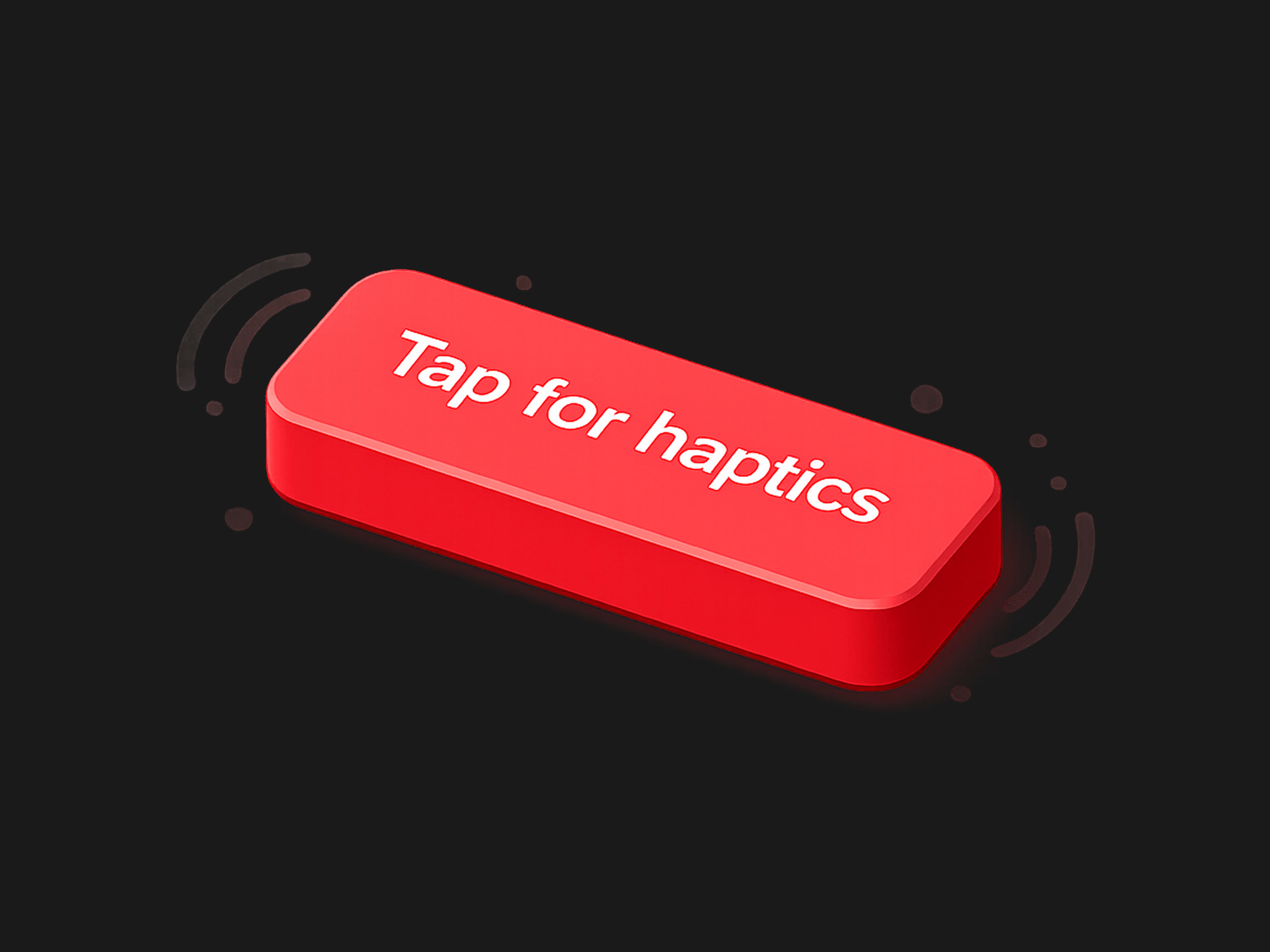
Take your Framer projects to the next level with the Mobile Haptic Button, designed specifically to give your mobile layouts a premium, native-app feel.
How It Works
This component harnesses the power of the
web-haptics library and Framer Motion to deliver a multisensory interaction:Visual Feedback: When a user hovers or taps, the button responds with a highly refined spring animation (adjusting scale and colors dynamically) so it feels alive and responsive.
Tactile Feedback: On tap, it triggers the mobile device's native vibration motor using the Web Vibration API.
Graceful Degradation: If the user is on a desktop or a device that doesn't support web vibrations, the button still functions perfectly as a beautifully animated, standard button.
Whether you want a subtle click or a complex double-pulse alert, the built-in property controls let you dial in the exact feel without touching a single line of code.
Property Details
The component exposes a comprehensive suite of Framer property controls, organized for rapid customization:
Content & Events
Text: The label displayed on your button (Default: "Tap me").
On Tap: Standard Framer event handler to trigger navigation, overlays, or state changes when the button is clicked.
Styling & Layout
Typography: Full native Framer text controls to match your brand's font, weight, and sizing.
Padding: Adjust the inner spacing of the button natively.
Radius: Control the corner roundness, from sharp edges to fully pill-shaped.
Background: The default background color.
Text Color: The default text color.
Interactive States (Framer Motion)
Hover BG: The background color the button transitions to on hover.
Hover Text: The text color the button transitions to on hover.
Hover Scale: How much the button grows or shrinks on hover (Default: 1.05).
Tap Scale: How much the button compresses when physically pressed (Default: 0.95).
Haptic Engine Settings
Haptic: Choose from carefully calibrated presets:
Light Tap: A quick, 15ms micro-interaction.
Medium Tap: A standard, 30ms confirmation click.
Heavy Tap: A solid, 50ms tactile thud.
Custom 2-Step: Unlocks advanced controls to build your own custom vibration pattern.
Custom Settings (Visible only when "Custom 2-Step" is selected):
Duration 1: The length of the first vibration pulse (in milliseconds).
Delay: The pause between the first and second pulse.
Duration 2: The length of the second vibration pulse.
Intensity: The strength of the second pulse (ranges from 0.0 to 1.0).
Get it for$3.00
Tags
Framer


framer component
framer marketplace
Product created by
Agustin Dell Aquila maxPalermo, Argentina
- $10k+
- Earned
- 27
- Paid projects
- 5.00
- Rating
- 528
- Followers
Agustin's other products
Prefab – Modular Architecture | Framer Template
$49.00
Multi-Purpose Form
$10.00
Get it for$3.00
Tags
Framer
framer component
framer marketplace
Take your Framer projects to the next level with the Mobile Haptic Button, designed specifically to give your mobile layouts a premium, native-app feel.
How It Works
This component harnesses the power of the
web-haptics library and Framer Motion to deliver a multisensory interaction:Visual Feedback: When a user hovers or taps, the button responds with a highly refined spring animation (adjusting scale and colors dynamically) so it feels alive and responsive.
Tactile Feedback: On tap, it triggers the mobile device's native vibration motor using the Web Vibration API.
Graceful Degradation: If the user is on a desktop or a device that doesn't support web vibrations, the button still functions perfectly as a beautifully animated, standard button.
Whether you want a subtle click or a complex double-pulse alert, the built-in property controls let you dial in the exact feel without touching a single line of code.
Property Details
The component exposes a comprehensive suite of Framer property controls, organized for rapid customization:
Content & Events
Text: The label displayed on your button (Default: "Tap me").
On Tap: Standard Framer event handler to trigger navigation, overlays, or state changes when the button is clicked.
Styling & Layout
Typography: Full native Framer text controls to match your brand's font, weight, and sizing.
Padding: Adjust the inner spacing of the button natively.
Radius: Control the corner roundness, from sharp edges to fully pill-shaped.
Background: The default background color.
Text Color: The default text color.
Interactive States (Framer Motion)
Hover BG: The background color the button transitions to on hover.
Hover Text: The text color the button transitions to on hover.
Hover Scale: How much the button grows or shrinks on hover (Default: 1.05).
Tap Scale: How much the button compresses when physically pressed (Default: 0.95).
Haptic Engine Settings
Haptic: Choose from carefully calibrated presets:
Light Tap: A quick, 15ms micro-interaction.
Medium Tap: A standard, 30ms confirmation click.
Heavy Tap: A solid, 50ms tactile thud.
Custom 2-Step: Unlocks advanced controls to build your own custom vibration pattern.
Custom Settings (Visible only when "Custom 2-Step" is selected):
Duration 1: The length of the first vibration pulse (in milliseconds).
Delay: The pause between the first and second pulse.
Duration 2: The length of the second vibration pulse.
Intensity: The strength of the second pulse (ranges from 0.0 to 1.0).
Agustin's other products
Prefab – Modular Architecture | Framer Template
$49.00
Multi-Purpose Form
$10.00
$3.00