Trez Case Study

Charly Agency
Presentation Designer
Web Designer
Web Developer
Figma
Webflow
Key Services
Branding, Strategy, Content Writing, Web Design, Development
Description
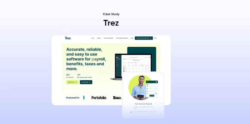
We created a visually engaging and user-centric website for Trez, focusing on showcasing their comprehensive and easy-to-use software solutions for payroll, benefits, taxes, and more. We emphasized the brand's full-service payroll, benefits management, and simplified finance and compliance processes.
Branding Work
Logo Design

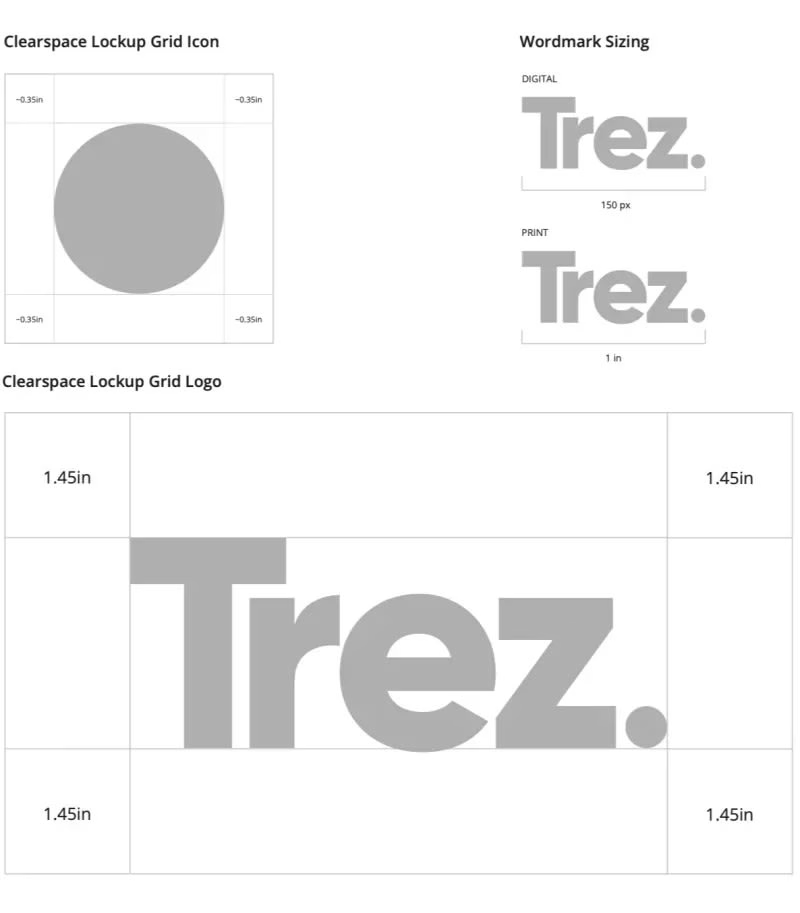
Logo Clearspace
Clear space is the area surrounding our logo that must be kept free of any text or graphic elements. The logo should be sufficiently large to maintain readability across all applications, with minimum size requirements specified.
It is sometimes necessary to resize the logo depending on the print area. While sizes beyond the minimum are acceptable, maintain consistent proportions between the logo and accompanying text. It's recommended that the wordmark size be 50% of the logo's total height.

Wordmark Sizing
It is sometimes necessary to resize the logo depending on the print area. While sizes beyond the minimum are acceptable, maintain consistent proportions between the logo and accompanying text. It's recommended that the wordmark size be 50% of the logo's total height.
Monochrome
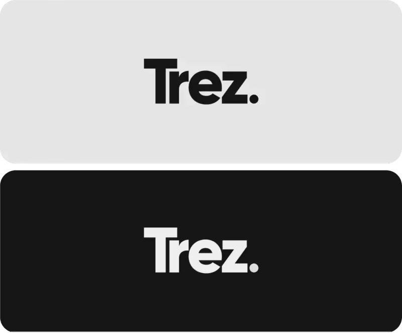
Monochrome logos help to reinforce elements of the design. This helps to make the logo stand out and create brand recognition. It is also used to lower the cost of printing, for scanning and faxing purposes, and for partnerships and collaborations.
Photography
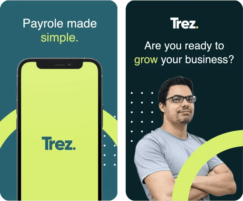
Photography helps to tell the brand's story. By presenting compelling imagery, you enable your audience to forge connections and foster trust in the brand.

Tone of Voice
Consider the brand's tone of voice across all channels, including print and digital. It serves as the personality through which the audience connects with the brand.
Stationery
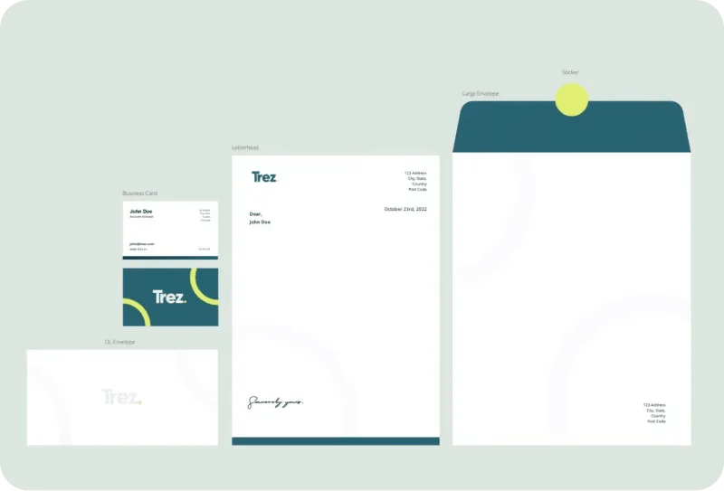
The stationery set utilizes the brand colors. Special print finishes such as foiling of the logo and duplexing the business card are recommended.
Email Signature
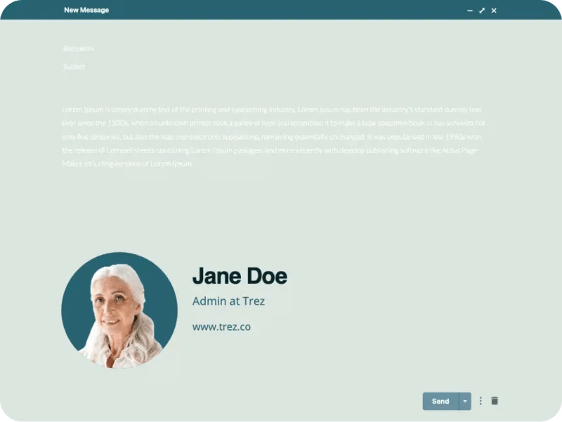
The email signature is designed to maintain consistency across all departments, ensuring a unified representation of the brand. Additional statements or taglines are not allowed in the template to uphold this consistency.
Social Media
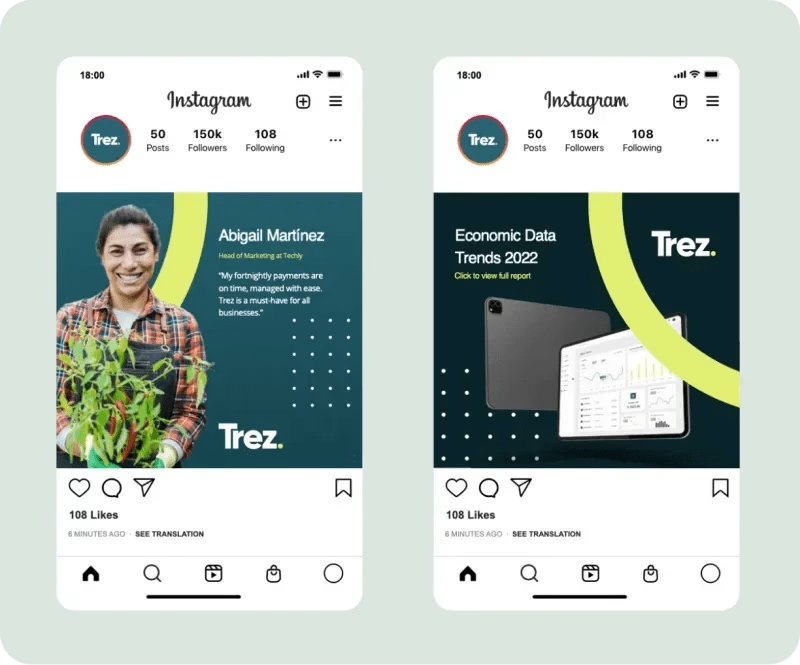
In addition to the brand package, we developed guidelines for crafting social media posts for Trez. These guidelines outline the types of content that add value to their audience, accompanied by visual examples demonstrating how to create these posts.
Slide Deck
Slide Deck

Global Design System
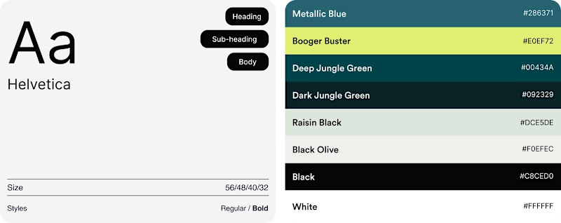
Our design system, curated for Trez, embodies the brand's vision through a consistent primary color palette and meticulous color hierarchy. Exclusively utilizing the Inter font ensures clarity, readability, and a contemporary aesthetic. This choice creates a cohesive design language, delivering a visually pleasing experience across all pages on the Trez website
Web Design
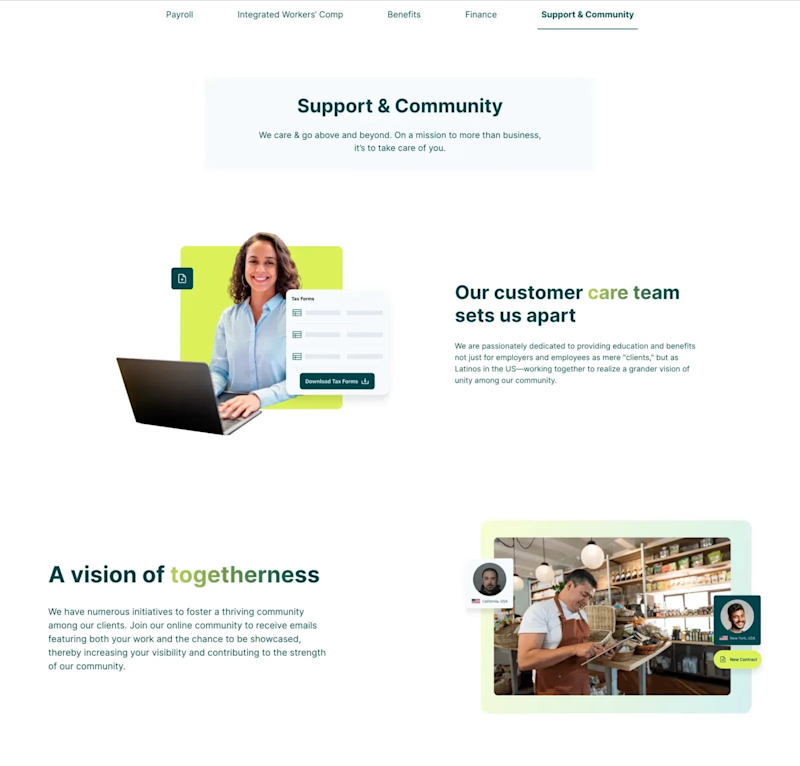
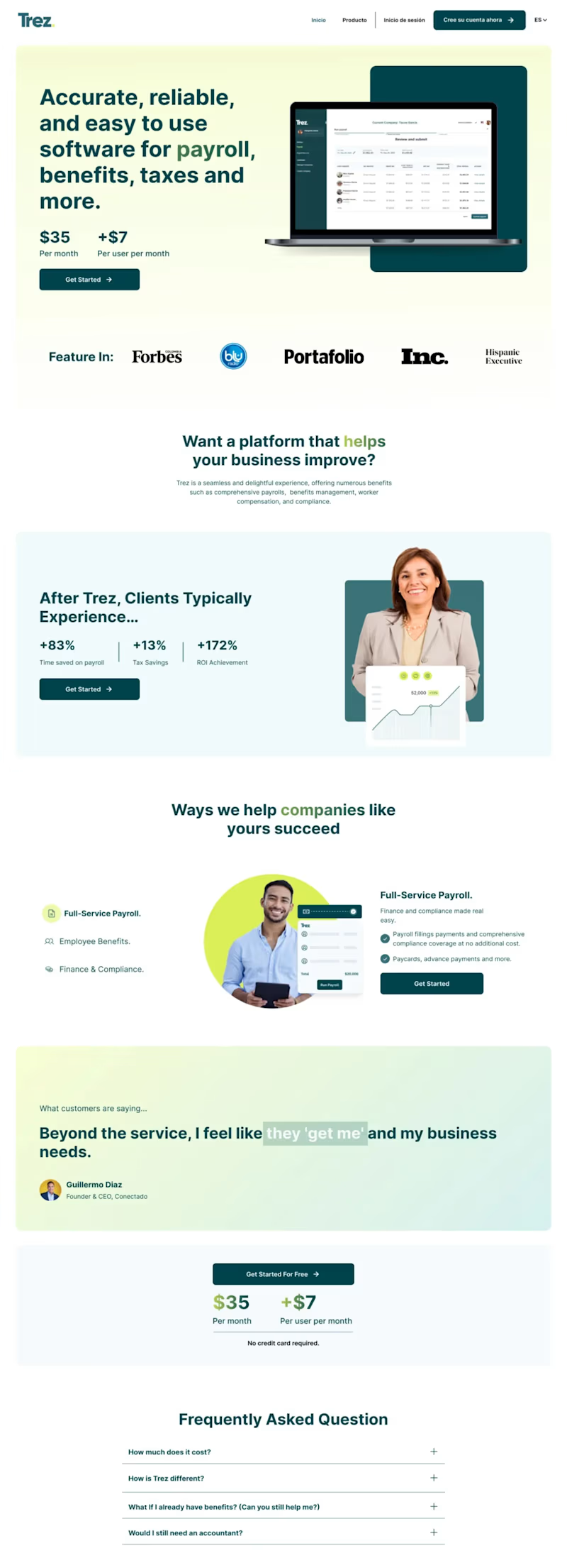
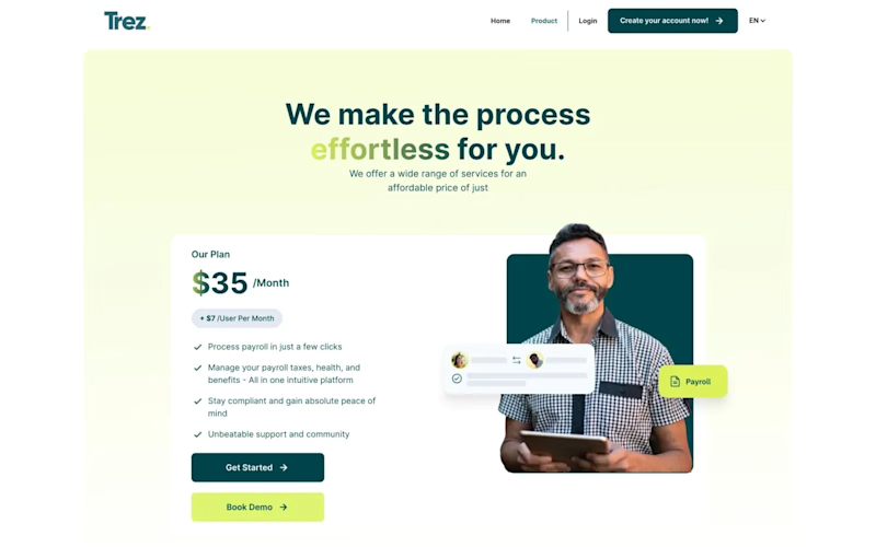
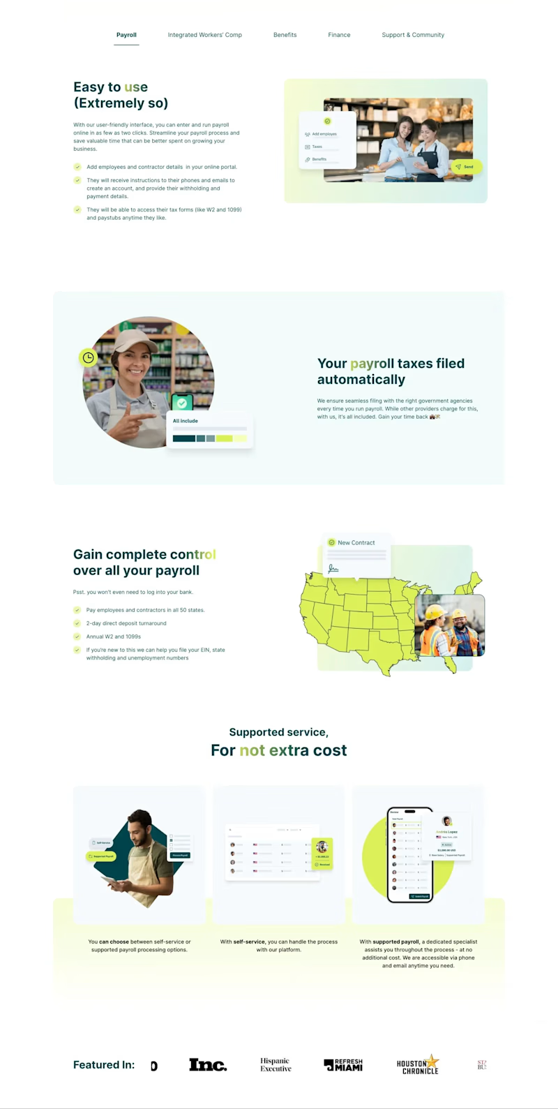
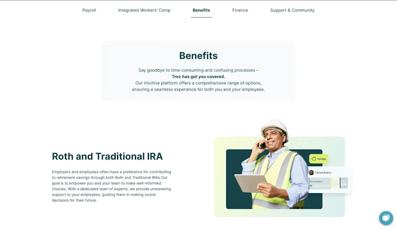
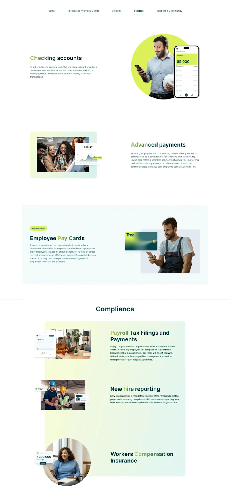
In shaping Trez's web design, our focus was on delivering seamless user experiences. The design prioritizes intuitive navigation, visually compelling layouts, and purposeful color choices, mirroring the brand's modern essence. This approach guarantees a user-friendly interface that captivates while remaining aligned with Trez's vision, establishing a new standard in the digital landscape.
Homepage
Product
Header
Payroll Tab
Benefits
Finance
Support & Community
