Complete Overhaul of Investor Pitch Deck to Improve Clarity
Ora Mogale
THE PROBLEM
The client sought design improvements for their existing investor pitch deck, feeling it lacked energy and visual appeal. Basic design elements were used, making the presentation feel flat and uninspiring. "The slides are overcrowded with text,which i fear would overwhelm the audience and detract them from the visual engagement"- Client
THE SOLUTION
I gave the original presentation a complete facelift by incorporating visually engaging design elements. The content was streamlined to be more digestible, focusing on a business presentation rather than an overload of information. We reduced repetitions and minimized the potential for overwhelming the audience. This was achieved through the use of impactful visual imagery, such as infographics and custom graphics.
BEFORE
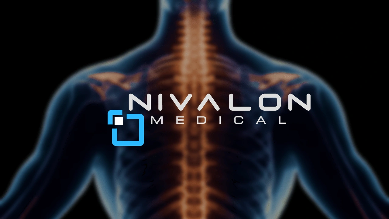
AFTER

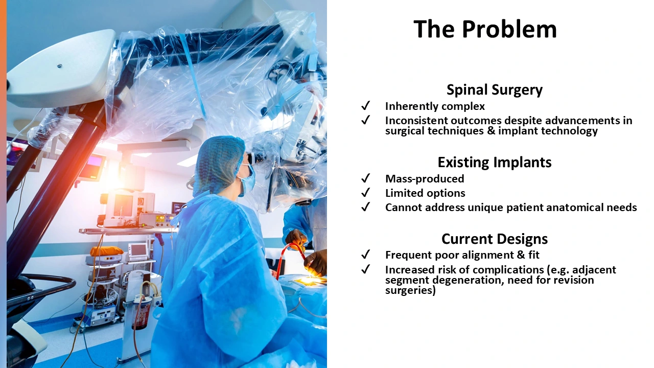
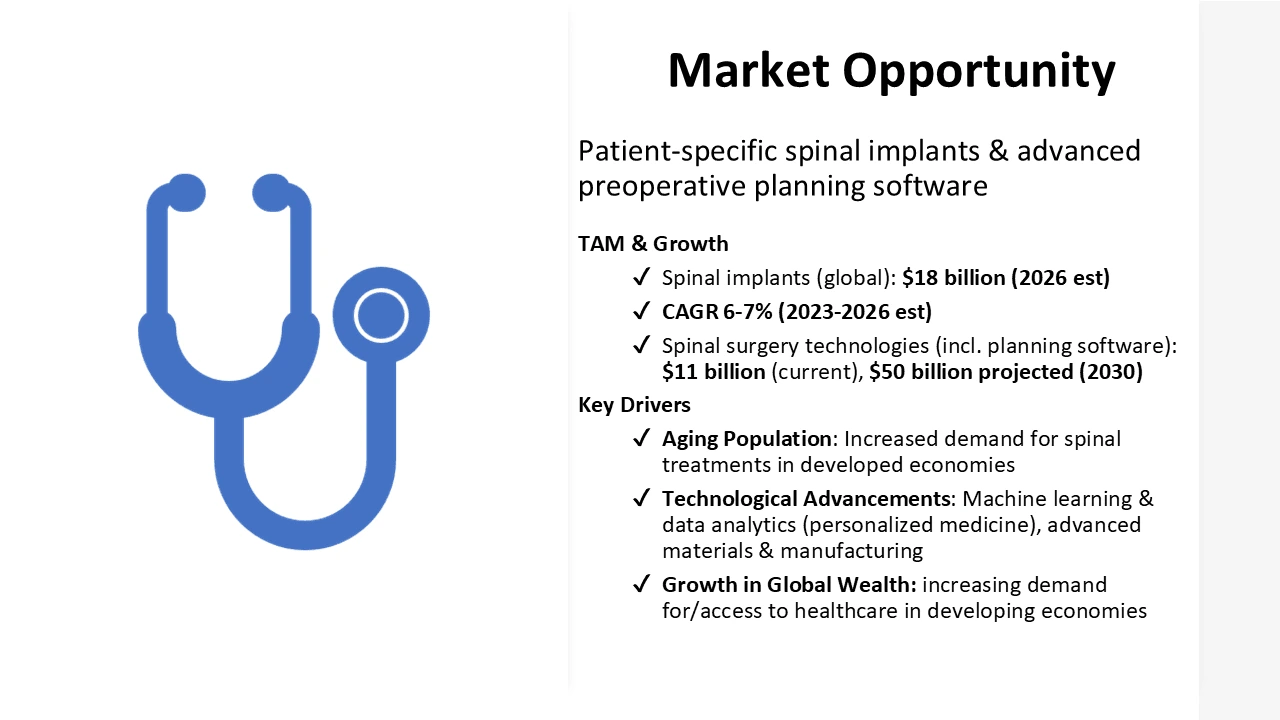
BEFORE, As you can see a generic slide was presented. We have no engaging visual elements expect the generic adobe stock photo on the right

AFTER, with just a few adjustments we've created depth. We have a background relevant to the theme, the company's logo on the bottom right corner to create the brand identity. A more aesthetically pleasing figure was added, it still focuses on the spine as you can see above.
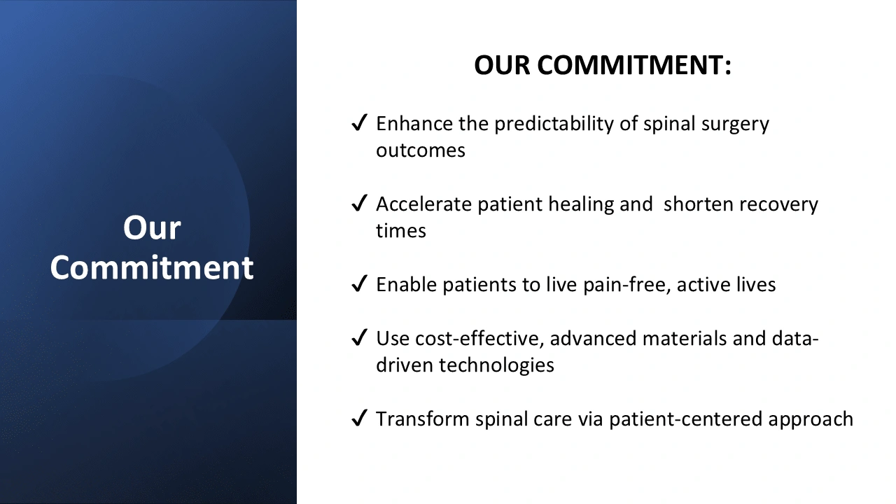
BEFORE
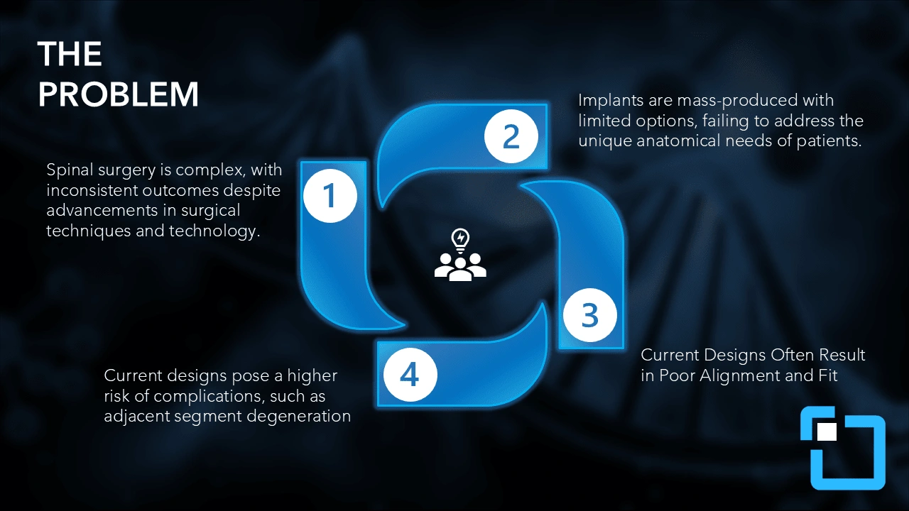
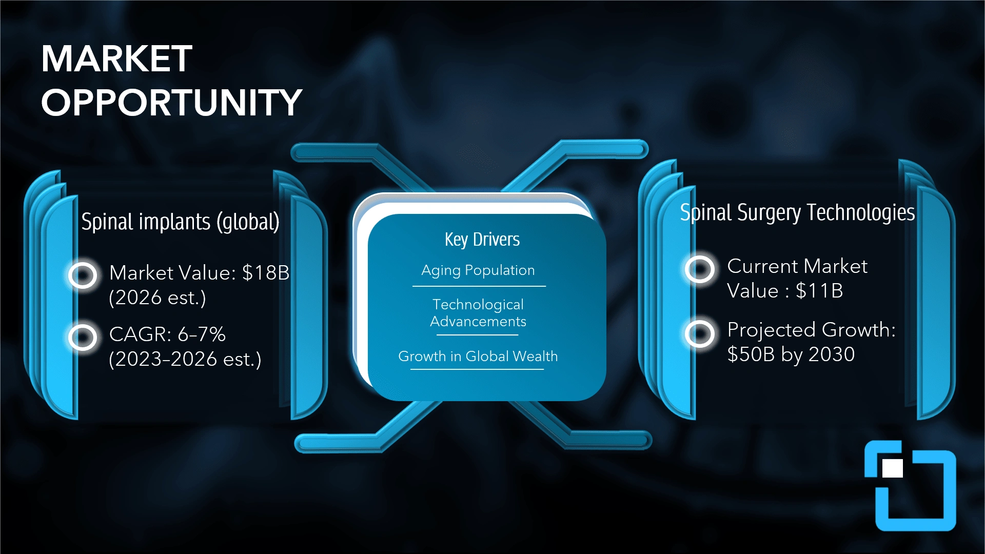
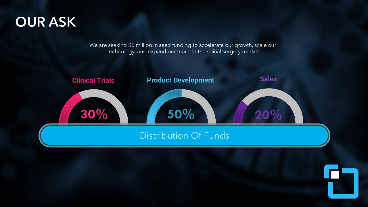
AFTER, an infographic with unique icons was introduced. Content is more engaging.
BEFORE
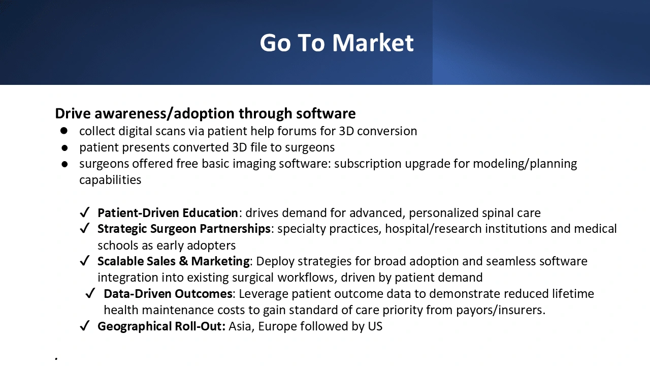
AFTER, visual improvement from generic original which lacked life.
BEFORE
AFTER
BEFORE
AFTER
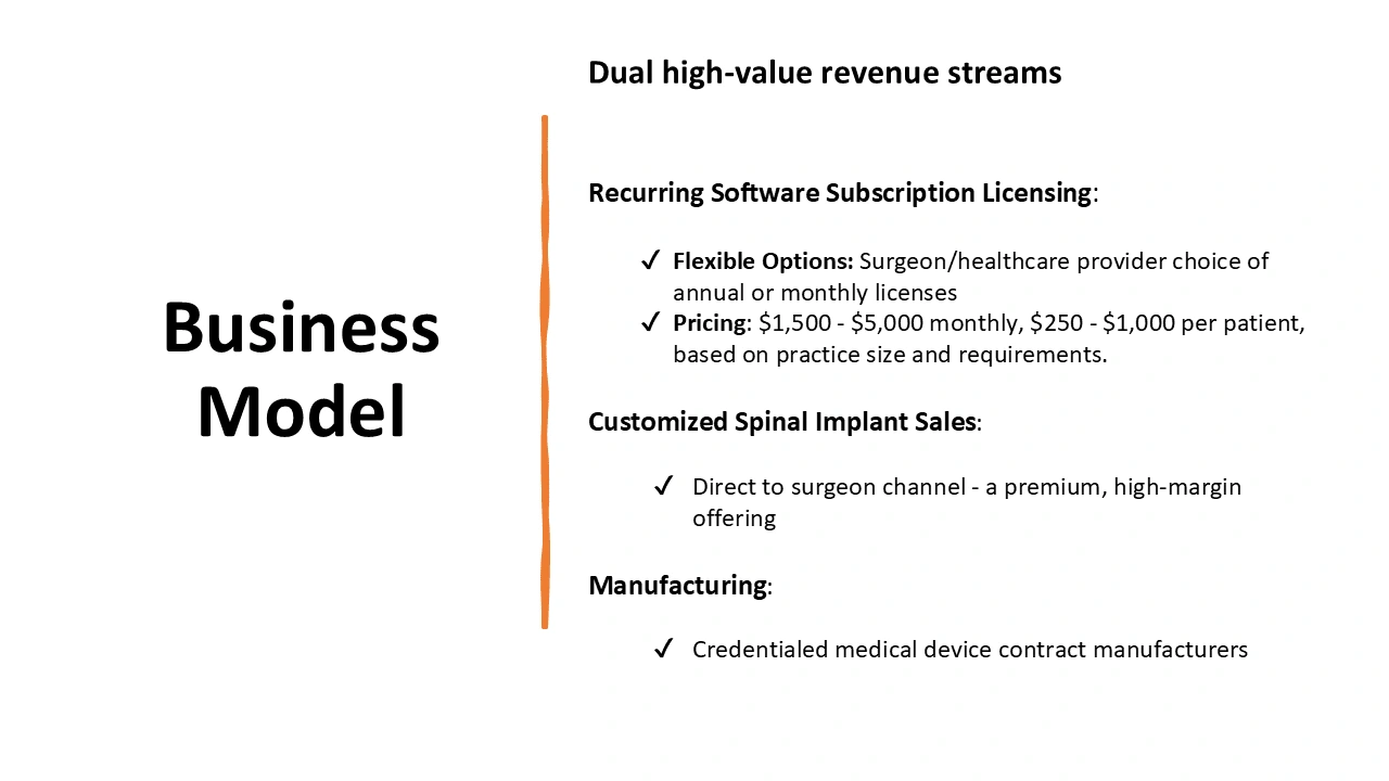
BEFORE
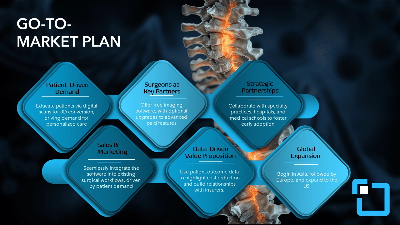
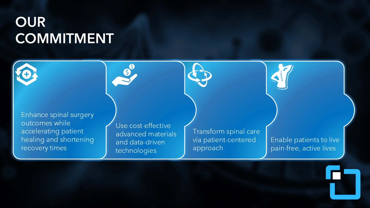
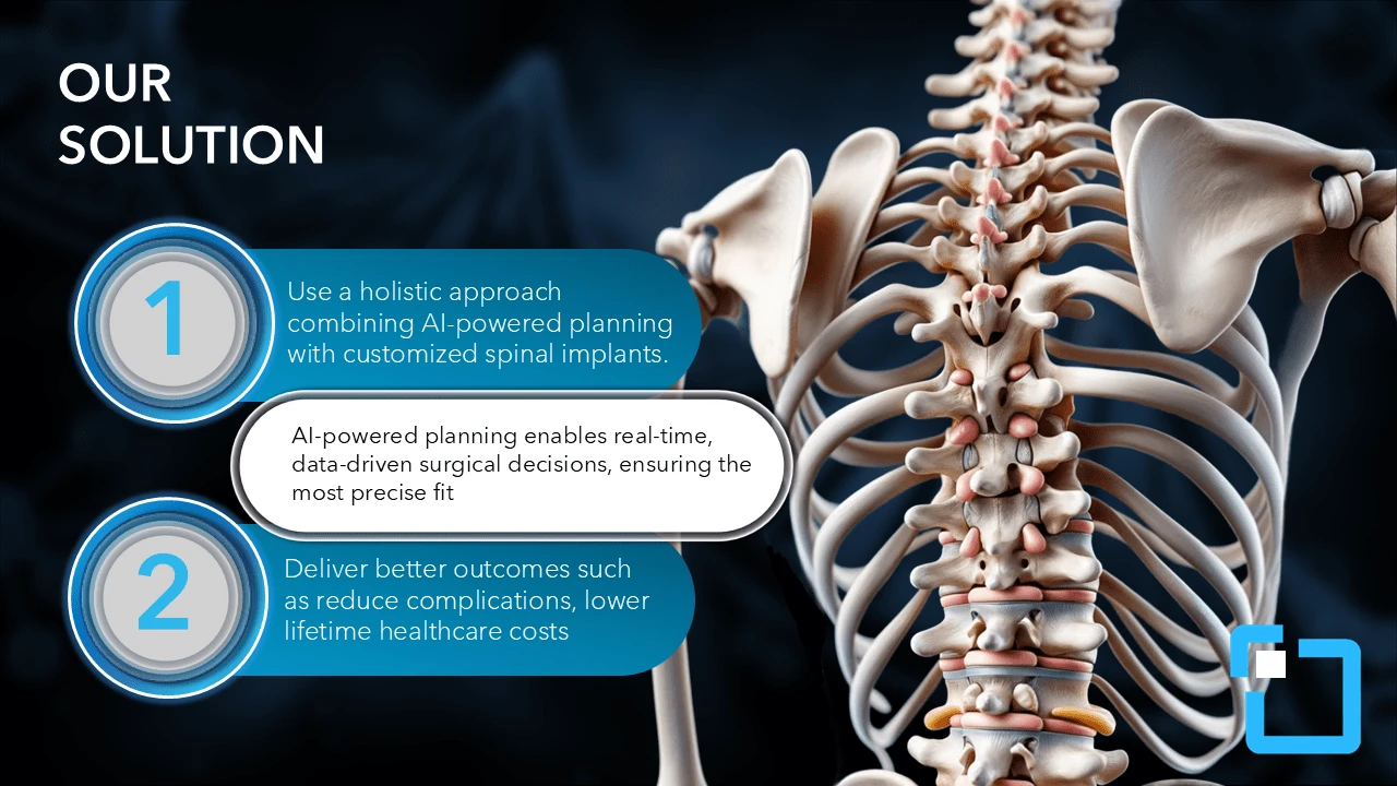
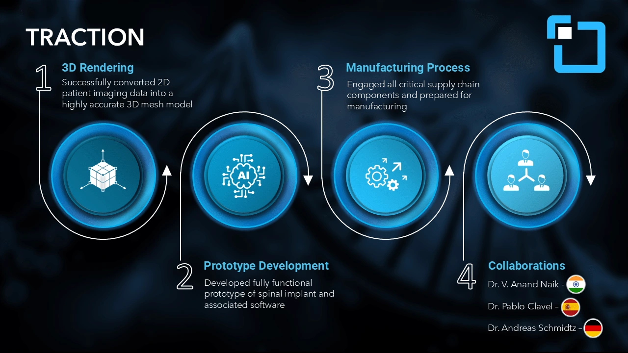
AFTER, as you can see we added an AI generated spine giving this slide a unqiue one of one feel. A custom inforgraphic was used, taking full advantage of powerpoint shadow effects to create a 3D illusion
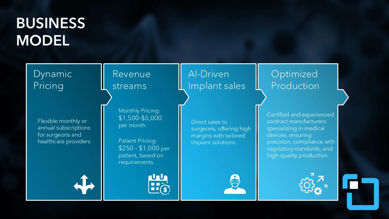
AFTER, more cohesive flow of business model
BEFORE
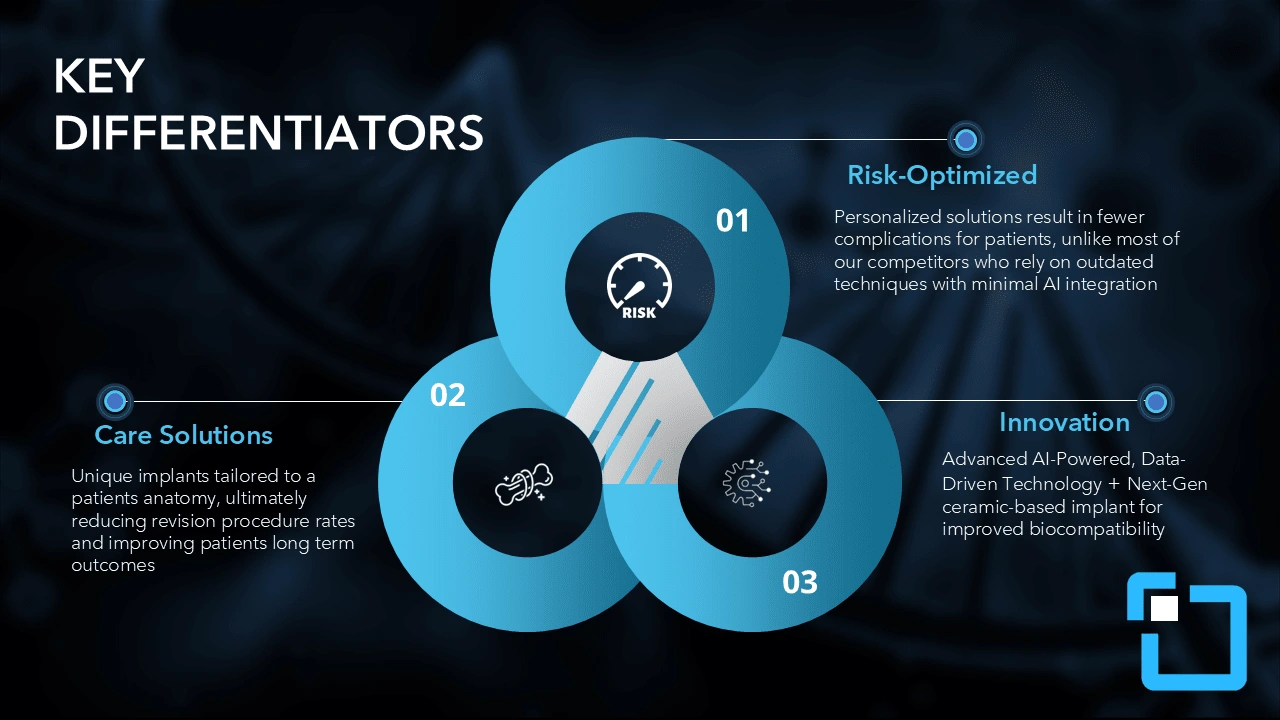
AFTER, i can gaurentee you, you havent seen some of these icons before...Content is not only more engaging but reduces readers anxiety (being overwhelmed by information)
BEFORE
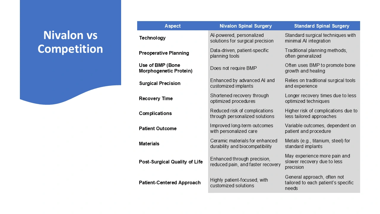
AFTER, readers anxety is reduced. Investors don't know you and neither do you. The last thing you want is to annoy people with specifics and mountains of words. key takeaways were captured from original nivalon vs competition.
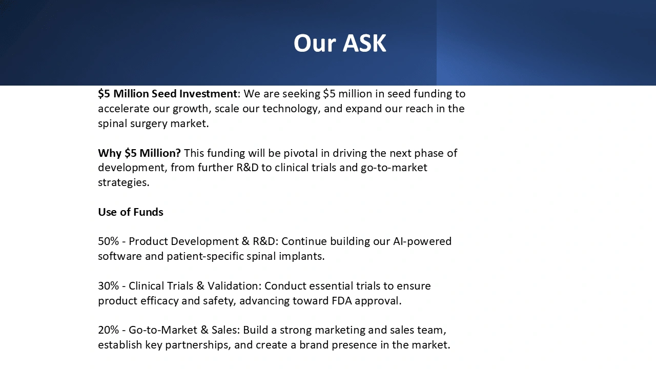
BEFORE
AFTER, Finally, on the last slide, we introduced two fresh, carefully selected colors to evoke a sense of novelty, sparking curiosity and signaling something new. This visual shift encourages the audience to engage more deeply, increasing the likelihood of capturing their interest and prompting investment.
Like this project
Posted Feb 2, 2025
Revamped an investor pitch deck to improve clarity, visual impact, and engagement. The client sought a polished, professional design that better showcased their