Pick Pixel Logo Design Process
Introduction
Pick Pixel is a spot-the-differences game that challenges players to use their keen eye to identify discrepancies between two images. In this document, I'll outline my logo design process for Pick Pixel, including concept development, color selection, and final execution.
Concept Development
I began the logo design process by brainstorming various concepts that would effectively convey the essence of the game. After sketching several ideas on Procreate, I settled on the concept of an eye. I believed that an eye symbolized the keen observation required to excel in a spot-the-differences game.
Color Selection
The color palette for the Pick Pixel logo was chosen carefully to align with the brand theme. Working closely with the client, we selected colors that were vibrant, eye-catching, and reflective of the game's playful nature. The final color scheme consists of bright shades of fucfuchsia and red.
Logo Creation
Using Adobe Photoshop, I transformed the concept sketch into a digital format and refined it to create a polished logo. The logo was designed as a scalable vector graphic (SVG), ensuring that it remains crisp and clear across various platforms and screen sizes.

Logo

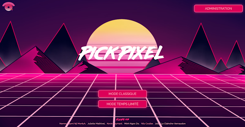
Home Page


