Creatief Schrijven

Lydia Jansen
Graphic Designer
Adobe Illustrator
Procreate
Paper and pen
FORM FOLLOWS FUNCTION
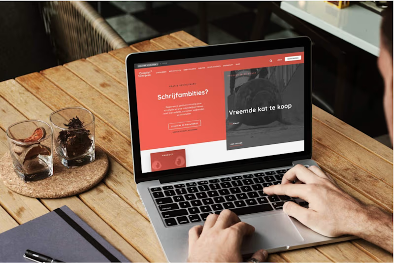
A new website; time for rebranding! Just as the website will help making everything easier to use, so do we want the new logo and branding to be of practical use.
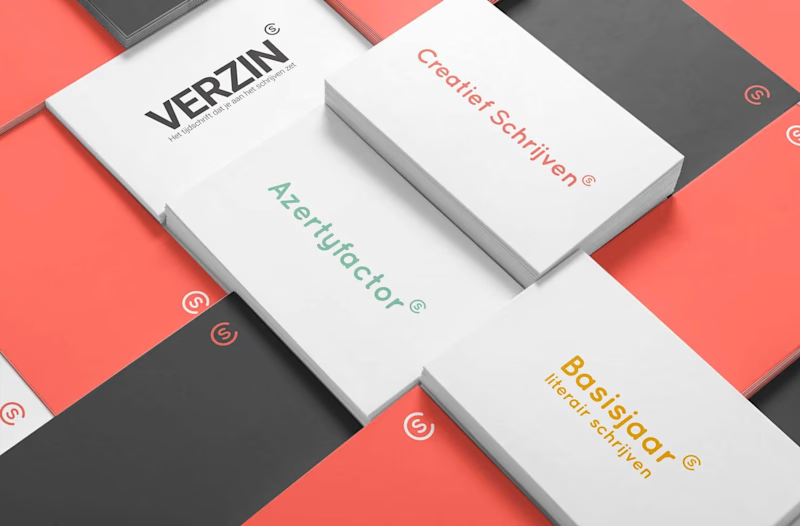
Not only do we want it to showcase ‘creatief schrijven’ (creative writing) who they really are, but we want it to be easy employable. Without a graphic designer of their own, they need a style that is easy adoptable for all the subbrands they create on an almost weekly basis.


SAME LOGO, YET DIFFERENT
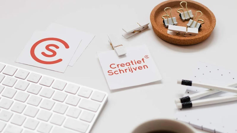
The logo didn’t change. It’s still a C with an S. Yet, by placing it somewhere else AND refresh the colours and the fonts, suddenly we have a complete new look, feel AND meaning.
Using the logo as a copyright sign and an overall style that is minimalistic yet recognisable, subbrands can easily adopt the main look and feel, without loosing their own voice.

2018


