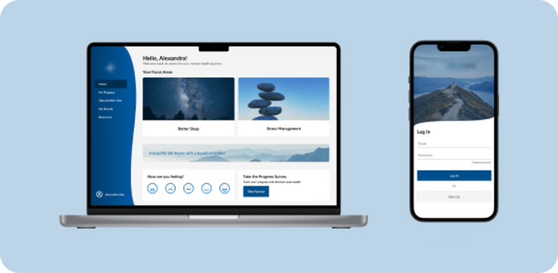
Overview
Background:
An important part of individuals' lives today is to educate themselves on how to improve their mental health. With so many resources available on the internet, they do not know where to begin. Mindyra wants to offer a tool that is data-driven and personalized for individuals to know where to start on enhancing their mental health.
Mindyras smart testing more precisely identifies an individual's mental health difficulties while their algorithm leads to condition-specific care options. Mindyra engaged OtherLeft for their strategy and design expertise to update their platform UI design, improve their user experience, expand their digital offerings, and create a product map that meets their business needs. In the first engagement, OtherLeft focused on finding the user needs/wants of user types. In the second engagement, I was brought on to create new workflows, designs, and requirements.
My Role:
Create a past and future state User Flow
Create wireframes for key workflows
Develop visual design compositions
Create a clickable prototype
Design gamification framework
Tools:
Figma, FigJam, Asana, Miro
Research
The project was broken into two engagements. The first was strategy and the second was design. I was in the second engagement, but before I could start designing, I needed to get familiar with the project, business needs, and user needs/wants. I began my process by talking to the UX researcher who guided me through the UI audit, competitive research, user journey map, and user interview results. To understand the business needs, the team and I had two sessions with our client to create a story map. This allowed us all to get creative and figure out what would be in the MVP.

UX/UI audit and MVP
Findings:
After talking to the UX researcher, doing some personal research, and talking to the clients, I gathered a couple of key findings.
Flow
Users struggled to find a clear flow of the app.
Many users did not know what to do next after signing up.
Too many navigation options circled to each other.
The clients wanted a seamless way to connect to different sections of the app.
Security
Users feared their privacy was not secure
Users were hesitant to answer personal questions for fear of data being sold to third parties.
Tone and Wording
The wording had very negative comments
Overall the brand lacked tone and direction.
Users and the clients wanted a visual direction that was not clinical.
Reflection
Understanding the needs of a user is important, but reflecting on them is also crucial. Throughout my process, I kept my users, the problem statement, and these questions in mind.
How can I give the users a sense of direction to improve usability and user experience?
How can I give my users the reassurance they need to trust in my client?
How can we improve the visual direction of the app?
How can we make the connotation of the app's words be more positive and inviting?
How can we keep the users engaged with the app?
Having these questions in mind throughout the project allowed us to keep our users and business needs as a priority.
Exploration
After having my questions, the next step was to create a past state user flow of the app as it was. This allowed me to see what navigation was repetitive and/or not serving the user. Having the past state allowed me to see opportunities for growth and improvement.
After having my questions, the next step was to create a past state user flow of the app as it was. This allowed me to see what navigation was repetitive and/or not serving the user. Having the past state allowed me to see opportunities for growth and improvement.
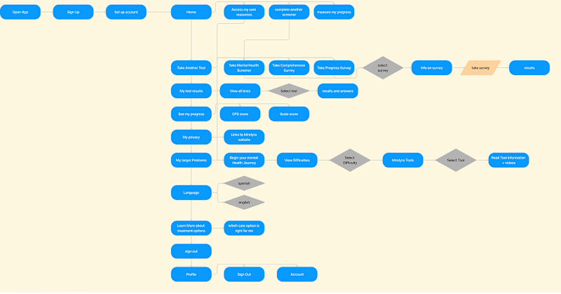
Original Sitemap
When I created the first iteration of the flow, I presented my iteration and the past state flow to the client . This way I got their input and feedback. No iteration is perfect on the first try, so I had a couple of iterations until I got to a final iteration. I saw the user flow as a living flow -- it was constantly changing with emerging needs and alterations.
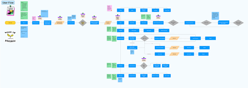
WIP and annotated user flow
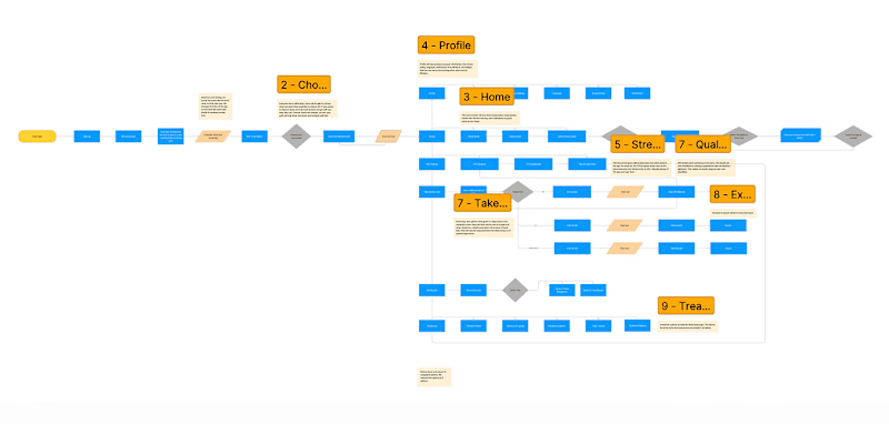
Final User Flow
Design
Once I had a full understanding of all the needs and a solid user flow, I began designing. I started by creating some concepts on paper and highlighted interactive points.
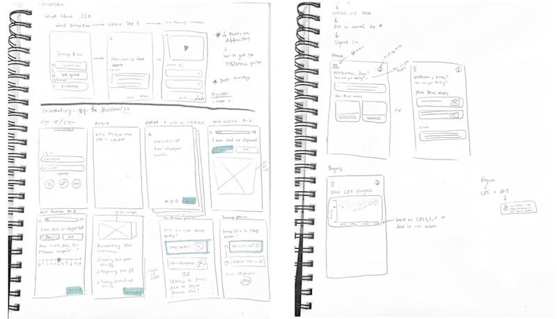
Original Sketches
Low-fidelity wireframes
I translated my sketches into low-fidelity digital wireframes with Figma. After presenting this to the client, it was very rewarding to see how enthusiastic they were to see my progress.
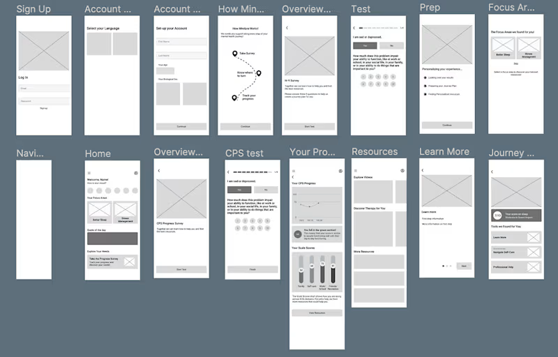
Low Fidelity
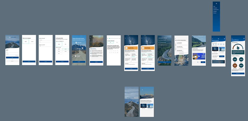
High Fidelity
A closer look...
When designing, everything is intentional. Every color, shape, image, button, etc.
Question 1: How can I give users a sense of direction to improve usability and user experience?
The best way to approach this question was by evaluating the past user flow and finding growth opportunities. I gave the users a task at the start to take a survey, guide them through a decision tree, and finally give them the next steps for their Care path.
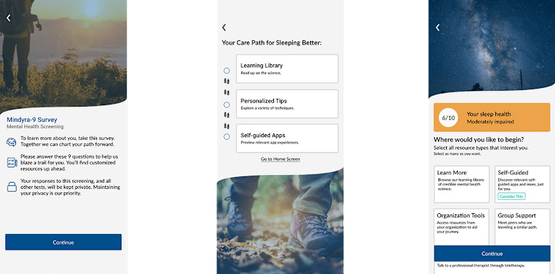
Pathway
Question 2: How can I give my users the reassurance they need to trust my client?
To reassure my users that their answers would not be sold, I reminded them of the privacy they were guaranteed before taking a test/survey. They would also have access to their privacy policy in their profile.
Question 3: How can I improve the visual direction of the app?
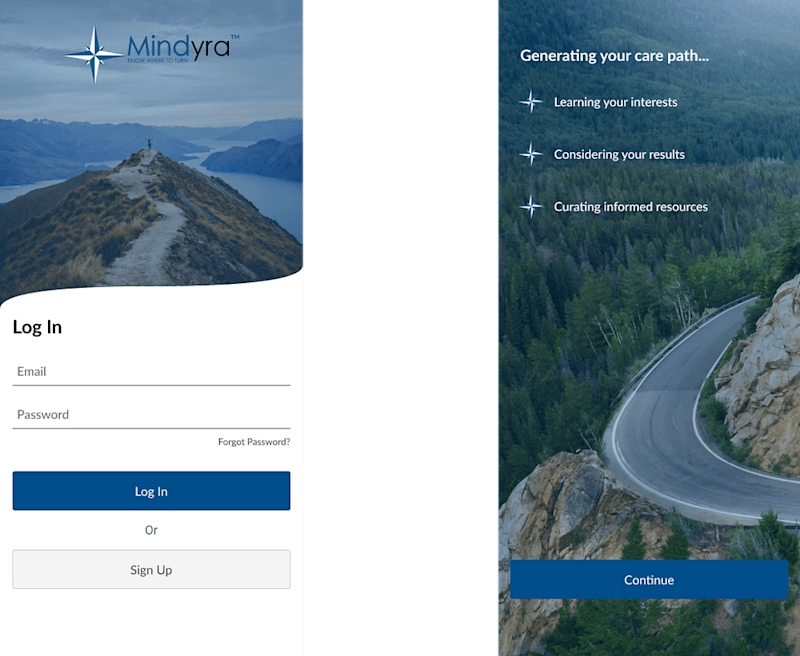
When it came to the visual direction, I wanted to develop a refreshing and relaxing aesthetic. I decided to do some photography research and found that an outdoor motif fit the app. I utilized a lot of images regarding hiking, exploration, and outdoor sports to call similarities to a journey with mental health. I also incorporated this wave to break the visual elements to emphasize how we recognized the mental health journey as a "sea of vast resources".
Visual direction
Question 4: How can we make the connotation of the app's words more positive and inviting?
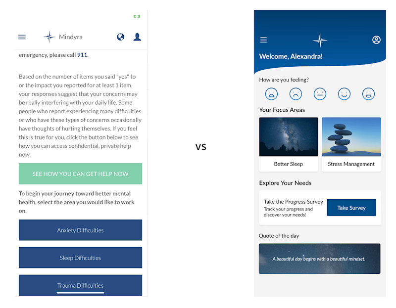
In the beginning, we noticed how negative the wording was. Alongside our UX Researcher, we worked on making the diction positive. Simply replacing negative words with something more uplifting completely changes the tone of the app. On the left is how the app's home page initially was. When someone had sleep difficulties, we thought a more hopeful way of wording this would be "Better Sleep". This way the app is focused on hope to get better instead of stressing deeper that there is a problem. A similar approach to the rest of the app was done.
Past vs new design
Question 5: How can we keep the users engaged with the app?
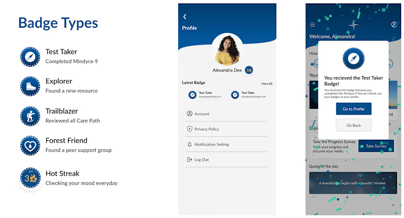
A strategy the OtherLeft team saw that could help keep users engaged is gamification. We have seen it successful in other apps and in previous clients as well. I began by brainstorming other ways that apps have been gamified as health-related apps. The first piece of gamification is by giving badges. These gamification ideas would not be given to track points but to reward the users' efforts. Another way that I gamified the app was by having streaks.
Gamification
Final Reflection
Helping on this project was very rewarding since I was able to help out a group of people who are passionate about enhancing the mental health of others. I would present to everyone every week and it was something I looked forward to. Presenting gave me a sense of direction and it made me happy to see how the clients reacted to their changing app. We were a team of expert designers, incredibly smart clients, business leaders, and researchers who all had different points of view. This was extremely helpful in gathering diverse ideas.


