Rio Musical: Editorial Design & Visual Identity
Perez Jesus Nascimento
Editorial Design: Rio Musical
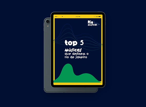
A visual identity and editorial layout for an e-book exploring the deep connection between the music, history, and vibrant culture of Rio de Janeiro.
The Concept
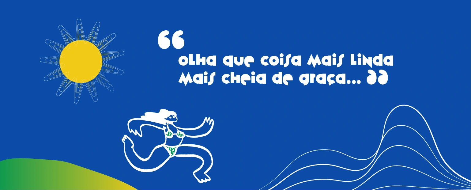
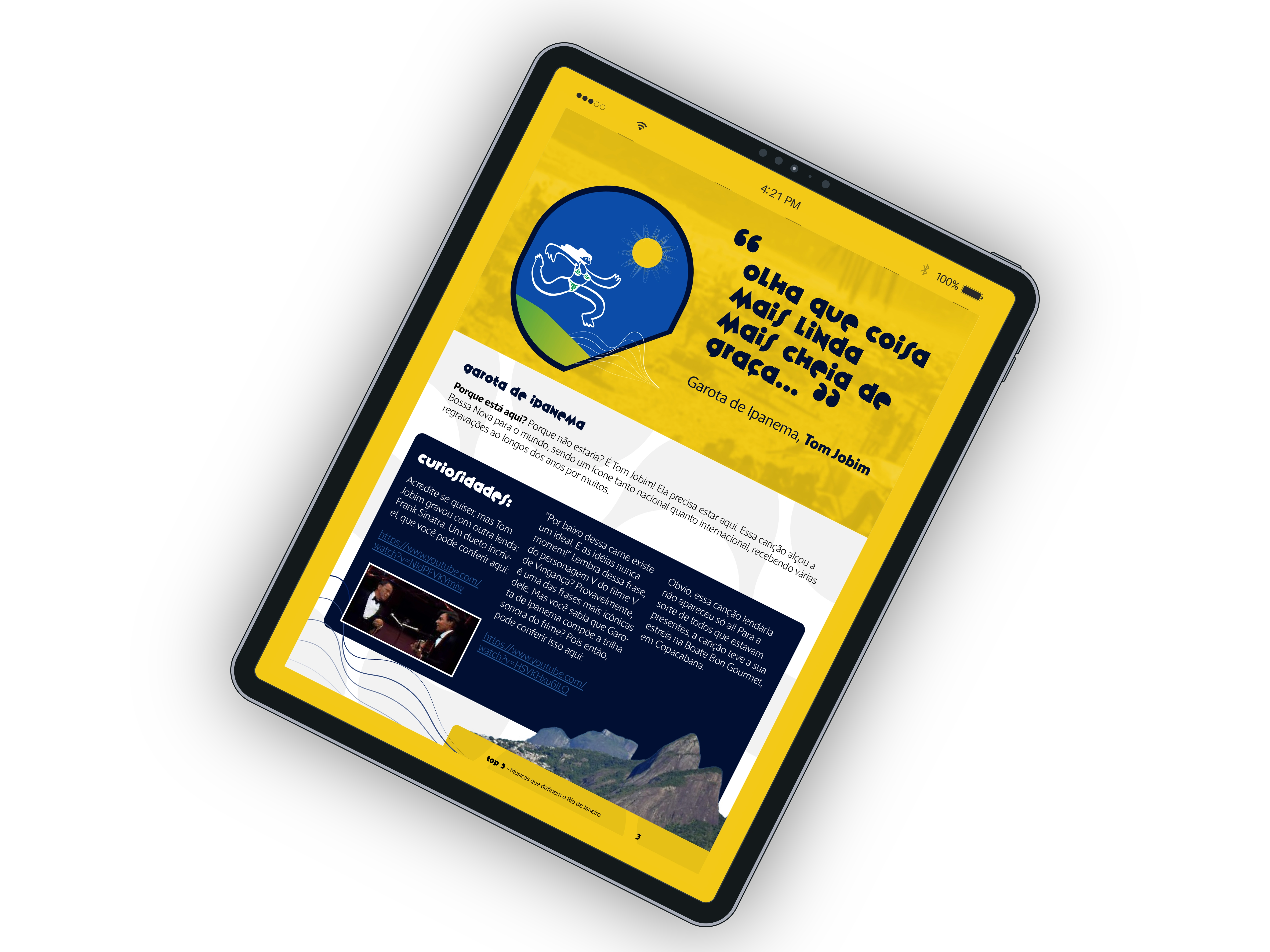
Materialized the invisible energy of the "Carioca" spirit by fusing rigid geometric shapes with fluid, sinuous lines that represent sound waves.
Developed a core graphic support element—a stylized sun and wave motif—that acts as a cohesive visual signature throughout the entire publication.
Typography & Color Strategy
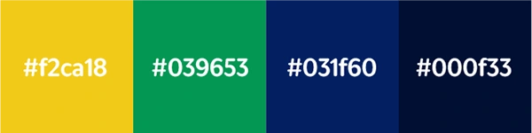
Bypassed standard photographic clichés of Rio in favor of a symbolic, solid color palette anchoring the design in the city's natural elements: sun, forest, and sea.
Selected the Variex OT typeface for its natural asymmetry and dynamic weight, bringing a warm, human touch that breaks away from traditional editorial rigidity.

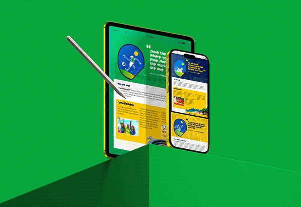
The Layout
Built an adaptable layout system that fluidly transitions between the smooth elegance of Bossa Nova and the raw, energetic reality of Rio's Funk.
Utilized heavy color blocking, high-impact quote typography, and strategic negative space to guide the reader through the contrasting musical narratives.
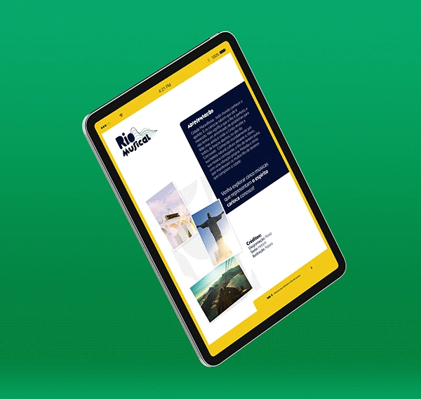
CREDITS
Visual Identity, Logo & Editorial Design: Perez J. Nascimento
Copywriting & Research: Hebert Paixão
Illustrations: Naiara Lyra
Like this project
Posted Apr 13, 2026
A vibrant editorial design and visual identity for a music e-book, featuring a custom graphic system, dynamic typography, and strategic layout pacing.