Modern Development Web Design For Kantflow

Pavan Kumar
Web Designer
Web Developer
Figma
Overview
1. Branding & Header
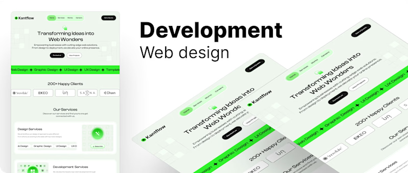
Logo (Kantflow): Positioned on the top left, indicating a clean, minimalist brand identity.
Navigation Menu: Simple and straightforward, with links to Home, Services, Works, and Careers. The "Get a Quote" button on the top right stands out for direct user interaction, likely encouraging conversions.
2. Hero Section
Headline: "Transforming Ideas into Web Wonders" communicates the company's core service – creating innovative web solutions.
Subtext: A clear value proposition explaining that the company offers "cutting-edge web solutions" from design to deployment.
Call-to-Action Buttons: "Contact us" and "View Projects" provide clear pathways for users to engage immediately.
3. Service Banner
A striking neon-green banner showcases the company's expertise: Web Design, Graphic Design, UI Design, UX Design, and Templates. The bright color draws attention, ensuring visitors know their primary offerings at a glance.
4. Client Logos Section
The section below highlights notable clients like Snowflake and EXEO, building trust and credibility by showcasing their impressive client base.
5. Our Services
Maintenance Services: Briefly lists additional offerings such as SEO, Hosting, and Migration with a green-highlighted "Select this" button, prompting action.
Our Showcase: Features two case studies (Terra and Cambridge), displaying the company’s work. This section allows users to view more details by clicking "View Case Study," a great feature for portfolio display.
6. Testimonials
Our Happy Clients: Includes a testimonial section with avatars, ratings, and short quotes, providing social proof and enhancing the company's credibility.
7. FAQs
Provides quick answers to common questions at the bottom, improving user experience by addressing potential concerns or inquiries directly.
Design Style and Color Palette
Colors: A combination of green, black, and white creates a modern, energetic vibe. The neon green emphasizes calls-to-action and key services, while the black text provides clarity and contrast.
Typography: Large, bold headlines paired with smaller body text make the design clear and easy to read.
Icons and Illustrations: Simple and modern, complementing the overall look without overwhelming the layout.
Overall, my design is focused on clarity, user experience, and conversion optimization with clear calls-to-action and strategic content placement.


😊 Thanks for making all the way here!


