SANA | Responsive Web Design For Small Business E-Commerce

The Baya Club
Web Designer
Business Development Specialist
UX Designer
Adobe Illustrator
Adobe Photoshop
Adobe XD

Landing Page Spread | Mockup
Design for Brand Engagement & Conversion in Niche, Small Business, E-Commerce
Lydia Kurkoski | UX Designer, New Business Development Specialist
Responsive Web Design & Branding
OVERVIEW
Context
My Key Stakeholder wants to create an e-commerce site for her store, SANA, which will sell varied products featuring her unique designs relating to therapy and the journey of improving your wellness and mental health.
Challenge
The founder of SANA requested web design for a landing page and purchase flow for the planned launch of her business. She will use these designs as she continues to determine the full layout and offerings of the website.
Project Specs
Role: UX Designer, Brand & Growth Strategist
Tools: Adobe XD, Adobe Illustrator, Adobe Photoshop
Deliverables:
responsive landing page and complete purchase flow (52 screens)
core user flows & user journey map
design system
logo & brand kit
Project Timeline: 4 weeks
Problem & Scope
How might I design an online user experience that attracts and engages new users in the business’s unique value proposal and brand storytelling, while also driving core task completion -- purchase conversion?
After defining the project goal in respect to the problem, I made a list of the questions and considerations that came to mind. I used this list to transition into the initial research phase of the project.
How do users interact with niche small businesses?
What common factors drive user dropoff in small business e-commerce?
How do I highlight brand story without distracting user from the core task flow?
How can I leverage design to inform and inspire users to the credibility and value of the business?
What features would a site have if it possessed the effective balance of UX and CX?
Process & Methods | Research
User Interviews
I wanted the research to provide data regarding what type of users are likely to convert into purchasing customers, and the design features/elements/strategy that creates that positive user journey.
In order to draw conclusions and make insights, I organised the data using an empathy map. I chose this method of analysis because I was looking to organise triggers and the correlating emotional/behavioral outputs from the user. This helped me translate interview data into what the user says, thinks, does, and feels.
Next I created an affinity map to group the findings. I chose to do this immediately following creating the empathy map, so I could find themes/repetitive patterns in the data. While creating affinity maps, I typically group first and let categories develop naturally throughout the process. I find this to result in more organic insights.
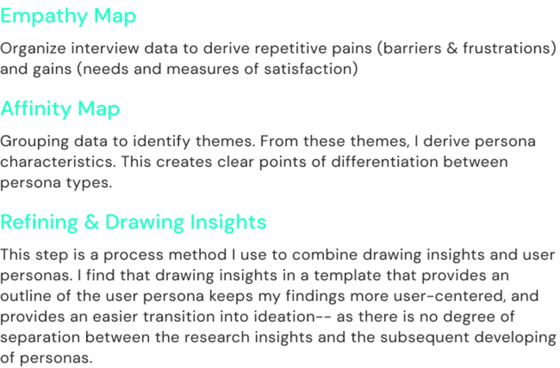
Process Explanation
Competitive Analysis
Following the interview data analysis and synthesis, I conducted a competitive audit.
I selected both direct and indirect competitors, all similar in respect to a brand mission relating mental health/wellness and a target audience of adults.
I used the research findings model I created to outline competitor strengths and weaknesses as the specifically related to the user interview insights.
With these final conclusions detailed, I was left with a comprehensive overview of user type, the goals, expectations, motivations, positive indicators, and pain points. This was grouped with audit insights to create a framework for mental modeling & user flows.
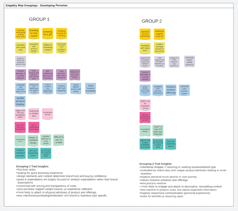
Research Diagram
Mental Modeling & User Flows
I first write down all the main steps that a user must take to complete the purchase flow from beginning to the end.
Not considering error states, drop offs, or alternate sequences, this list becomes a general outline of the “happy path” for each user type. I use these sketches to create user flows.
From there I consider how users with different intentions would interact with the content differently, or what features or elements would be needed for the path to accomodate these secondary users/edge cases.
This “brain storm” session is how I gain depth in my identification of user needs and how the potential solutions could overlap and/or interect with one another. This is the begining of my design taxonomy.

mental model | Group 1

mental model | Group 2
SOLUTIONS | FINAL DESIGN HIGHLIGHTS
Landing Page | Structure & Taxonomy
The design of the landing page brings together the power of habit and familiarity within e-commerce user experience, while incorporating strategic visual design elements and Gestalt Principles that drive brand recognition and reflect the unique value proposition.
The Power of Habit
The power of habit and familiarity in e-commerce user experience involves using familiar design patterns, such as a clear and prominent sectioning, easily identifiable navigation, and a recognizable brand logo, to make users feel more comfortable and confident while browsing the website.
Users can easily find what they are looking for and navigate the website with ease, increasing the likelihood of a successful user journey.
Visual Design Psychology
The visual design decisions reflect the unique selling proposition and brand identity of SANA. This is achieved through the use of consistent typography, color, imagery, and content elements that create a cohesive and distinctive look and feel-- a balance of calming ethereal tones, and bold accents (off neon green, futuristic sans serif font, edgy content blocking).
Strategic Visual Design & UI
In addition to these familiar design patterns, strategic visual design elements incorporated into the landing page increase user engagement without interfering with the user task flow. For example, high-quality product images, clear sections and personalized flows can help users to visualize the products, understand their value proposition, and make informed decisions.
The strategic placement of these elements on the page to draws the user's attention without disrupting their browsing experience. Considering the core goals of this project - brand representation and conversion - design needed to function first. Secondary visual elements needed to highlight the user experience, rather than distract.

Landing Page | final design
Landing Page | "The Shop"
“The Shop” section of the landing page includes featured products, as well as offering options to "shop by category" and "shop by product type."
Presenting featured products on the landing page can be a powerful tool for highlighting key items or promotions, and attracting the user's attention to specific products.
Offering options to "shop by category" and "shop by product type" can also improve the user experience by providing a clear and organized way for users to find what they are looking for. This feature can be particularly helpful for niche e-commerce stores, where users may have specific product needs or interests. By organizing products into categories and product types, users can easily browse through relevant products without being overwhelmed by irrelevant options. This can also help to encourage users to explore more of the website and potentially make more purchases.
By providing these features, users can more easily find the products that meet their needs, making their overall shopping experience more enjoyable and efficient.

Landing Page | Tablet
Product Detail Page | Reimagining Recommended Products
The links to all products within a collection offers unique value to users by allowing them to explore different items within a category without being navigated away from the product page.
This feature enhances the user experience by providing a convenient way for users to browse and compare similar items within a collection, without the need to go back and forth between different pages. It also helps users to discover new products that they may not have otherwise found, increasing the chances of a sale.
This design feature offers a more comprehensive and streamlined shopping experience for users, which can lead to increased engagement and conversions.

Product Detail Sweatshirt | The Optical Collection
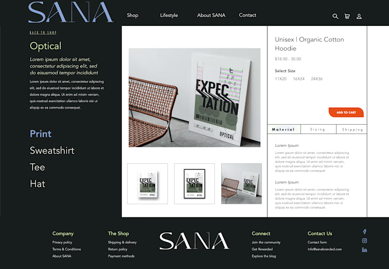
Product Detail Print | The Optical Collection
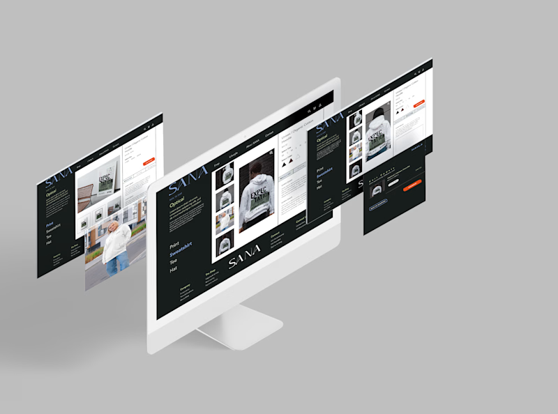
Product detail spread
Product Detail Page | Brand Storytelling
The product page includes a brief collection story that provides brand storytelling to users who may not have engaged with similar content on the landing page. This design element creates an emotional connection with the user by providing context and meaning to the products they are considering purchasing. It helps to convey the brand's values, aesthetic, and mission through a cohesive story that ties the collection together.
enhances the overall brand identity, making it more memorable and distinctive in the user's mind. It also helps users to understand the value proposition of the products and why they should consider making a purchase.
provides a more engaging and immersive experience, as users can learn about the inspiration and design process behind each product, creating a stronger emotional connection.
improves the usability of the page by providing clear and concise information about the collection, making it easier for users to navigate and find what they are looking for.
Next Steps & Looking Forward
Considering the existing design for the SANA Store, there are several recommended next steps to improve the user experience further.
Firstly, the checkout flow should be iterated and tested to ensure it is intuitive and efficient for users. This could include streamlining the checkout process, providing clear and concise instructions, and minimizing the number of steps required to complete a purchase.
Secondly, building out the SANA Life page, including a blog section, can help to provide users with brand storytelling, as well as offering helpful and informative content related to the product designs and collections. CTAs and design principles can be used to guide users back to the core task flow of purchasing products, ensuring a seamless user journey.
Finally, ongoing user testing and feedback should be incorporated into the design process to identify any areas for improvement or new features that could be added to enhance the user experience further. This can help to ensure that the website remains up-to-date and relevant to user needs, even as the business continues to evolve and grow.
Despite the project constraints of limited budget and timeline, these recommended next steps can help to improve the overall user experience of the e-commerce store and drive conversions.
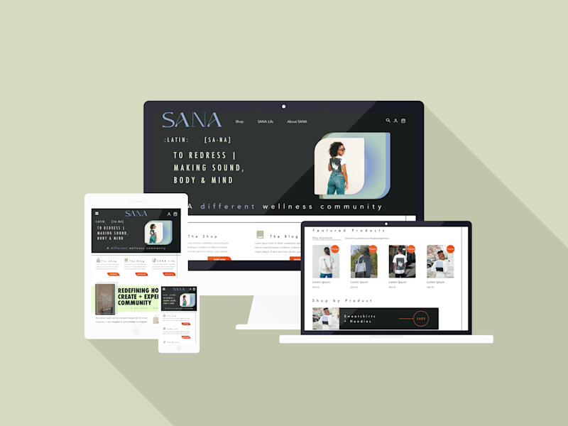
Responsive Design Across Screens | Mockup

main navigation | tablet

checkout flow | screen 1

checkout flow | screen 2

checkout flow | screen 3
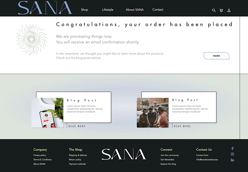
checkout confirmation
Thank you for viewing!
Let's Connect
You can email me at Kurkoski.lydia@gmail.com, or reach out on one of the linked platforms listed in my profile. (:


