Rialto Product Site Redesign
Project Details
The Rialto product site is the face of the product and in many ways of the company as well, and a crucial driver for the company's revenue. It's the customers' first point of contact with the Rialto brand and product. However, it was designed in a way that urgently needed to be improved. The most frequent comment by customers was that there was not enough context on the website for the product they were considering paying for; and that there wasn't enough clarity about the product — the former website simply didn't give them enough information about the product.
User Research
To find out the specific challenges users faced with the former product site design, we conducted a heuristic evaluation and began to include the website in product demos of the web application itself. So, each demo session began with navigating the product site leading to the application.
Findings
Both the user groups and individuals had similar comments to make about the application, and the product site that had welcomed them to the application:
• They loved the application and felt they had a good experience walking through it.
• They thought the product site did not give them enough information about what to expect from the application, and felt a disconnect between the site and the app.
• The fact that both user groups and individuals had similar comments is a good indicator that there are common usability issues that need to be addressed. This feedback can be used to inform the design of both the product site and the application.
• The positive feedback about the application is encouraging and suggests that the design is effective in providing a good user experience. However, the negative feedback about the product site highlights an area where improvements can be made.
• The feedback about the product site not giving enough information and feeling disconnected from the app suggests that there may be a mismatch between user expectations and the content provided on the site.
Problem Definition
The fact that users were having trouble understanding the value proposition of signing up on the platform is a critical issue that needs to be addressed urgently. This is because if users cannot clearly understand the benefits of signing up, they are unlikely to do so. This can result in a lower conversion rate and negatively impact the company's business goals. By addressing the issue of user understanding of the platform's value proposition, the company can increase its conversion rate and achieve its business goals.
" I love the actual app! but the website is confusing, it's not very clear " - Ashley M
The Solution
UX Content Strategy (Problem 1)
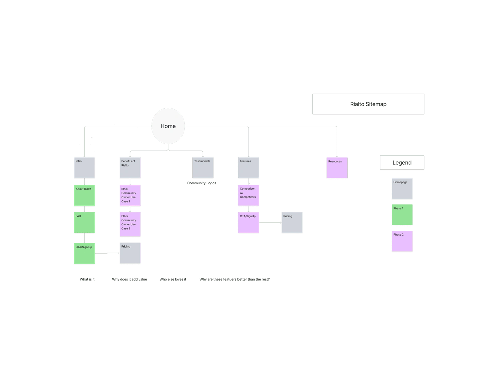
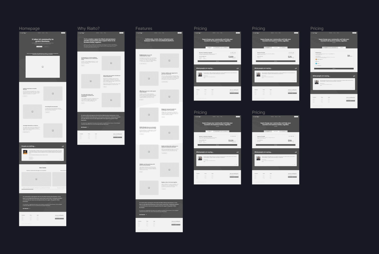
The team held several brainstorming sessions involving all stakeholders to create new content for the website that met the following objectives:
Explain in clear terms what the platform is.
Give website visitors a clear picture of the type of users who would benefit from using Rialto to manage their communities.
Present clearly the benefits business owners stand to gain by signing up on the platform.
Encourage users to sign up by presenting social proof.
Introduce clear calls to action to guide potential customers towards their next steps.
Visual Design (Problem 2):
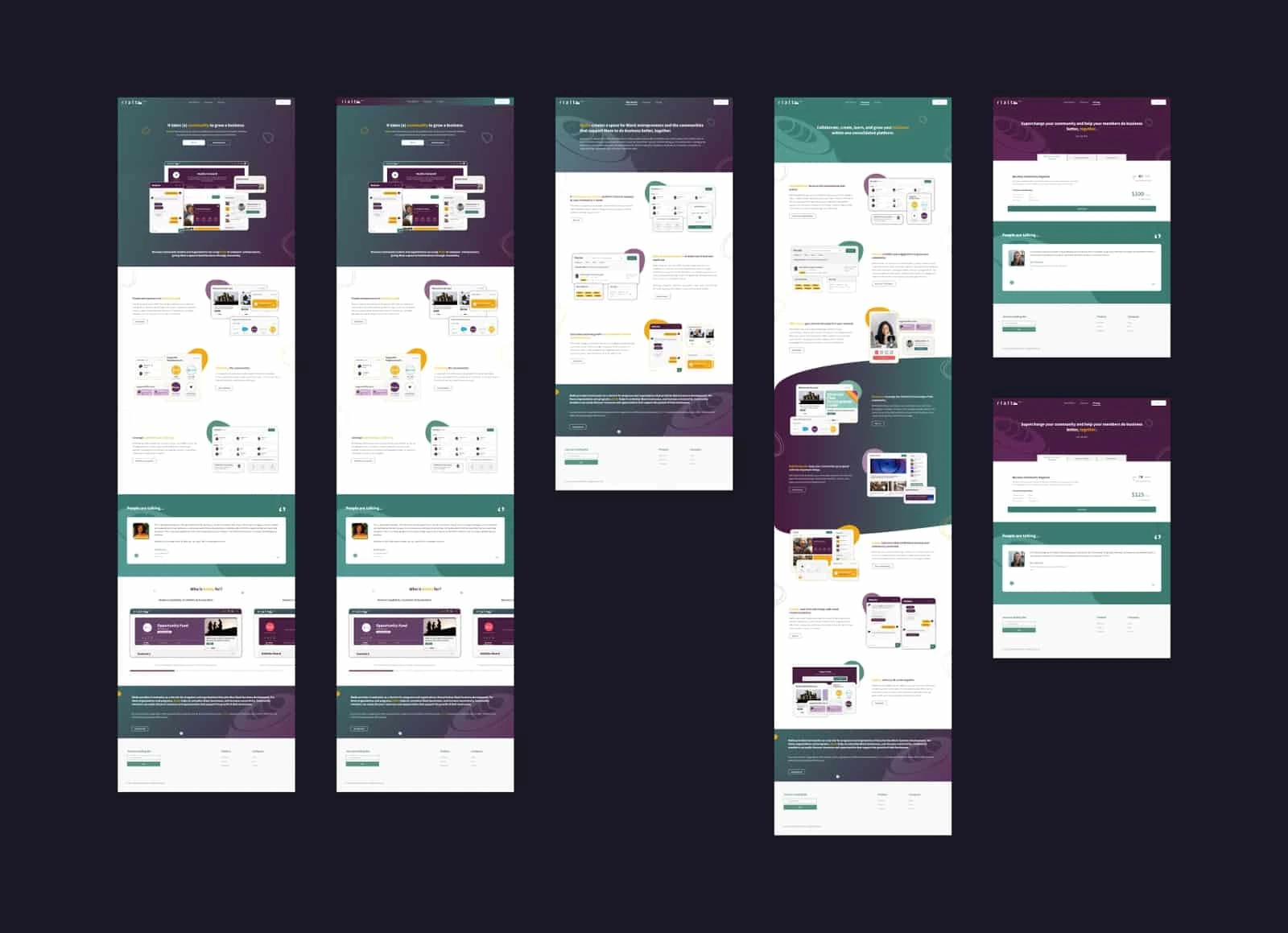
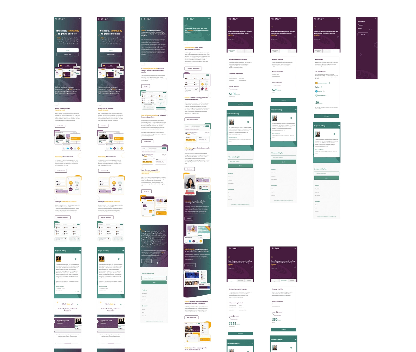
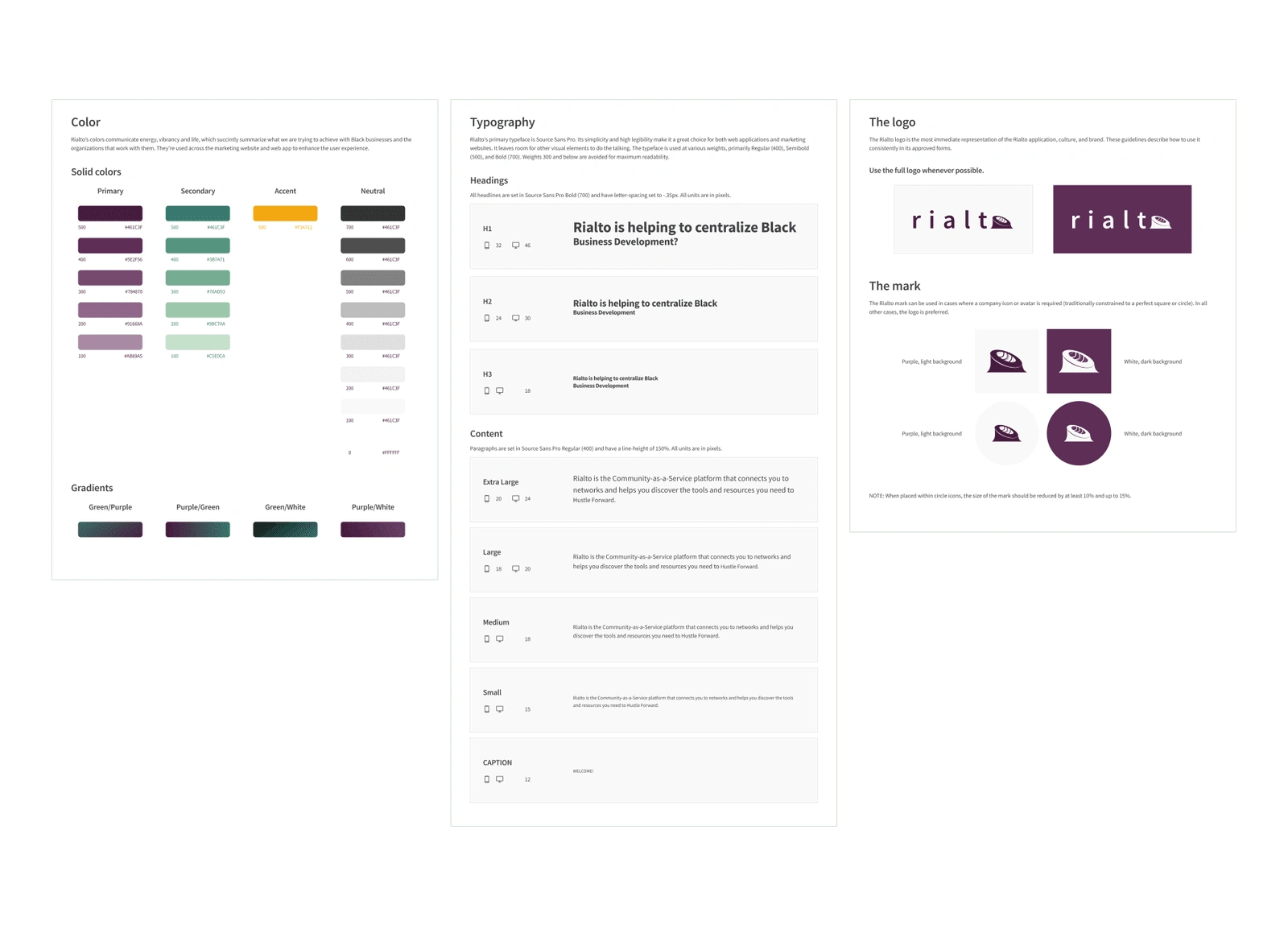
The design team, led by me, sought to align both the product site and product to give users a smooth, homogeneous experience across all touch points. This was achieved by a consistent and deliberate introduction of the product's style and assets across the website.
Things I Did
In my role as UX Designer, I collaborated with members of the design team and other stakeholders, including the brand designer, the head of design, and the CEO, to recreate the product site into what we have now: a much better representation of the product, both visually and in terms of messaging. I Initiated and led the UX effort to audit and redesign Rialto's product site, resulting in increased user engagement, improved visual design, and made the message clearer.

Like this project
Posted Oct 11, 2023
I Initiated and led the UX effort to audit and redesign Rialto's product site, resulting in increased user engagement, improved visual design and message.

