Problem
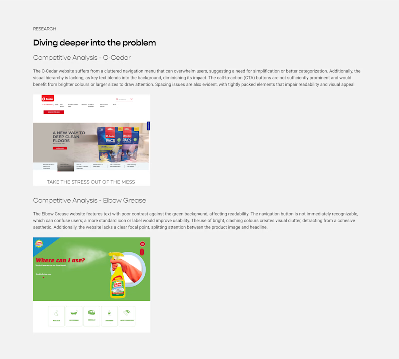
The website doesn’t effectively highlight Scrub Daddy's innovative products or unique features.
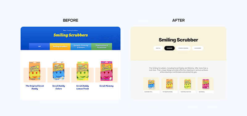
Excessive use of colors and fonts creates a chaotic and inconsistent visual experience.
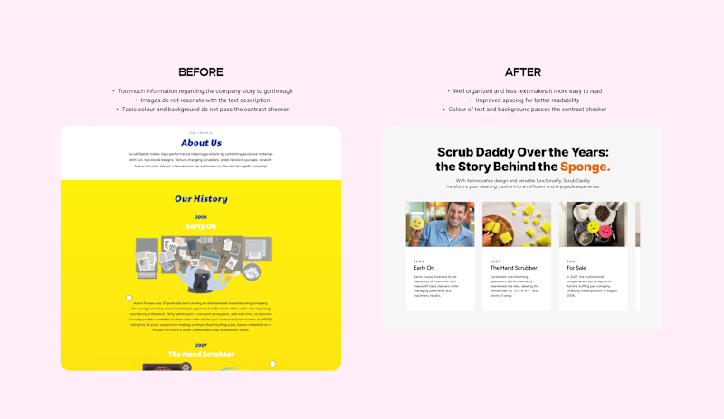
The cluttered layout overwhelms users with too much information, making navigation difficult.
Outdated design elements give the website a non-modern appearance.
Poorly designed buttons and links lead to frustrating user interactions.
Solution
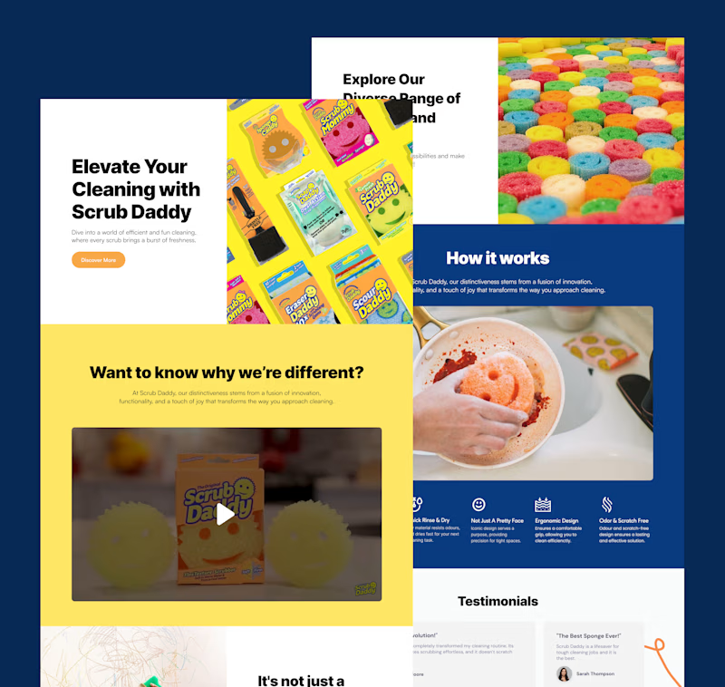
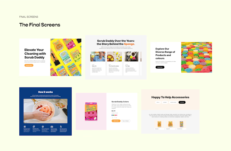
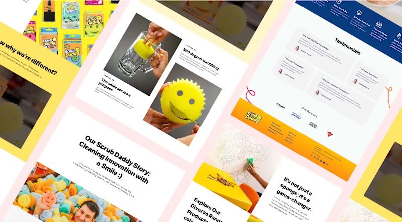
Re-designing the main, about us, products, and checkout page to showcase different sections effectively and improve the user's journey when visiting the website.
Before
BeforeDoes not look attractive or minimal.
Poorly structured text and image, making it less appealing to viewers.
After
AfterWell-structured text and a pulsing button enhance the user experience.
Minimal and clean design.
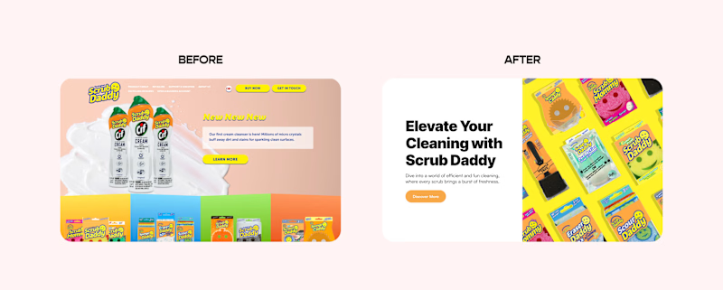
Before
Does not look attractive or minimal.
Poorly structured text and image, making it less appealing to viewers.
After
Well-structured text and a pulsing button enhance the user experience.
Minimal and clean design.
DESIGN
Initial Ideas + A New Direction
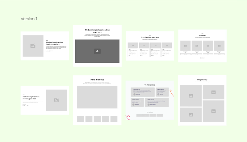
I explored various section ideas using wireframes to enhance user engagement and experience. This included adding testimonials for trust, dynamic hero sections for capturing attention, and clear product feature areas. Wireframing allowed me to visualize and refine these ideas to effectively meet our audience's needs.
What I’d do differently next time.
This is my latest UI/UX project! 🎉 More than just the final output, I'm immensely grateful for following the correct design process, which allowed me to see the progression from initial concepts to the final design. Throughout this journey, I've learned several valuable lessons:
The importance of wireframing in visualizing and refining ideas.
Color and typography define a company’s brand and can impact user perception.
Feedback provides new perspectives and highlights areas for improvement. For example, I shifted from bright to muted colors based on feedback, creating a minimalistic design.
Struggling to find ideas initially is normal; keep experimenting until you achieve a breakthrough.


