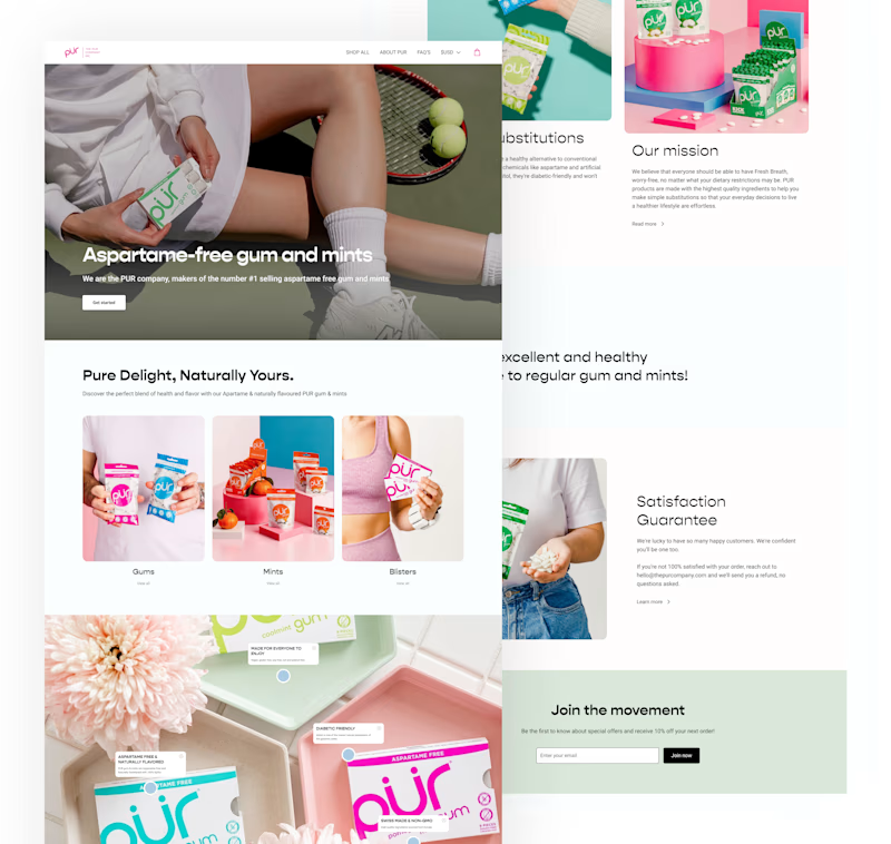
PROBLEM
The current website does not effectively showcase PUR’s high-quality products
PUR's current website has several key problems. It isn't visually appealing and looks cluttered, making navigating hard. The font and style are outdated, and the bright colors are overwhelming. Overall, the website doesn't have a modern look and doesn't effectively showcase PUR's high-quality brand.
SOLUTION
Re-designing the main page to showcase different section effectively and send a clear message to users
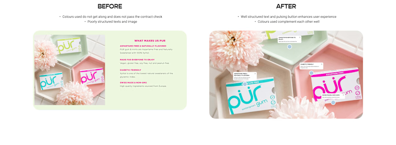
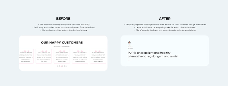
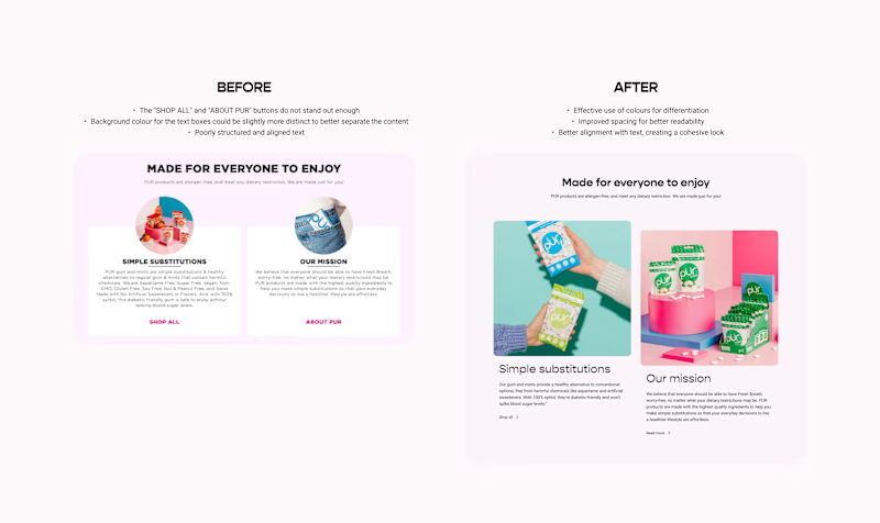
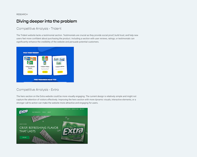
DESIGN
Initial Ideas + A New Direction
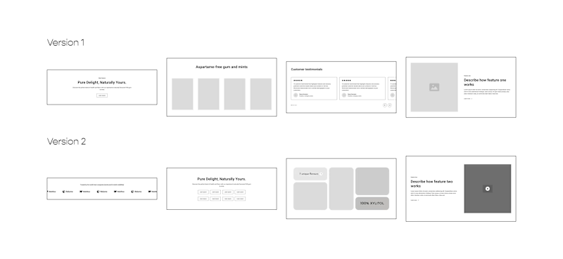
I explored various section ideas using wireframes to enhance user engagement and experience. This included adding testimonials for trust, dynamic hero sections for capturing attention, and clear product feature areas. Wireframing allowed me to visualize and refine these ideas to effectively meet our audience's needs.
What I’d do differently next time.
This is my second-ever UI/UX project! (Hooray!) 🎉. More than the final output, I'm immensely grateful for following the correct design process, which allowed me to see the progression from initial concepts to the final design. Through this journey, I've learned several valuable lessons:
The importance of wireframing in visualizing and refining ideas.
Color and font and how they define a company’s products or services are important.
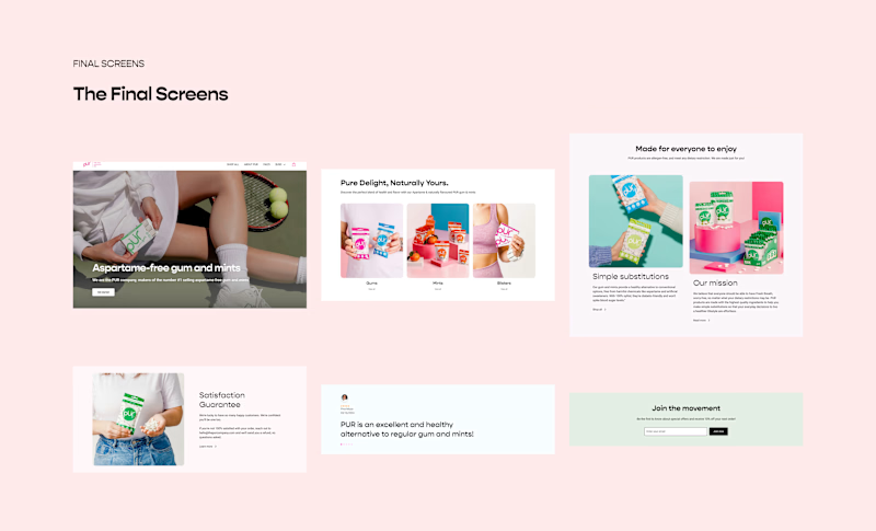
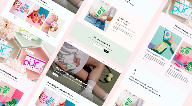
Feedback is always important to get ideas from others because I might be wrong about many things but people's feedback allows me to think differently. I took feedback regarding the colors used on this design and I went from using bright colors to using low-tone colors which created a minimal vibe when scrolling through the website.
You may struggle to find ideas initially but keep trying different things as it might click for you sooner or later.


