Website Redesign @ 42 Silicon Valley

Kim Alvarez
Graphic Designer
Digital Marketer
Product Designer
Sketch
WordPress
42 University
Project
42 Silicon Valley Website Redesign
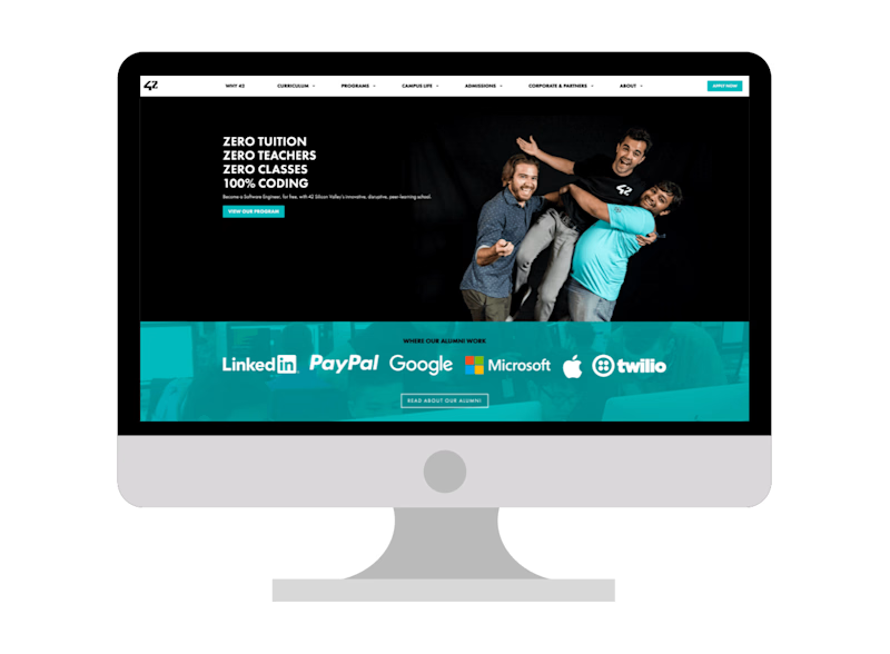
42 is a non-profit, tuition-free coding school. The school is originally based in Paris, France and opened its US campus, 42 Silicon Valley, in 2016. I redesigned the 42SV website in order to increase admissions and decrease customer support tickets. The redesign increased the conversion rate of people completing the admissions process directly from the website by 7%, and decreased the amount of customer support by approximately ~5 hours a week.
Role
UI/UX Designer, Web Developer
Timeline
Ongoing 2019-2020
Tools
Wordpress, Sketch
***
Objective
Our goals for this project were:
Increase admissions
Decrease customer support tickets
Approach & Analysis
We relied on analytics, user testing, and user feedback to improve the website over several iterations.
We found that as monthly visitors increased, so did the number of emails and calls asking for more information. Even though that information was readily available on the website, prospective students and parents couldn't find what they were looking for.
As a result of our analysis, we decided to redesign the landing page and information architecture of the website.
Research & Interviews
When we first started on the project, we talked to a variety of prospective students, current students, and alumni to discover how they originally found out about the school, what information they sought before applying, and their experience/frustrations with the website.
From that information, we identified four general categories of visitors:
Prospective Students - wanted to learn all the details about the program, what the admissions process was like, and read about success stories
Current Students & Alumni - looking for the latest news about the school, and to keep up with the Student & Alumni Interviews on the blog
Friends & Family - curious about the program, and wanted to better understand what it entailed
Companies & Partners - wanted to learn about the program, previous partnerships, and how to get in the contact with the Corporate Relations team
User Insights
Our research and interviews highlighted the following key issues:
Fragmentation of information - The different pages in the navigation menu were poorly organized, their titles were sometimes confusing, and as a result, visitors didn’t know where to look
Lack of relevance - Even after navigating to the correct page, the page would sometimes contain too much text for the visitor to find what they're looking for
Back and forth user journey - According to the analytics on the behavior flow of visitors, a large percentage were jumping back and forth between the landing page and the program/about page before dropping off
***
Design Goal
From our research and interviews, we decided on our goal:
Help visitors easily find the information they're looking for, and if they're prospective students, streamline their user journey towards applying to the 42SV program.
***
Information Architecture
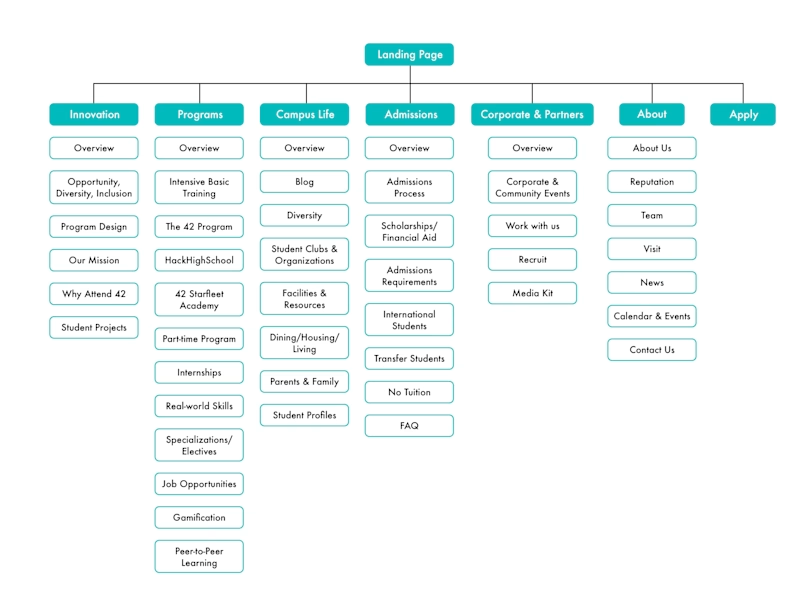
Original IA
To begin, I mapped out the original information architecture and used the behavior flow from the analytics to view which pages were the most and least visited.
I also discussed and created a physical card sorting round with a few team members to gather their feedback and decide what pages they thought necessary to keep and what could be moved or reworked into existing pages.
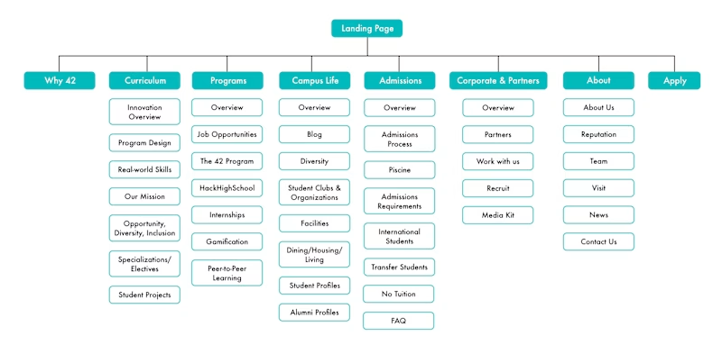
First IA iteration
Using the information from user interviews, ideation with team members, and analytics, I developed a second iteration of the site that we used for approximately a year.
Main Changes/Additions:
Renamed 'Innovation’ to ‘Curriculum’ - The 'Innovation' page outlined the curriculum, but it wasn’t getting a lot of visits, and we kept getting inquiries from people who weren't able to find the curriculum
Renamed ‘Intensive Basic Training’ to ‘Piscine’ - We experimented with both of these names. The original name of the month-long admissions process was the ‘Piscine,’ meaning "swimming pool" in French. In a previous iteration of the website, it was renamed to "Intensive Basic Training". However, the new name created more confusion about how it fit into the 42SV curriculum, so I changed the name back to 'Piscine'.
Addition of 'Why 42' page - we added a direct link to this page because it provided the most information on the different aspects of 42SV that we received inquiries about.
Removal of pages deemed unnecessary
Final Design
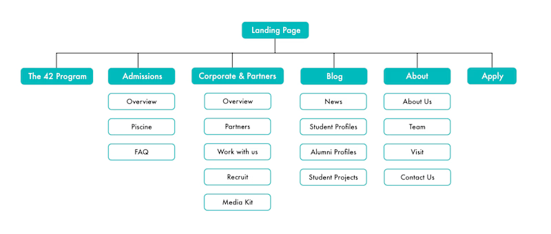
Final IA design
The third and final design further streamlined the IA and reworked a majority of the information on some of the removed pages into existing ones.
At this point, students had been mentioning the 42SV program to those around them and the school had started to organically grow through word-of-mouth. Alumni had also started receiving jobs and advocating the curriculum and school to their peers. As a result 42SV started becoming more well-known within the tech community. With that in mind, we decided we could improve the IA by shifting around some of those pages.
Using the data gathered from new and previous research and iterations, I made the following final changes:
Created ‘The 42 Program’ page - it became a combined page containing information about the different programs, curriculum, campus life, and removed them from the IA
‘Blog’ - Condensed and moved news, student profiles, alumni profiles, and student projects into an easily accessible section
This simplified IA ultimately led to the improvement in admissions and decrease in customer support tickets that we were looking for.
Landing Page
Here's a before & after comparison of the landing page:
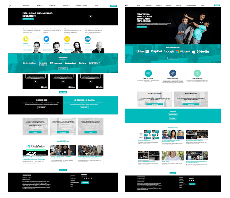
Before & After - Landing Page
Research
For both the landing page and information architecture, I looked at the websites of other universities and coding bootcamps for inspiration on layout and what information to include. I also had feedback from previous interviews with students about the landing page.
Main Changes/Additions:
Tagline - I penned the tagline,“Zero Tuition, Zero Teachers, Zero Classes, 100% Coding” for the hero section of the landing page. Prospective and current students said the previous tagline “Disrupting Engineering Education” reduced the legitimacy of the program for them, and they tended to gloss over that and the video attached.
Description - Added a one-sentence summary of 42SV underneath the tagline
Alumni Section - Since we did the redesign after the school had been open for a while, I replaced the "press" section with the companies our alumni had worked for and a link leading to the alumni profiles page
Tagline Exploration - Expanded and added descriptions to the taglines here, as they’re the most frequently asked questions about 42SV
Outcomes
Compared to the previous year, there was a 12% increase in the number of people visiting other pages. Based on our analytics, we found they were visiting the pages that contained the information of our most frequently asked questions, so we concluded that the redesigned IA helped them find what they were looking for. There was also an almost 20% decrease in the amount of drop-offs from the landing page.
Conclusion & Learnings
My main takeaway from this project was the importance of user research. It's easy to make assumptions about what users might do based on our own experiences, but this can lead to inaccessible designs.
As a 42SV alumni myself, I had initially expected other users to browse the website similar to how I did when I applied to the school. While some did, many followed different (and unexpected!) flows entirely. Thanks to the user research we did, I was ultimately able to design a new flow that worked better for more prospective students.


