Cybersecure CMS Implementation for Marketing Business

Pavan Kumar
Web Designer
Web Developer
Cybersecurity
Cloudflare Workers
Figma
WordPress


Overview
1. Branding & Header
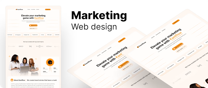
Logo (Kantflow): Positioned on the top left, much like the previous design, but with a slightly different color palette (orange and black), giving it a warm and welcoming feel.
Navigation Menu: Includes sections like Services, Case Studies, and Company, with a strong "Contact Us" button that is highlighted in orange, making it stand out for conversions.
2. Hero Section
Headline: "Elevate your marketing game with Kantflow" focuses on improving marketing efforts, positioning the company as a marketing partner.
Subtext: Reinforces that the team is knowledgeable and supportive, guiding users through the evolving marketing landscape.
Call-to-Action Buttons: There are two strong calls to action—"Sign up for free" and "Book a demo"—offering multiple user paths.
Services Icons: A row of quick links to essential tools like SEO, API Integration, and White Label Services, helping users understand key offerings right away.
3. Client Logos Section
Like the first design, this section showcases notable clients, adding credibility. However, it's integrated into the flow of the page in a cleaner and more subtle manner.
4. About Kantflow
A section introducing Kantflow’s background with a clear headline: "We create brand stories that leave a mark." It tells the story of how Kantflow began and what it stands for, giving visitors more context on the brand.
5. Services Section
Our Services: A neatly structured layout with icons that represent each service. The focus is on Digital Strategy, Content Creation, SEO Services, and Social Media Marketing (SMM).
Each service has a "Learn more" button, encouraging users to dive deeper into the offerings.
6. Case Studies
This section is well-designed with three specific examples of Kantflow’s work: Terra, Cambridge, and Alaskia. Each case study provides a brief overview of what Kantflow helped achieve for the client.
There’s also a View More option for those interested in exploring other case studies.
7. Testimonials
A large Testimonials section features client feedback, with ratings and short descriptions of their experiences working with Kantflow. This boosts trust by showcasing happy clients.
8. FAQs
Similar to the first design, there’s an FAQ section that directly answers common queries about Kantflow’s services, making it easier for users to find answers quickly.
9. Footer
The footer includes Company Info, quick links to Case Studies and Services, and a Newsletter Subscription form. This form invites users to stay updated with Kantflow, improving user engagement.
Design Style and Color Palette
Colors: This design uses soft orange tones combined with neutral whites and blacks, giving it a friendly, inviting look. The orange emphasizes important elements, such as buttons and icons.
Typography: The bold headlines stand out, while the smaller body text remains readable and easy on the eyes.
Layout: The page is very well structured, with a good balance between imagery, text, and white space, ensuring readability and flow.
Key Differences from the First Design
This design has a more cohesive color palette (orange and white), making it feel warmer and more approachable than the green-heavy first design.
There’s a stronger focus on marketing services and the story of the brand.
Icons are used more effectively to break up the content and highlight services visually.
Overall Impression
My design focuses on user engagement and clarity, with strong call-to-actions and a warm color palette that invites interaction. It provides social proof through testimonials and case studies while making it easy for potential clients to explore the company’s services.


