Built with Jitter
Anovia — Technical Services Brand Redesign
Transforming a legacy service division into a modern, directional brand.
When Anovia approached us, they were preparing to step out of the shadow of their parent company and establish themselves as an independent brand. The services were strong, the team experienced, but the identity was dated and overly rigid.
They needed a brand that didn’t just look new…
but felt like a fresh start.
01 — Alignment
The first step was understanding who Anovia was becoming.
Their strengths:
Precision
Reliability
Clean execution
Technical problem-solving
Their challenge:
None of that was reflected in their visual identity.
So the brand strategy became simple:
Direction over decoration.
Clarity over noise.
The brand needed to express order, progress, and modern technical confidence — without relying on generic “tech” tropes.
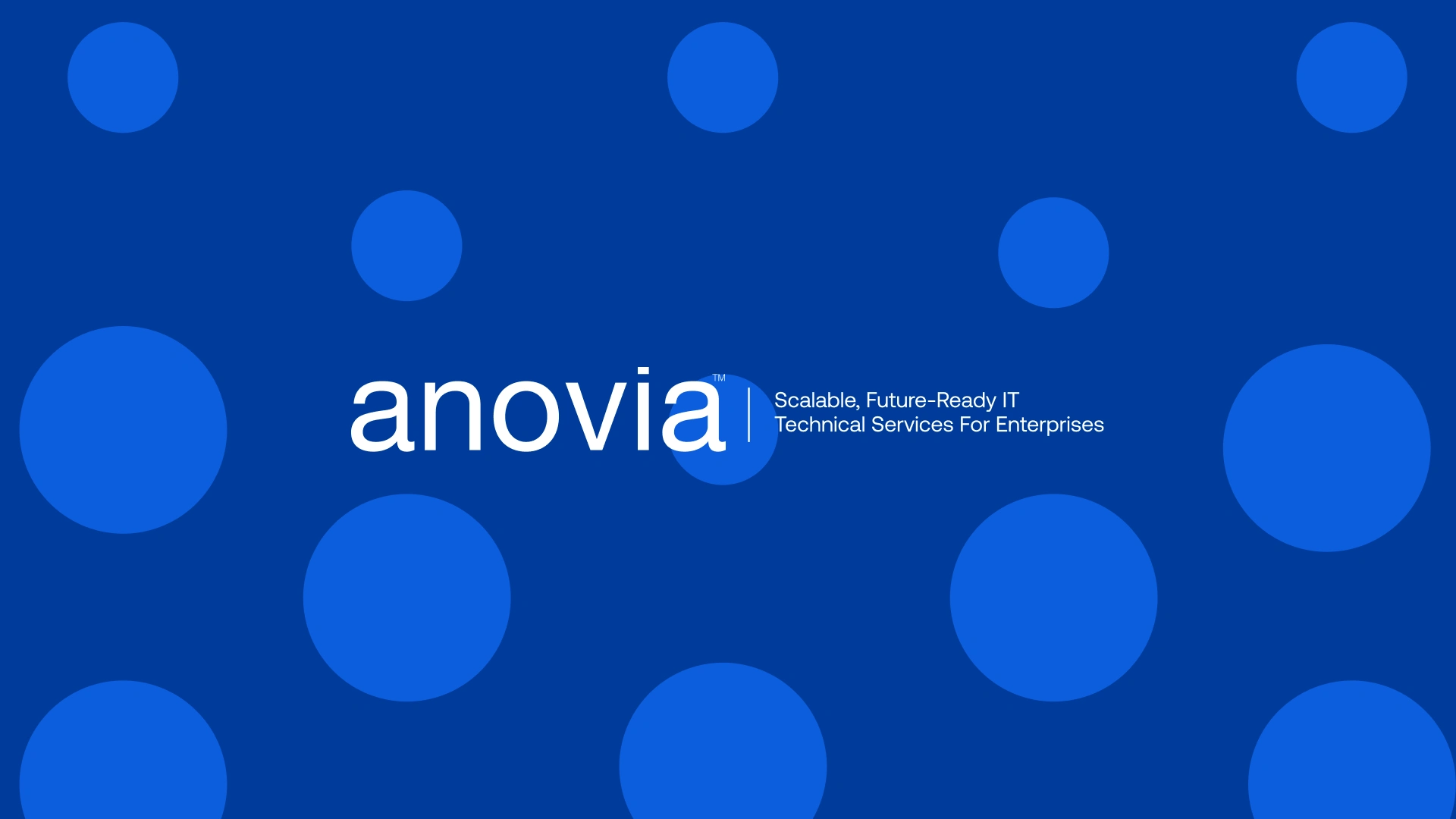
The new Anovia
02 — Exploration
We explored several directions:
Arrow-inspired systems (too literal)
Geometric blocks (too heavy)
Dot-motion concepts (clean, subtle, directional)
Typographic precision systems
The dot-to-direction concept was the breakthrough.
It expressed exactly what Anovia does:
turn complexity into clear forward motion.
It was modern without trying.
Technical without being cold.
Clean without being sterile.
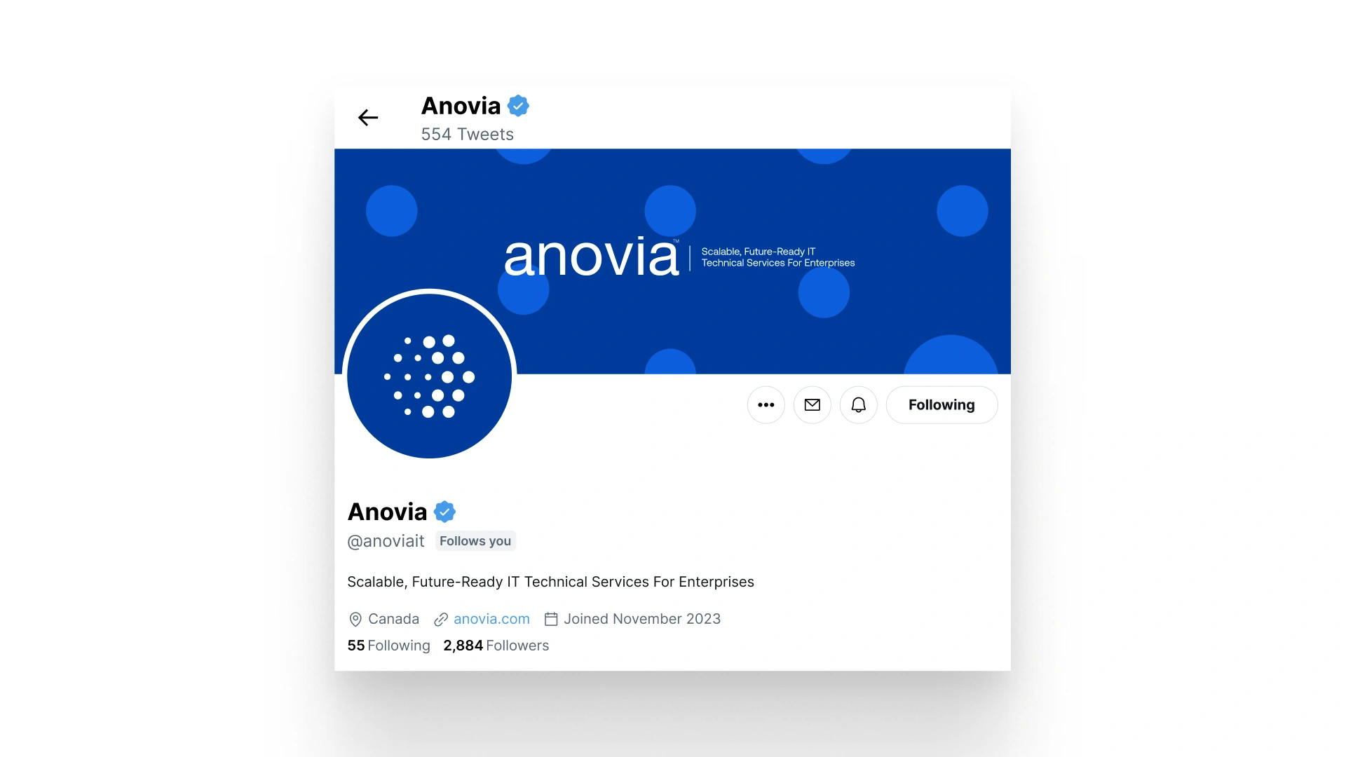
Social Media Page
03 — Refinement
This is where the identity sharpened.
We refined:
The upward-leaning angle of the mark
The dot shape (more square, more intentional)
Typographic rhythm (tried Aeonik → landed on Geist)
Letter-weight balance
Spacing, geometry, and tension
Color tone for a digital-first environment
There were multiple rounds — explorations, clarifications, adjustments — but each step removed noise and moved the brand closer to its true voice.
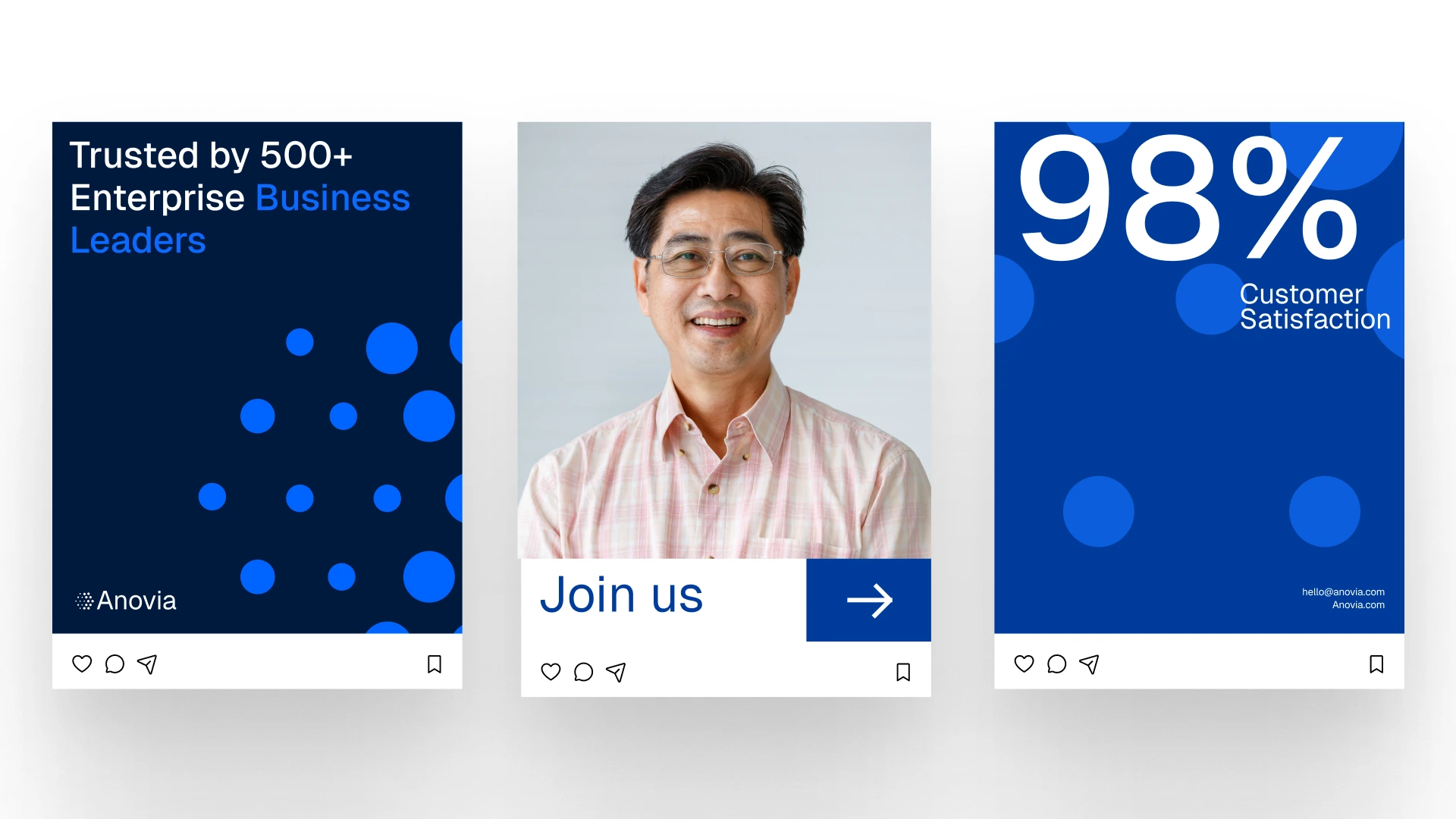
Social Media Posts
04 — Final Identity
The final identity is simple, strong, and modern:
A geometric symbol suggesting progress and clarity
Geist as the core type system — clean, technical, confident
A balanced, digital-friendly color palette
A layout system ready for web, decks, and future products
It feels like a brand built for scale.
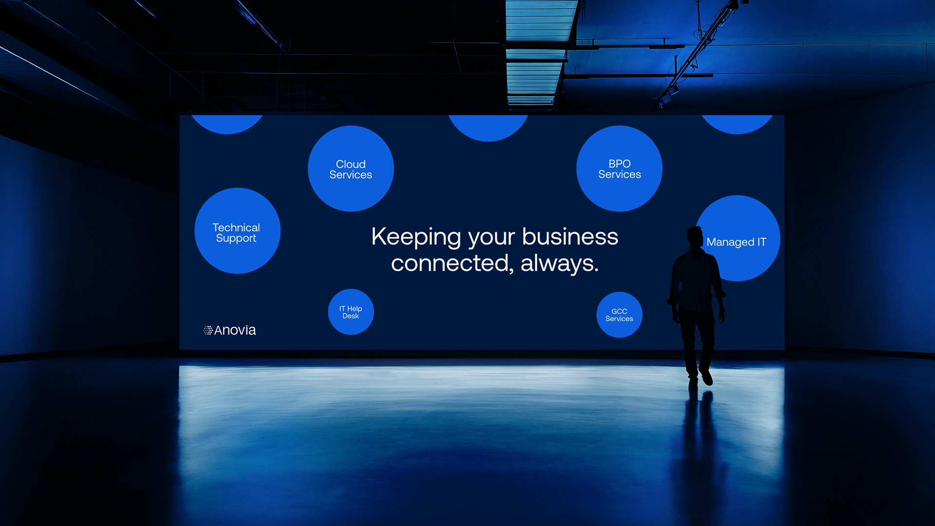
Event Banner
Outcome
Anovia now looks like the company it actually is:
professional, modern, structured, and forward-thinking.
The new identity sets the foundation for the upcoming website relaunch and positions the company for its next phase of growth.
It’s a complete reset — a clean, confident beginning.
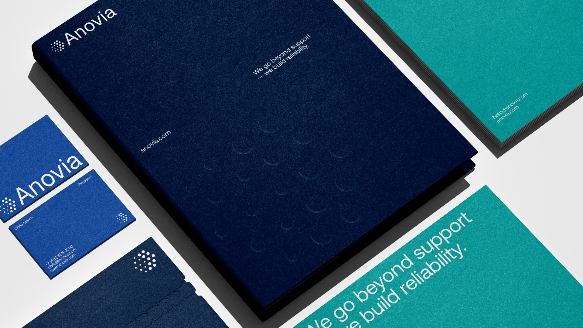
Business Cards
Like this project
What the client had to say
Really great experience and top quality work, thank you very much!
Chris Marsh, Sprucehill Capital Inc.
Nov 13, 2025, Client
Posted Mar 30, 2026
Transformed Anovia's legacy brand into a modern, directional identity that's centered around direction, clarity, and technical confidence.
Likes
2
Views
51
Timeline
Oct 15, 2025 - Nov 13, 2025
Clients
Sprucehill Capital Inc.

