Enterprise SaaS UX research & redesign

Rakesh Chitroda
UX Researcher
UX Designer
Design Systems
Figma
Ryzeo

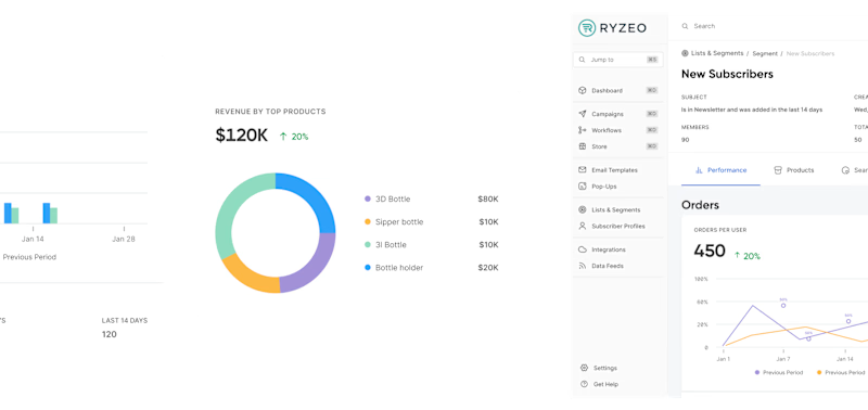
Ryzeo is an enterprise SaaS company that offers marketing automation solutions to eCommerce businesses. They help their users optimize conversion rates by utilising individual browsing behaviour and targeting shoppers early in the buying process, thus turning window shoppers into buyers. They approached us with a goal to become an industry leader through comprehensive UX research, a highly collaborative design process and consumer-grade UX.
As a company functioning in the digital domain, they had a rough idea about the problems they were facing. The two main issues they shared with us were that :
The users found it difficult to navigate the existing app interface which led to a high user drop off rate, and
Their reports didn’t offer any actionable insights.

UX Research
To transform the UX of this SaaS application, we proposed a comprehensive UX research phase that comprised of understanding the product and overall business domain, assessing the UX maturity of the stakeholders, benchmarking the competitors and understanding the users and their expectations.
UX research methods used during this phase were: (1) Heuristic evaluation and design audit of the product (2) stakeholder interactions (3) competitor analysis (4) user research (5) review of the product analytics.
Domain Understanding
The first step in our UX research was to analyze the domain of the product. We went through multiple articles and videos about email marketing SaaS, how it helps improve e-commerce businesses conversions etc. This research also helped us gather some insights into how the client’s competitors performed.
Once we had a good understanding of the domain, we moved on to auditing the product.
Product Audit
We audited the application through various methodologies. We deployed a team of auditors to perform –
Heuristic Evaluation
Overall Findings
Enterperise design validation
These exercises helped us cover a lot of ground including – understanding the heuristics, the enterprise design framework that we’d have to consider while designing this product, identifying the problem areas in this enterprise SaaS and coming up with desirable recommendations.
Along with being able to provide users of this email marketing SaaS a good experience, we also aimed to help our clients increase their Annual Recurring Revenue (ARR), Customer Lifetime Value (LTV) and lower their Customer Acquisition Cost (CAC) owing to a good ux.

Competitor Analysis
Once we knew who our stakeholders saw as competitors, we started analysing them. During the evaluation, we reviewed several demo videos in the email marketing SaaS domain.
We examined their user flow and possible actions that users may need to take when interacting with their products.We identified 8 common features across all enterprise SaaS products. Based on that, we conducted a detailed analysis to compare their user experience and functionality.No research can ever be complete without a qualitative research tool, and that was rightly our next step in the research phase.
User Interviews
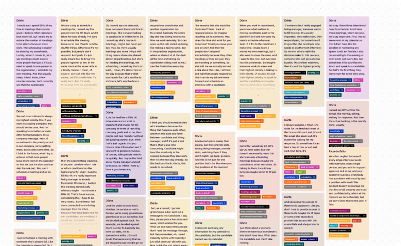
We performed qualitative user research for validating the assumptions related to the user problems. The insights we gained were given the most importance. They were then combined with the findings from the stakeholder insights and competitors’ analysis.

Research Synthesis
Once we had all the data we would need, we started drawing insights to guide our redesign process.
Persona building
We developed goal-directed user personas to identify design problems and devise product strategies. They provided us with a clear understanding of user behaviour and the purpose of the product.
Thematic Analysis
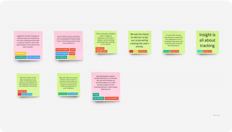
For our research synthesis, we utilised the thematic analysis approach. It helped us refine the data that was gathered during qualitative research. Next, we looked for meaningful patterns in themes across the data. The patterns were then analysed by repetitive data coding and theme creation.
Through thematic analysis, we were able to map various insights from the stakeholder interviews, competitor analysis, and user interviews. These insights helped us chalk out the design problems that we would have to solve during the design phase.
The following were the key insights uncovered during research synthesis:
Personalized report view
Actionable insights from reports
Campaign Creation
Workflow Creation
Multiple tenant capability
Campaign calender
Features
Backed by the insights obtained during the user interviews and from the clients, we identified the list of features to be designed. This was done at the beginning of the Information Design process.
Personalized report view
Actionable insights from reports
Campaign Creation
Workflow Creation
Multiple tenant capability
Campaign calender
Visual Design
Given we were working with a legacy enterprise SaaS, we considered our SaaS UX framework before developing the IA.Since most Ryzeo users were concerned with insights and preferred reviewing mass email analytics, we gave the reports modules the highest priority. We also redesigned their weekly report email template.
Page Wise IA and User journey
We developed goal-directed user personas to identify design problems and devise product strategies. They provided us with a clear understanding of user behaviour and the purpose of the product.
Mid-Fidelity Wireframes
The next step was to visualize the screens by creating paper sketches. We, later, converted these to mid-fidelity wireframes.The wireframes gave us a more accurate depiction of the layout. We were able to see the overall structure and how things would work. Based on this, we proposed a layout that was best suited for users.
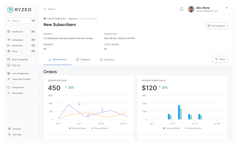
The screen had two folds: the first consisted of cards that showed actionable insights and key metrics to the users, while the second consisted of a list of campaign details. This layout has been designed so that users could drag and drop the components within the screen and can create a unique view according to their needs.
User Feedback
Our design process was iterative. We asked for constant feedback from our personas at various stages – starting from IA to final designs. This constant feedback cycle helped us in iterating the metrics and the user experience of the product.
Component Based Approach
Our design consisted of elements that could be used across a variety of modules. Thus, we decided to follow a component-based approach by re-styling the components from our design system. This helped us reduce the cost of design while delaying repetitive tasks during the technical development phase.
When designing the information architecture, we categorized the screen elements like metadata, content, and supporting content. In this way, we gained an understanding of what the structure of a component will look like and what type of component it will be. It could be a card, a button, a dropdown menu, etc. We followed the atomic design methodology while creating these components so that it would make it easier to understand what all atoms, molecules, and compounds were used in creating a component.
Final Outcome
Style Guide
Our design consisted of elements that could be used across a variety of modules. Thus, we decided to follow a component-based approach. This helped us reduce the cost of design while delaying repetitive tasks during the technical development phase.
When designing the information architecture, we categorized the screen elements like metadata, content, and supporting content. In this way, we gained an understanding of what the structure of a component will look like and what type of component it will be. It could be a card, a button, a dropdown menu, etc. We followed the atomic design methodology while creating these components so that it would make it easier to understand what all atoms, molecules, and compounds were used in creating a component.
Hi-fi Wireframes & Prototypes
Once the style guide was finalized, we started implementing it onto the prototypes. Prototyping helped us showcase an experience that was as close to the final product. It also helped us to identify issues with the wireframes’ usability. This gave us the idea to make the tabs sticky on the top while scrolling through so that users do not feel disconnected.
Design System Documentation
We created a document of all the components that were used in the designs. This would make it easier for future designers and developers to understand each element of the component. Furthermore, we also divided every component into atoms, molecules, compounds, and organisms.
What makes a design system a “design system” is not just the designs, but also the documentation. We documented all design decisions like
Information Design
Component Anatomy
Visual Design Tokens
Design Tokens
Component Documentation
This project allowed us to develop a deeper understanding of the enterprise SaaS users and further enhanced our capabilities as a UX design agency. If you have a similar requirement, we would love an opportunity to share our experience with you.


